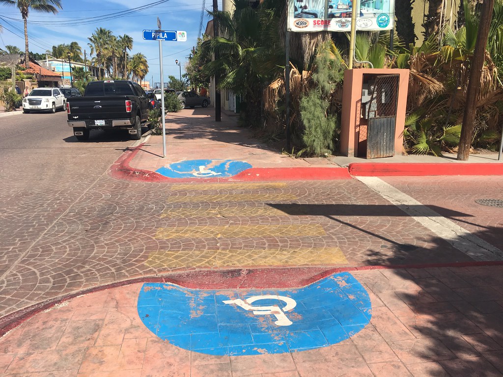
Human-centered design starts with people. All of them. When you design for the people at the edges, like someone who can’t see the screen, can’t hear the video, or can’t grip the handle, you almost always build something better for everyone else too.
At a glance
1
Disability is common
More than 1 in 4 U.S. adults has a disability. That is not a niche audience.
2
Everyone is at the edge sometimes
A broken wrist, a loud bar, a baby on your hip. Ability changes by the day.
3
Design for the edges
Solve for the hardest case and the solution usually works better for all.
4
It is part of the job
Alt text, contrast, and captions are marketing basics, not extras.
People-Centered Includes Abilities
In human-centered design, we start with empathy. We go find the people we are designing for and learn how their day really works. Too often, that picture quietly leaves out people with disabilities.
That is a big miss. The CDC reports that more than 1 in 4 U.S. adults has some type of disability. The most common are cognition and mobility, followed by hearing and vision.
Microsoft’s Inclusive Design team gives us a helpful way to think about it. Disability is a mismatch between a person and the thing they are trying to use. Change the design and the mismatch can go away. Their persona spectrum shows that the same need can be permanent, temporary, or situational.
Can’t use one arm
Permanent: someone with one arm. Temporary: a broken wrist. Situational: a parent holding a baby.
Can’t see the screen
Permanent: someone who is blind. Temporary: dilated eyes after the eye doctor. Situational: glare on a phone at the pool.
Can’t hear the audio
Permanent: someone who is Deaf. Temporary: an ear infection. Situational: a loud game day crowd or a quiet library.
Can’t focus right now
Permanent: a cognitive or learning disability. Temporary: a concussion. Situational: scrolling while tired, stressed, or distracted.
Remember
Your customer is not always at their best. Design for the tired, distracted, one-handed version of them and you will reach more people.
Design for the Extremes
Here is the principle I want you to remember. When you design for the people at the extremes, the middle usually takes care of itself. Microsoft calls it solve for one, extend to many. In HCD we look for extreme users on purpose, because their needs are clearer and their workarounds show us what a better design could be.
The classic example is the curb cut. In the early 1970s, disability activists in Berkeley, California poured their own concrete ramps at street corners, and in 1972 the city installed its first official curb cut. Then everyone started using them: parents with strollers, travelers with rolling bags, delivery workers with carts, kids on bikes. Angela Glover Blackwell named this the curb-cut effect. A change made for one group ends up helping all of us.
Design for the edges and the middle usually takes care of itself.
Real Brands That Designed for the Edges
These are not charity projects. Each one started with a specific person’s need and became a better product or a stronger brand story.
OXO Good Grips
Sam Farber noticed his wife Betsey’s arthritis made ordinary peelers hard to hold. He worked with Smart Design on a wide, soft, non-slip handle. OXO launched in 1990 with 15 tools, and now almost every kitchen drawer has that handle style in it.
Xbox Adaptive Controller
Microsoft built the controller with input from gamers with limited mobility and released it in 2018. Its Super Bowl ad, We All Win, showed kids playing together. The message was inclusion and joy, not pity.
Nike FlyEase
In 2012, a teenager with cerebral palsy wrote to Nike asking for a shoe he could put on by himself. That letter led to FlyEase and later the hands-free Go FlyEase. Nike now markets it to parents with full hands and anyone in a hurry.
Tommy Hilfiger Adaptive
Working with the nonprofit Runway of Dreams, Tommy Hilfiger released adaptive kids’ clothes with magnets and Velcro that looked just like the regular line and cost the same. Style and dignity, not a separate medical aisle.
Pinterest inclusive search
Pinterest added skin tone ranges to beauty search in 2018 and hair pattern search in 2021. People could finally find results that looked like them. Inclusion became a search feature.
Captions everywhere
Captions were made for Deaf and hard of hearing viewers. In a 2026 Extreme Reach survey across five countries, 80% of people used subtitles at least sometimes, and most of them reported no hearing difficulty.
What Happens When Brands Skip It
Skipping accessibility costs sales, trust, and sometimes a lot of money. Inaccessible sites are still the norm. The 2026 WebAIM Million report found detectable WCAG failures on 95.9% of the top one million home pages. The most common problem was low-contrast text, followed by images with no alt text.
- Target, 2008. The National Federation of the Blind sued because blind shoppers couldn’t use Target.com with screen readers. Target settled and paid $6 million in damages.
- Domino’s, 2019. A blind customer couldn’t order a pizza on the website or app. A federal appeals court said the ADA applied. The Supreme Court declined to hear Domino’s appeal, and the case settled in 2022.
- Public universities, now. Under the Department of Justice’s ADA Title II rule, public colleges like UT must meet WCAG 2.1 AA on their websites and digital content. The deadline for large public entities moved to April 26, 2027. That is why your course materials are getting accessible makeovers.
- Selling in Europe. The European Accessibility Act took effect June 28, 2025. It covers many businesses that sell to EU consumers online, including U.S. brands.
Remember
Accessibility is not only about avoiding lawsuits. The bigger cost is the customer who gives up and buys from someone else. You never see them in your data.
If it works for the person at the edge, it usually works better for everyone.
Jules Morris
Your Accessibility Checklist as a Marketer
You do not need to be a developer to get this right. Most of it is in the hands of the person writing, designing, and posting. Make these habits:
- Write real alt text. Say what the image shows and why it matters, in a sentence. Skip “image of.” Instagram, LinkedIn, and most email tools have an alt text field. Use it.
- Caption every video. Burn in captions for short-form social, and check auto-captions for errors, especially brand names.
- Check your contrast. Light gray text on white is the most common failure on the web. Test your brand colors with the WebAIM Contrast Checker.
- Don’t use color alone. “Click the green button” fails for people who are colorblind. Add a label, an icon, or an underline.
- Write links that make sense alone. “Download the spring menu” beats “click here.”
- Use real headings. Structure pages and emails with true H1, H2, and H3 headings so screen reader users can scan like everyone else.
- Write hashtags in CamelCase. #SmallBusinessSaturday is easier for screen readers and for everyone else.
- Keep it plain. Short sentences and clear words help people with cognitive disabilities, second-language readers, and busy people on their phones.
Try this
Run your brand’s homepage through the free WAVE checker. Then try to use the site with only your keyboard: Tab, Enter, and the arrow keys. Write down three things that got in your way.
Inclusive Is Bigger Than Access
Accessibility makes sure people can use what you make. Inclusion makes sure they can see themselves in it. Both are part of people-centered marketing.
Look at the people in your photos and video. Do they show a range of ages, body types, skin tones, and abilities? Is a person using a wheelchair or a hearing aid just part of the scene, or only shown when the topic is disability? The best inclusive work treats people with disabilities as customers, not as a cause.
Cast
Show real range in your imagery, including people with visible and non-visible disabilities, in everyday moments.
Co-create
Bring people with disabilities into research and testing. They are the experts on their own experience.
Check
Before you publish, ask who this leaves out. Then fix one thing.
Keep going
Microsoft Inclusive Design
The persona spectrum and free inclusive design toolkits.
W3C Web Accessibility Initiative
Plain-language guides to WCAG and how people with disabilities use the web.
WAVE accessibility checker
Free tool that flags accessibility errors on any web page.
WebAIM Contrast Checker
Test whether your brand colors are readable.
The Curb-Cut Effect
Angela Glover Blackwell on how designing for one group helps everyone.
Color Theory and Brand Psychology
Choose brand colors that are on-strategy and readable.
Website design for your portfolio
Build an accessible personal site with free tools.
Leave a Reply