The big idea: Color isn’t decoration, it’s a decision. Change the color and you change the customer, the price point and the promise.
See it in action
Palette Lab
Recolor an ad for STILL, an invented sparkling water. Pick a brand mood and a color harmony, then check whether the text passes contrast.
Key concepts
- Color is psychology at scale: People react to color before they think. Learn the vocabulary so you can use it on purpose.
- Own a color completely: A brand can commit to an unexpected color and turn it into its greatest asset.
- Color as competitive strategy: In a look-alike category, color can be what sets you apart.
- Color story: A collection of visuals has one color world (warm or cool, bright or muted). It either holds together or fights itself.
- Contrast for everyone: Text needs enough contrast with its background to be readable, including for people with low vision or color blindness.
Real examples
- UPS Brown: An unlikely color the brand committed to completely.
- T-Mobile Magenta: Color as strategy in a category where everyone looks alike.
Real brands in action
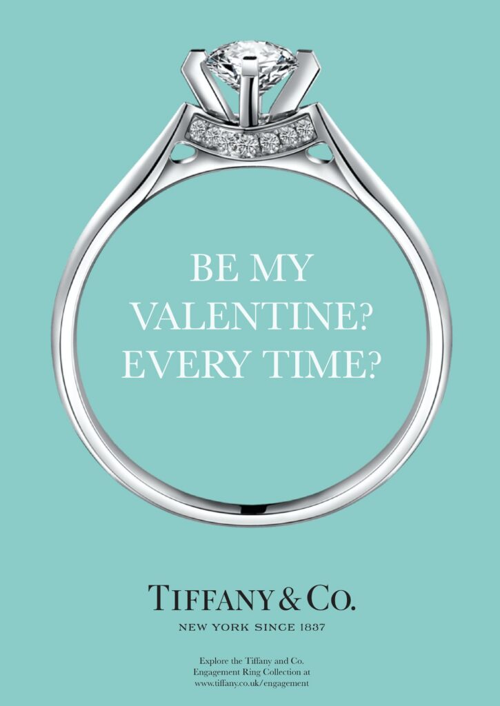
Tiffany & Co.: A color so recognizable it is trademarked
Tiffany Blue has been part of the brand since 1845 and is a trademarked color. You know what is inside the box before you open it. The palette follows a clear split: Tiffany Blue dominates, white lets it breathe, and black is used sparingly for text and ribbon.
The lesson: Own one color completely and it can carry the brand without a logo or words.
Image courtesy of Tiffany & Co.

Spotify: Electric green nobody else owns
Spotify pairs a bright green with black, a combination nobody else in tech or music owns. It stands out on every phone screen. The green does not say nature or money. It says electricity and movement.
The lesson: Pick a color that means something distinct in your category, then use it everywhere.
Image courtesy of Spotify
UPS: Owning an unexpected color
Brown is not a color most brands would choose. UPS committed to it completely, and it became one of the brand’s greatest assets.
The lesson: You do not have to love a color. You have to commit to it.
Learn more: UPS
T-Mobile: Color as competitive strategy
Wireless carriers tend to look alike. T-Mobile made magenta its signature and has gone to court to protect it.
The lesson: In a look-alike category, color can be the strategy.
Learn more: T-Mobile

Olivia Rodrigo: A new album, a new color
For GUTS, Olivia Rodrigo moved from the blue of her debut album era to rich purples. The color feels moody and introspective but still bold. Handwritten type and close, sometimes uncomfortable camera angles back up the same feeling.
The lesson: A color change can signal a new chapter before anyone hears a note.
Image courtesy of Olivia Rodrigo
Brand images are shown for educational purposes only. Each image and trademark belongs to the brand credited, and each credit links to that brand.
Frameworks from class
The same color can say different things
A color’s meaning depends on its exact shade and its company. Spotify’s electric green on black says electricity and movement. Whole Foods green says natural and organic. Finance green says money and stability. Picture Spotify in light blue. It would feel calmer, safer and more like a utility. Color is never arbitrary.
- Warm tones like red and orange bring energy and passion.
- Cool tones like blue and green bring calm and professionalism.
- Neutrals like gray and white bring balance and sophistication.
Check your collection’s color story
Look at your moodboard or campaign as one collection, not as single images. Ask three questions. If seven different color temperatures are fighting each other, the story is not there yet.
- What is the dominant color world? Warm or cool, saturated or muted, light or dark?
- Is there one emotional tone, or several competing ones?
- What does this collection say about you or your brand?
Mood comes from more than color
Visual mood is the emotional atmosphere people feel before they engage. Color starts it, but texture, type and imagery finish it. Glenfiddich pairs rich copper and warm browns with leather, wood and copper textures to feel crafted and timeless.
- Texture and materials: concrete, linen, worn leather and polished wood each carry a mood
- Typography: the voice of the palette
- Imagery: authentic photos feel trustworthy, illustrations feel playful, abstract visuals feel premium
Collect wide, then edit hard
Gather far more images and swatches than you need. Then cut anything that does not serve the argument. When it is arranged, the set should look like one person with a clear vision made it. Ask yourself whether it shows who you actually are or who you think you are supposed to be.
Class exercise: The color swap test
See how much work a single color does for a brand.
- Pick a brand with a strong signature color, like Spotify, Tiffany or UPS.
- Imagine its logo, app or packaging in a very different color.
- Write down what changes: who it seems to be for, what it seems to cost, and what it promises.
- Name one competitor the new color would make it look like.
- Explain in two sentences why the real color is the right strategic choice.
Try it
Build a personal moodboard that makes a visual argument for who you are. Include images that make you feel something, a clear color direction, fonts in real use, textures and at least one surprise. Collect too much, then cut hard. Does the final board tell one color story?
Tips and best practices
- Use the 60-30-10 split. About 60 percent dominant color, 30 percent secondary and 10 percent accent keeps a design balanced. Save the accent for the thing you want clicked.
- Check contrast every time. Run text and button colors through a contrast checker such as WebAIM. WCAG AA asks for 4.5:1 for normal text and 3:1 for large text.
- Lock exact color codes. Record HEX, RGB and CMYK values in a style guide and use them everywhere. Slightly different shades across channels make a brand look careless.
- Research color meaning in each market. Color associations are learned and vary by culture and category. Check what a color signals to your specific audience before you commit.
- Pick a color competitors do not own. Look at the colors your category already uses. A distinct color, used consistently, can become a recognition shortcut, as T-Mobile did with magenta.
Quick check
Think through your answer, then select a question to reveal one.
What does it mean for a brand to own a color?
It uses one color so consistently that people recognize the brand by the color alone.
Why check color contrast?
Low contrast makes text hard or impossible to read, especially for people with low vision.
Go deeper
- Pinterest, Behance and Are.na for moodboard references
- Unsplash for photos
- WebAIM Contrast Checker
View the Color Theory and Brand Psychology slides on Gamma