
The big idea: On a visual, the image shows and the words say what the image can’t: a short headline, one support line and a clear next step, placed where people can read them in three seconds.
In 60 seconds
- The image shows what it is, who it is for and how it feels. The words say why it matters and what to do next.
- Use three levels of words: a short headline, one support line and a verb-first call to action.
- Put text in calm, empty space, off faces and away from app buttons, and check contrast so it reads in three seconds.
Do this: write a headline, support line and CTA for your platform design, in your brand’s voice, that pass the length, placement, contrast and CTA checks.
How words and visuals work together
How words and visuals work together
The picture shows. The words say what it can’t.
On a social graphic, a thumbnail or a slide, the picture and the words are a team. When they repeat each other, you waste the only few seconds you get.
Two jobs, one team
Let the image show. Let the words add.
The image shows
- What it is. The product, the place, the person.
- Who it is for. The people and setting your audience sees themselves in.
- How it feels. The mood: light, color, energy.
The words say
- Why it matters. The benefit or the twist the photo can’t show.
- What’s new or true. A date, a number, a promise, a reason to care now.
- What to do next. One clear action.
Show vs. say, in one example
Same photo, twice the work.
For example, an imaginary coffee shop posts a photo of a latte.
“Fresh latte”
Says what we already see.
“Your 7 a.m., but better”
Adds a feeling and a reason to come in.
Three levels of words, three jobs
Hook, back it up, then tell them what to do.
- 1HeadlineThe hook. Short enough to read in one glance. Looks like: the biggest, boldest words on the design.
- 2Support lineThe detail or proof that backs up the hook. Optional on small formats. Looks like: clearly smaller, one line if you can.
- 3Call to actionThe one thing to do next, starting with a verb. Looks like: a button shape or a contrasting color.
The 3-second test
Look for three seconds, then look away.
Can you say what it is about and what to do next? If not, cut words or make the headline bigger. Test it on a teammate who has not seen it.
Short beats long
People scroll fast on small screens.
3 to 7
A good rule of thumb for text on a visual: a headline of about 3 to 7 words, fewer on a thumbnail. Everything else goes in the support line or the caption.
How to cut a headline down: five moves that turn 14 words into 5
Write the long version first, then cut. For example, a long first draft for an imaginary bakery: “Order a custom cake for your next birthday party with free delivery this month.” Then:
- Delete what the photo shows. If we see a cake, drop “cake.”
- Move details down. Delivery and dates go in the support line or caption.
- Keep the benefit, not the feature. “Make it their day” beats “Custom cakes available.”
- Use numbers. “Ready in 48 hours” is faster to read than “ready in just two days.”
- Read it at phone size. Zoom your design out to the size of a thumb. If you squint, cut again.
Result: headline “Make it their day.” Support line “Custom cakes, ready in 48 hours.” CTA “Order by Thursday.”
Where the words go
Put text where it doesn’t fight the hero.
Use negative space
Put text in the calm, empty part of the photo: sky, a wall, a tabletop. Plan that space when you shoot.
Watch out: no empty space means the photo or the crop is wrong for text.
Stay off faces and product
Faces pull the eye first, and the product is the point. Text on top of either fights the hero of the image.
Watch out: a text box over a chin or a logo still covers it.
Mind the edges
Stories, Reels and TikTok put buttons, names and captions over the top and bottom of the screen. Keep key words inside a safe margin.
Watch out: preview your design on a phone, not just in Canva.
When the photo is busy
Busy background? Pick one fix.
Busy backgrounds make text hard to read, even in a bold font.
Add a scrim
A soft dark (or light) gradient behind the text. The photo still shows, the words pop.
Use a solid shape
Put the text on a box, band or circle in a brand color. Clean and very readable.
Move the text
Slide it to the quietest part of the frame, or crop so a calm area opens up.
Check the contrast
Accessibility guidelines (WCAG AA) ask for a contrast ratio of at least 4.5:1 for normal text and 3:1 for large text. Use them as your target on graphics too.
Quick test: view it in grayscale. If the words fade, fix it.
How to do each fix in Canva
- Scrim: a gradient element or a shape with lowered transparency.
- Solid shape: a rectangle from Elements, then send it behind the text.
- Move the text: double-click the photo to reposition the crop.
Voice that matches the look
Your words should sound the way your visuals look.
When a calm, soft photo gets a shouting all-caps headline, people feel the mismatch even if they can’t name it.
Calm, warm
Unhurried, friendly, short sentences.
“Your 7 a.m., but better.”
Bold, high contrast
Direct, punchy, verbs first.
“Beat yesterday.”
Playful, bright
Light, a little cheeky, wordplay welcome.
“Make it their day.”
Clean, minimal
Precise, confident, few words.
“Three steps. Ten minutes.”
Voice that matches the look: your personality keywords should sound and look the same
Your identity board lists voice keywords. The words on every visual should sound like those keywords, and the font and layout should look like them.
| If the visuals feel | The words sound | Example headline (imaginary brands) |
|---|---|---|
| Calm, warm, natural light | Unhurried, friendly, short sentences | “Your 7 a.m., but better.” |
| Bold, high contrast, motion | Direct, punchy, verbs first | “Beat yesterday.” |
| Playful, bright, lots of color | Light, a little cheeky, wordplay welcome | “Make it their day.” |
| Clean, minimal, lots of white space | Precise, confident, few words | “Three steps. Ten minutes.” |
Test it: cover the logo. Could this headline belong to a competitor with a different look? If yes, push the voice further toward your keywords.
CTAs on social graphics
Make the next step real for that platform.
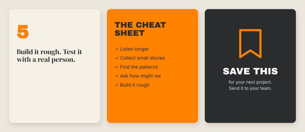
- Start with a verb and be specific. “Order by Thursday” or “Find your set.”
- Match what the platform allows. Point people somewhere real.
- Don’t double up on ads. Keep any on-image CTA short.
- Make it look tappable when it is. Use one CTA per graphic.
CTAs on social graphics: the details
- Start with a verb and be specific. “Order by Thursday” or “Find your set” tells people what happens. “Learn more” and “Click here” don’t.
- Match what the platform allows. A picture in an Instagram feed post is not clickable, and links in feed captions don’t click either. Point people somewhere real: “Link in bio,” “Save this for Saturday” or “Tap the link sticker” on a Story with a link sticker.
- Don’t double up on ads. Paid ads on Meta platforms show their own button under the image. Let the graphic carry the headline and keep any on-image CTA short.
- Make it look tappable when it is. A button shape in a brand accent color signals “this is the action.” Use one CTA per graphic.
Copy for each platform format
Every format fits a different number of words.
- Feed post: headline, optional support line, short CTA. Test how it looks small.
- Story or Reel cover: headline and CTA, centered. Mind the top and bottom edges.
- YouTube thumbnail: a few big words that add to the video title. It shows tiny.
- Pinterest pin: a clear headline people would search for. A little more detail is fine.
Copy for each platform format: how many words fit where
| Format | Common size | Words on the visual | Watch out |
|---|---|---|---|
| Instagram feed post | 1080 x 1350 px (4:5) or 1080 x 1080 px (1:1) | Headline, optional support line, short CTA | The grid view crops posts, so test how it looks small. |
| Story or Reel cover | 1080 x 1920 px (9:16) | Headline and CTA, centered | App buttons and names cover the top and bottom edges. |
| YouTube thumbnail | 1280 x 720 px (16:9) | A few big words that add to the video title | It shows tiny in search results and on phones. |
| Pinterest pin | 1000 x 1500 px (2:3) | A clear headline people would search for | Pins are saved to read later, so a little more detail is fine. |
| Video title cards and captions | Same as the video | Hook text in the first 3 seconds, a CTA end card, captions throughout | Captions and hook text should not cover faces or each other. |
Platforms update their recommended sizes. Check the current size in Canva’s preset or the platform’s help pages before you export.
Try it: Headline on Image Lab
Tool · MARK 475
Headline on Image Lab
Each layout starts with a weak draft for an imaginary brand. Fix it, then try your own brand’s copy.
- 1Write
- 2Style
- 3Test
Format
Text position
Text color
Behind the text
Headline style
Time is up.
Without looking: what was the headline, and what should you do next?
All checks
Put it to work: words on your platform designs, video and deck
Graders look for cohesion in the Final Campaign: every asset should look and sound like the same brand. Your identity board lists voice keywords, and your platform designs, video and Campaign Deck are where those words meet the visual system. Use these steps to pair them.
Pair your voice with your visuals in five steps
Turn your voice keywords into rules
Pull the voice keywords from your final identity board. For each one, write what it sounds like and what it never sounds like.
Your deliverable: a short voice line on the identity board, such as “Warm: short, friendly sentences. Never: hype, all caps, exclamation points.”
Lock the tagline
Write five options, read each next to your logo, and pick the one a competitor could not borrow. It stays the same on every asset.
Your slide: the Brand name, tagline and positioning slide, with the tagline set in your brand fonts.
Write a copy stack for every platform design
Each teammate writes a headline, an optional support line and a CTA for their own platform design, then runs it through the Headline on Image Lab before building it in Canva.
Your deliverable: each platform design, labeled by member and platform at the correct dimensions, passes the length, placement, contrast and CTA checks.
Title the video the same way
Your 1-minute video needs a hook in the first 3 seconds, a clear CTA and captions throughout. Treat the on-screen hook text like a headline and the end card like a CTA graphic.
Your deliverable: on-screen hook text of a few words, captions that stay clear of faces, and an end card with your logo, tagline and one CTA.
Show words and visuals together in the deck
On the Identity slide, put the voice keywords beside the logo, colors and type. On the Campaign content in context slide, show the designs the way your audience would see them, words included.
Your slide: the Identity slide and the Campaign content in context slide, plus one sentence in the Strategy rationale on why your words fit your audience.
A worked exampleOne imaginary brand, from keywords to a finished copy stack
For example, a team invents Hollow Pine Coffee, a cozy cafe for students.
- Voice keywords: warm, unhurried, local.
- Visual system: soft window light, cream and pine green, a calm serif for headlines.
- Tagline: “Stay a while.”
- Instagram feed post (1080 x 1350 px): a latte photo with an empty wall at the top. Headline “Your 7 a.m., but better.” Support line “Small-batch beans, roasted every Tuesday.” CTA “Order ahead” in a pine green button. Dark text in the negative space.
- Story (1080 x 1920 px): same photo, cropped tall. Headline and CTA only, centered, away from the top and bottom edges.
- Video: hook text “Finals week. Find your corner.” in the first 3 seconds, captions throughout, end card “Stay a while. Order ahead.”
Every piece says something the photo does not, and every piece sounds warm and unhurried.
Before you submitA quick check of every asset with words on it
- [ ] Our voice keywords are on the final identity board with a “sounds like / never sounds like” line.
- [ ] The tagline is the same everywhere it appears: identity board, deck and video end card.
- [ ] No headline repeats what its image already shows.
- [ ] Every headline passes the 3-second test with someone outside our team.
- [ ] No text sits on a face, on the product or under a platform’s buttons.
- [ ] All text is easy to read: we checked contrast and used a scrim or shape on busy photos.
- [ ] Each platform design has one clear, verb-first CTA that works on that platform.
- [ ] The video has hook text in the first 3 seconds, captions throughout and a CTA at the end.
- [ ] The Identity slide shows our voice keywords next to the logo, colors and type.
Go deeper
Back to all Marketing 475 topics
In-class group activity · 25 min
Show It, Then Say It
Voice rules, a tagline, and one tested copy stack (headline, support line, CTA) for each teammate’s platform design, all in your brand’s voice. Your instructor will give you the password in class.
Frequently asked questions
How should words and images work together in a social graphic?
The image shows what it is, who it is for and how it feels. The words say what the image cannot: why it matters, what is new or true, and what to do next. When words repeat the picture, they waste the few seconds you get. For a latte photo, "Fresh latte" repeats the image, while "Your 7 a.m., but better" adds a feeling and a reason.
How long should a headline on a social media graphic be?
A good rule of thumb for text on a visual is a headline of about 3 to 7 words, and fewer on a thumbnail. Everything else goes in the support line or the caption. Run the 3-second test: look at the design for three seconds, then look away. If you cannot say what it is about and what to do next, cut words or make the headline bigger.
How do you make text readable on a busy photo?
Pick one fix: add a scrim, which is a soft dark or light gradient behind the text, put the text on a solid shape in a brand color, or move the text to the quietest part of the frame. Aim for WCAG AA contrast of at least 4.5:1 for normal text and 3:1 for large text. A quick check is to view the design in grayscale.
What is the difference between a tagline and a headline?
A tagline is the brand's lasting line. It sits with the logo and stays the same across the whole campaign, like Nike's "Just Do It." A headline is written for one piece of content and changes with every post, ad or slide, but it still sounds like the brand. A strong tagline is short, easy to say out loud and hard for a competitor to borrow.
How do you write a call to action on an Instagram graphic?
Start with a verb and be specific, like "Order by Thursday" or "Find your set." Remember that images and feed captions on Instagram are not clickable, so point people somewhere real: "Link in bio," "Save this for Saturday" or "Tap the link sticker" on a Story. Use one CTA per graphic, and on Meta paid ads keep any on-image CTA short since the ad shows its own button.