The big idea: Typography communicates before the words do. Choose type on purpose, pair fonts that contrast rather than compete, and design the path the eye takes.
See it in action
Type Personality Lab
Same jazz poster, different type. Pick a font pairing and set the hierarchy. See how personality and readability change.
Key concepts
- Four font families: Serif (history, authority), sans-serif (modern, clean), display (personality, headlines only) and script (warm, but looks amateur fast if overused).
- One display font, maximum: Use display or script type for a headline or logo and nothing more.
- Contrast, not competition: Two equally loud fonts freeze the eye. Contrasting fonts give it a first and second stop.
- Visual hierarchy: The eye has a path, and you design it with size, weight, color, spacing and position.
- Critique with vocabulary: Skip “it looks good.” Name what works or doesn’t, and why.
Real examples
- Apple’s San Francisco: A custom typeface that stays consistent from a watch face to a TV.
- Vogue: The Bodoni masthead carries decades of authority.
- The New York Times: A typeface so tied to the paper you recognize it before you read a word.
Real brands in action
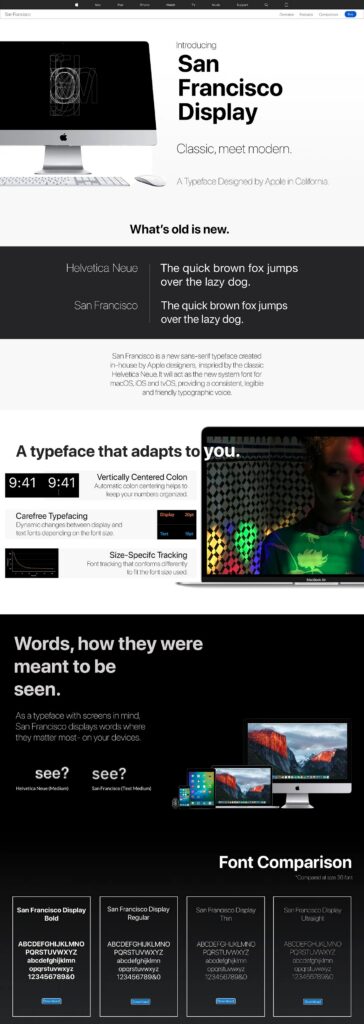
Apple: Why Apple built its own typeface
Apple released San Francisco in 2015 when it could have kept licensing Helvetica. Owning the typeface gave Apple control over every weight and size and one consistent look from Apple Watch to a large TV. SF uses optical sizing, so the letterforms change shape at small sizes to stay readable.
The lesson: A typeface can be a brand asset worth owning.
Image courtesy of Apple
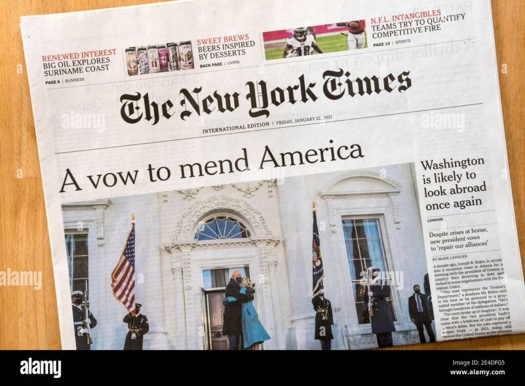
The New York Times: A typeface that became the brand
The Times has used Cheltenham since the early 1900s, one of the longest typeface relationships in publishing. Its version, NYT Cheltenham, is custom and exclusive to the paper. You know it is the Times before you read a word.
The lesson: Long, consistent use of one typeface builds instant recognition.
Image courtesy of The New York Times
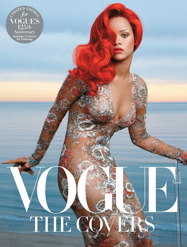
Vogue: One font, decades of authority
Vogue’s masthead uses a high-contrast Bodoni-style serif with extreme thick and thin strokes. It reads as sophisticated and precise, much like fashion itself. Take it away and an institution starts to look like a newsletter.
The lesson: The right font is not decoration. It is the identity.
Image courtesy of Vogue

Spotify: Type built for a phone screen
Spotify uses Circular, a geometric sans-serif licensed from Lineto. It is clean, modern and approachable without feeling corporate, and it stays readable at small sizes on a phone. The same type shows up on billboards, so the brand looks the same at every scale.
The lesson: Choose type that fits the brand’s personality and the screens people actually use.
Image courtesy of Spotify
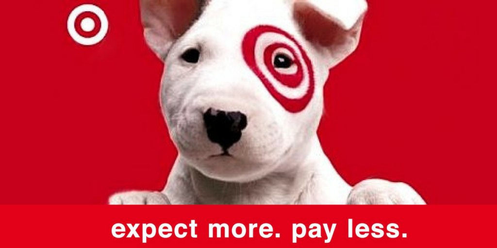
Target: Friendly type for “expect more, pay less”
Target uses a rounded sans-serif that feels friendly and easy to approach. The type supports its “expect more, pay less” promise. It looks welcoming, not cheap.
The lesson: Pick type that sounds like your brand promise.
Image courtesy of Target
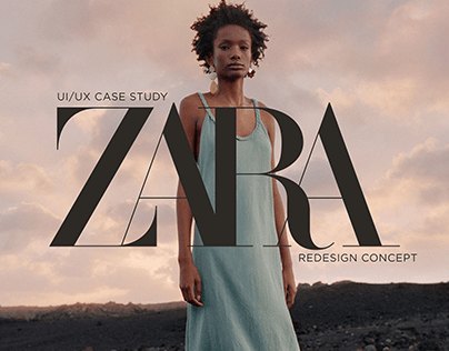
Zara: Serif type that signals fashion
Zara uses serif typography to signal elevated fashion and sophistication. That gives the brand an aspirational, premium feel even though its prices are mid-range.
The lesson: Type can raise how premium a brand feels.
Image courtesy of Zara
Brand images are shown for educational purposes only. Each image and trademark belongs to the brand credited, and each credit links to that brand.
Frameworks from class
Micro-typography: leading, kerning, tracking
Picking the font is only half the job. Small spacing adjustments decide whether text looks professional. These three terms come up in every design tool and every critique.
- Leading: the vertical space between lines. Too tight feels dense. Too loose falls apart.
- Kerning: the space between two specific letters. Fix awkward pairs like WA or AV in headlines and logos.
- Tracking: even spacing across a whole word or block of text. Loosen or tighten it for readability or impact.
What each font family says
Type speaks before anyone reads the words. Hand two people the same business card in two different fonts and they will judge two different people. Each family carries its own message.
- Serif: we have been here a long time. We are serious and we have authority.
- Sans-serif: we are of this moment. We are efficient and clear.
- Display: personality and occasion. One per design, headlines only.
- Script: warmth and a handmade feel. It looks amateur fast when overused.
Why brands own their typefaces
Apple could have licensed Helvetica forever. It built San Francisco in 2015 instead. The New York Times runs its own version of Cheltenham, which no one else can use. When a typeface is tied that closely to a brand, you know who it is before you read a word.
- Control: every weight and size is theirs
- Consistency: one typeface from a watch face to a TV screen
- Legibility: San Francisco changes letter shapes at small sizes so it stays readable
Type sets the price point
Fonts signal what something costs and who it is for. Zara uses serif type to feel elevated even at mid-range prices. Target uses a rounded sans-serif to feel friendly and accessible. If the same poster had to sell a $15 ticket instead of an $85 ticket, the type would need to change.
Class exercise: Become a font detective
Document how real brands use type on purpose.
- Collect 10 real examples from magazines, websites, packaging, store signs, social ads, posters or emails.
- For each one, note the brand and describe the type: serif or sans, case, weight, spacing.
- Name the emotion or tone the type gives off.
- Explain why the font works or does not work for that brand.
- Ask one last question: is the type helping the message or competing with it?
- Group your examples by tone, by category, or by your own system.
Try it
Design a poster for a moody, sophisticated jazz festival in an industrial warehouse, with the event name, date, venue and ticket price. Use no more than two typefaces, make the event name dominant, and make every type choice fit the mood. Then ask: where does your eye go first, and does the type fit the vibe?
Tips and best practices
- Limit yourself to two typefaces. One for headlines and one for body text is enough for almost any piece. Use size and weight within those families for variety.
- Pair for contrast, not similarity. A serif headline with a sans-serif body, or a bold display face with a quiet text face, gives the eye a clear first and second stop.
- Keep script and display fonts for headlines. Decorative fonts lose readability at small sizes. Never set script in all caps, and never use it for body copy.
- Make the size jump obvious. If the headline is only a little bigger than the body, the hierarchy reads as flat. A large, deliberate jump tells people where to start.
- Test readability at real size. Check type on a phone screen and from across the room for posters. What reads on a large monitor can fail at actual size.
Quick check
Think through your answer, then select a question to reveal one.
What are the five tools of visual hierarchy?
Size, weight, color, spacing and position.
Why do two equally bold fonts hurt a design?
They compete for attention, so the eye doesn’t know where to go first.
Go deeper
- Fontpair: curated font pairings
- Google Fonts
- Canva font combinations
View the Typography and Visual Hierarchy slides on Gamma