The big idea: A great logo doesn’t make a brand. A system does. Make the decisions once, document them well and follow them, so the brand holds together no matter who’s designing.
See it in action
Identity System Lab
Build the identity for Trailhead Outfitters, an invented outdoor gear shop, one piece at a time. Every piece shows up on four touchpoints. Then break the rules and see what happens without a system.
System strength
Key concepts
- Elements vs. system: Logo, color, type, imagery and voice are tools. The system is the rules for how they combine at every touchpoint.
- Logo versions: Reversed, small and one-color versions, plus clear space and minimum size.
- Color system: A primary color, a supporting palette, neutrals that give room to breathe and an accent saved for moments that need attention.
- Type hierarchy: Display, body and utility type, with the exact font, weight and size for each level.
- The style guide: The manual that lets anyone design on-brand. Show right and wrong side by side, and keep it current.
Real examples
- University of Tennessee brand guidelines (brand.utk.edu)
- Notion: A system built on restraint and calm.
- Mailchimp: A public brand guide that treats voice as seriously as visuals.
Real brands in action
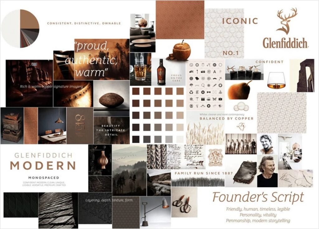
Glenfiddich: A mood board that sets the whole system
Glenfiddich’s mood board pulls the brand into one look: rich copper, warm browns and soft neutrals, with natural textures like leather, wood and copper. The visuals carry the brand’s story of heritage and craft, family run since 1887, while still feeling modern. Every piece feels proud, warm and premium.
The lesson: Decide on color, texture and story together so every touchpoint feels like the same brand.
Image courtesy of Glenfiddich
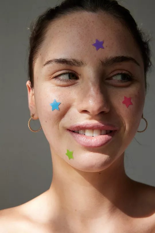
Starface: Making acne patches something to show off
Starface entered a skincare category built on clinical looks and shame. It chose bold yellow, an unexpected color in skincare, and star-shaped pimple patches that turn a blemish into an accessory. Its photography shows real skin texture, and its content is built to be shared, not hidden.
The lesson: A visual system can flip how a whole category feels.
Image courtesy of Starface
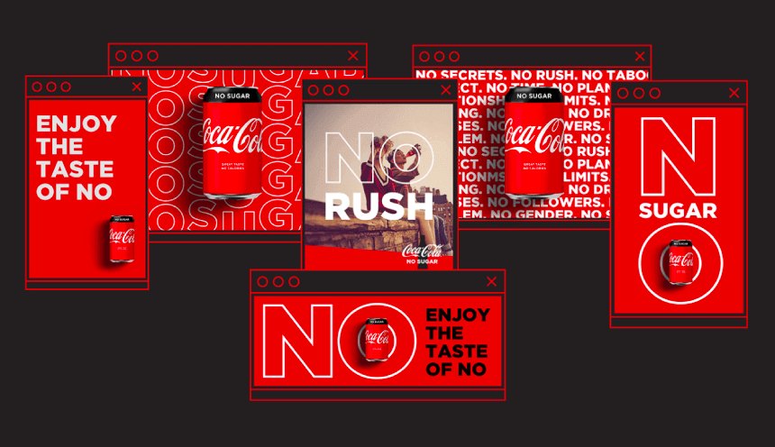
Coca-Cola: Consistency you can feel
The class uses a Coca-Cola mood board to show how a cohesive aesthetic works. Coke’s red, its script logo and its imagery of happiness and shared moments show up the same way across decades of packaging and ads. That consistency builds instant recognition and trust.
The lesson: A consistent aesthetic makes a brand recognizable before anyone reads a word.
Image courtesy of Coca-Cola
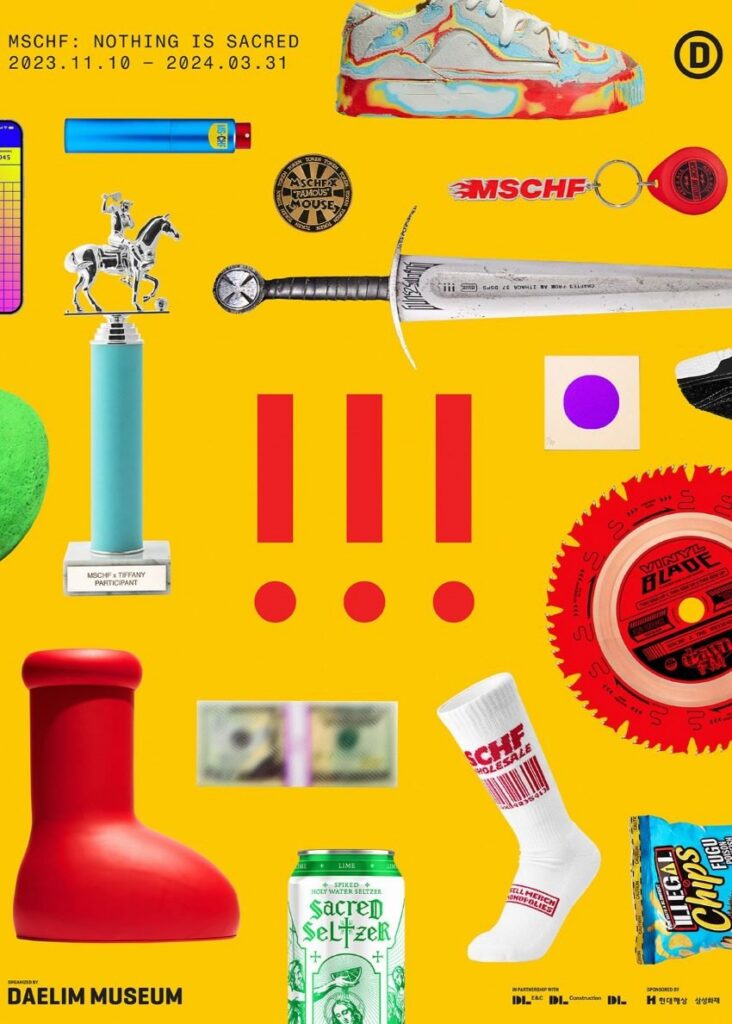
MSCHF: Breaking the rules on purpose
MSCHF built a Gen Z following by rejecting normal branding rules. Its look changes with every product drop, its designs are made for social sharing, and controversy is part of the plan, as with the Big Red Boots and the Satan Shoes. For this audience, the inconsistency is the brand.
The lesson: Inconsistency only works when it is a deliberate strategy for a specific audience.
Image courtesy of MSCHF
Mailchimp: A color with a name and a story
Mailchimp publishes its whole brand guide at brand.mailchimp.com. Its yellow is not just a hex code. It is called Cavendish Yellow, after a banana variety. The guide gives Freddie, the chimp mascot, his own rules for poses, sizing and where he can appear, and it treats voice and tone as seriously as the visuals.
The lesson: Name your brand choices and explain why, so anyone can use them correctly.
Learn more: Mailchimp
Notion: Restraint as a system
Notion’s identity runs on very few decisions: black, a warm off-white background, one typeface and simple line illustrations. No gradients, no photography and no color accents. The calm, focused look matches what users want from the product, which is to get things done without noise.
The lesson: Restraint is a choice, and it takes confidence to make it.
Learn more: Notion
Brand images are shown for educational purposes only. Each image and trademark belongs to the brand credited, and each credit links to that brand.
Frameworks from class
Personality words are design instructions
Notion’s whole identity runs on a few choices: black, a warm off-white, one typeface and simple line illustrations. Each choice traces back to a personality word. Calm sets the off-white background. Focused sets the single typeface. Organized sets the strict grid. The personality comes first and the system follows.
- Restraint is a brand choice, not a budget problem.
- Your system is always saying something. Make sure it says what you mean.
Color rules say where each color lives
A palette is not a list of hex codes. It is a set of rules about placement. Answer three questions for every palette you build.
- Background: what sits behind everything?
- Accent: what draws the eye and signals action?
- Never together: which combinations are off limits?
Write the why, not just the what
Mailchimp’s public guide does more than list assets. It explains the reasoning behind each rule and shows what breaks the spirit of the brand. Rules with reasons build brand sense, not just compliance. Its guiding question is what the brand looks like when it is most itself.
- What to use: the assets, colors, typefaces and components
- Why it works: the reasoning behind each decision
- What violates the spirit: real examples of misuse
- Name your choices. Cavendish Yellow is a story. A hex code is not.
How a logo gets made
Great logos do not happen by accident, and the process is not a straight line. Expect to circle back and refine. Judge every version against three rules: simple, memorable and right for the audience. A playful logo fits a toy company but not a law firm.
- Research: the brand’s mission, audience and what makes it different
- Study competitor logos. What feels overdone in the category?
- Sketch freely by hand before you open any software
- Design in black and white first so shape and balance carry the mark
- Make 5 to 10 versions, each solving a different problem
- Add color last. It should support the message, not carry it.
- Test the type at very small and very large sizes, and save PNG, SVG and editable originals
Class exercise: One decision, one reason
Prove each visual choice is strategy, not taste, in 60 seconds.
- Pick one visual decision your team made: a color, a typeface, a logo type or a layout choice.
- State it clearly and specifically. Name the exact color, font or logo style.
- Finish the sentence: we chose this because… Tie it to your personality, your audience or your competitors.
- Keep it to one decision and one reason.
- If you cannot finish the because, go back to your strategy before you lock that visual in.
Try it
Build a brand identity board: the logo on light and dark backgrounds, one primary, two secondary and one neutral color with hex codes, a headline and body font in real copy, six to eight mood images, and a voice section with one line that sounds exactly like the brand and one it would never say. Then explain one decision and the reason behind it.
Tips and best practices
- Make decisions once, then document them. A system is the set of rules for combining logo, color, type, imagery and voice. Write the rules down so anyone can apply them.
- Build logo versions for every size. Plan a primary logo, a compact secondary mark and a simple icon, plus one-color and reversed versions. Set clear space and a minimum size.
- Give every color a job. Define a primary color, supporting neutrals for breathing room, and one accent saved for calls to action. List hex codes for each.
- Limit type to a clear hierarchy. Specify a display face, a body face and the sizes and weights for each level. Show them in real copy, not lorem ipsum.
- Show do and do-not examples side by side. Stretched logos, off-palette colors and wrong fonts are easier to avoid when people can see them. Keep the guide current as the brand grows.
- Give voice the same rigor as visuals. Describe how the brand sounds and write sample lines, including things it would never say. Consistency in words builds trust just like consistency in color.
Quick check
Think through your answer, then select a question to reveal one.
What’s the difference between brand elements and a brand system?
Elements are the pieces. The system is the rules for how the pieces work together everywhere.
Why show wrong examples in a style guide?
Seeing what not to do makes the rules clear to anyone using them.
Go deeper
- brand.utk.edu
- Frontify brand guidelines gallery
- Mailchimp brand guide
View the Building Your Brand Identity System slides on Gamma