Case study · Marketing 475 · Color Theory and Brand Psychology
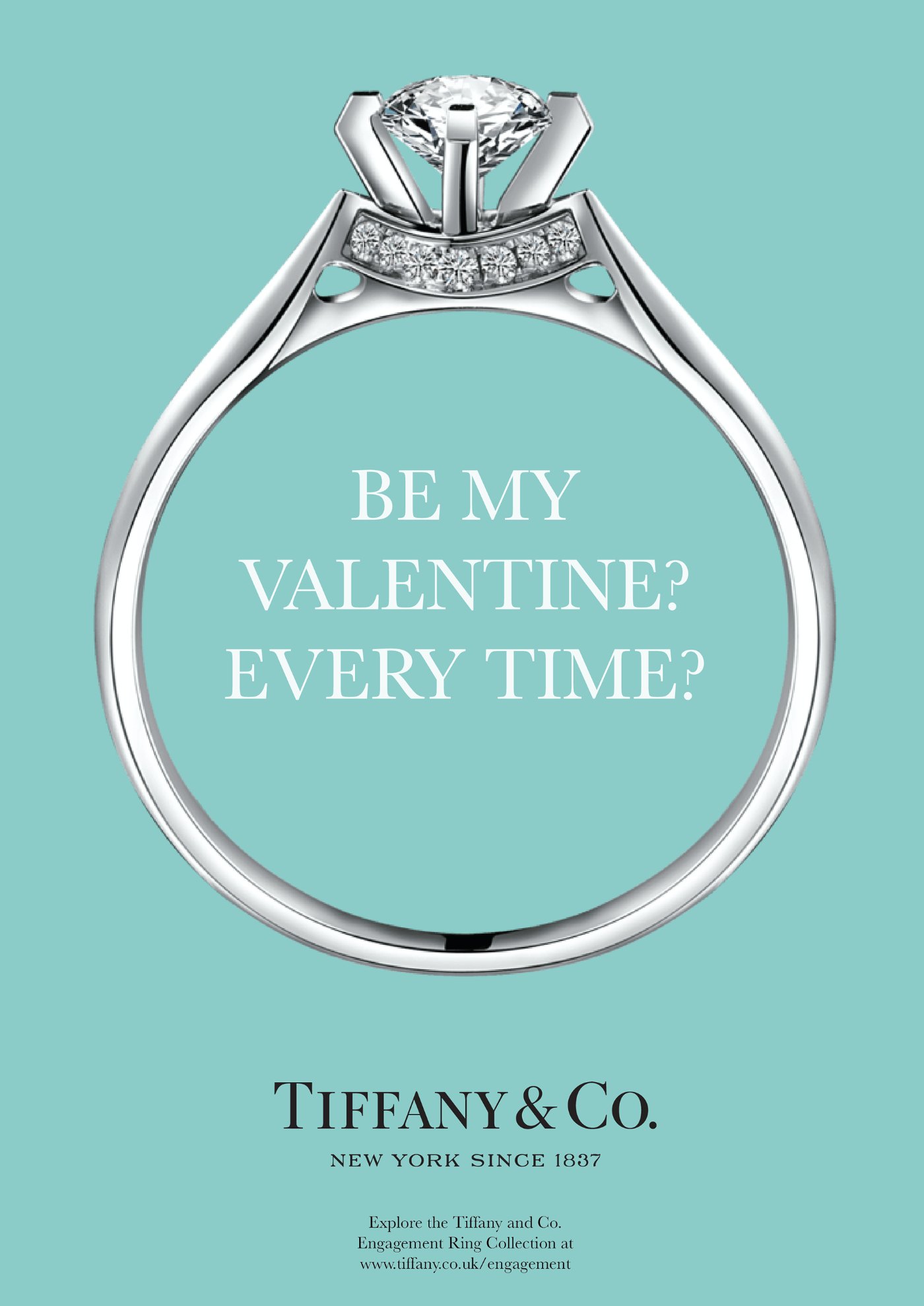
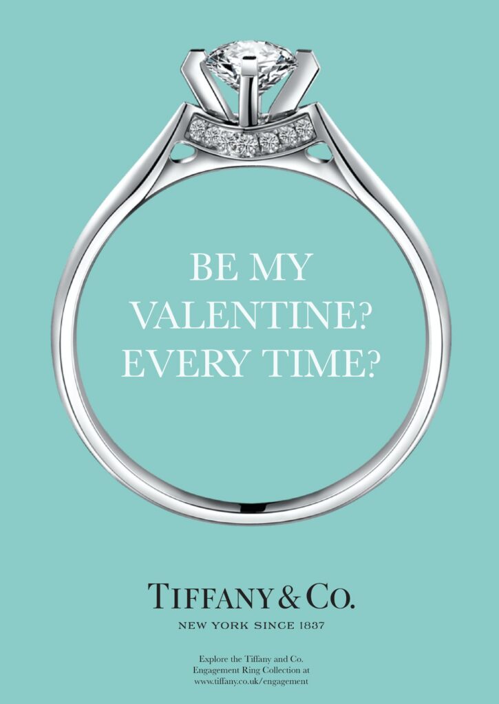
Tiffany & Co. used one shade of blue with enough consistency, for long enough, that the color now signals the brand before anyone reads a word, and the law treats it as a trademark.
Brand
Tiffany & Co.
Year(s)
1845 (first Blue Book) to present; trademarked 1998
Channel(s)
Packaging, catalog, stores, advertising
Goal
Make a single color a signal of quality and of the brand itself
Topic
Color Theory & Brand Psychology
1845
first Tiffany Blue Book catalog (Tiffany & Co.)
1998
year Tiffany trademarked the color (Tiffany & Co.; CNN)
1837
name of Tiffany’s custom Pantone color, after the founding year (Tiffany & Co.)
The situation
Charles Lewis Tiffany and John Young founded Tiffany & Co. in New York in 1837. In 1845 the company published its first Blue Book, a catalog of its goods. Tiffany’s own heritage page says the founder chose the blue for that cover.
The color’s early history is less tidy than the legend. CNN reported that the first Blue Book cover leaned greener than today’s robin’s-egg shade, that the hue varied over the years, and that the company settled on a color close to modern Tiffany Blue around 1966. Nobody knows for certain why the founders chose it.
The challenge
Jewelry is hard to tell apart at a glance. A diamond from one store looks much like a diamond from another. The brand needed a signal of where something came from that worked before the box was opened.
What they did
Tiffany attached the color to the one object every customer receives: the box. Its heritage page says that in 1886, the company introduced the Tiffany Setting engagement ring in the first Tiffany Blue Box. Tiffany’s site also quotes a 19th-century New York Sun item saying the founder had ‘one thing in stock that you cannot buy for any price; he will only give it to you.’ The box came only with a purchase.
Over time the company locked the color down.
- 1998: Tiffany registered the color as a trademark.
- Around 2001: Pantone standardized it as a private custom color called ‘1837 Blue,’ named for the founding year, so it matches across packaging, design and advertising.
- The packaging system is simple: the blue box and a white satin ribbon, which the company says client advisors hand-tie so it unfurls in one motion.
What happened
The color became a shortcut for the brand. Tiffany’s senior vice president of global marketing told CNN that consumers recognize the brand by its color alone. Pantone’s Laurie Pressman said Tiffany had turned the shade ‘into an international icon of elegance and sophistication.’
That recognition is what makes the trademark possible. In the 1995 Qualitex case, the U.S. Supreme Court held that color alone can sometimes serve as a trademark. In practice, that requires a color to have become so tied to one company that customers read it as a source. A color is not protectable just because a company likes it.
Why it worked
Color works as a brand signal when it is distinctive in its category, used the same way every time, and tied to a meaningful moment. Tiffany Blue meets all three. It is a single, standardized shade. It appears on the same object every time. And that object is handed over at a moment that matters, often an engagement.
The white ribbon helps by staying out of the way. It frames the blue instead of competing with it. That restraint is part of the system.
Where it gets complicated
Owning a color can make a brand feel locked in time. LVMH completed its $15.8 billion acquisition of Tiffany in January 2021. That July, Tiffany ran a campaign with the line ‘Not Your Mother’s Tiffany,’ aimed at younger buyers. Marketing Brew reported a backlash from longtime customers who felt the brand was dismissing them. One agency executive called it a miss because the brand stood against its own history.
The lesson cuts both ways. The color gives Tiffany enormous recognition, but it also carries decades of associations. A brand that owns a color has to change around it carefully.
It is also worth being precise. ‘Since 1845’ is the company’s own story. The shade has a messier history, and the trademark came 153 years after the first catalog. Consistency was built over time, not on day one.
The marketing principle
A color becomes a brand asset through consistency, distinctiveness and repetition at meaningful moments, not through color psychology alone. When one color is owned completely, it can carry the brand without a logo or words. Tiffany shows the payoff, and the work behind it: standardizing the shade, protecting it and resisting the urge to dilute it.
Sources
- The Tiffany Blue Box, Tiffany & Co. (n.d. (accessed 2026))
- Tiffany & Co. blue (published in partnership with Artsy), CNN Style (n.d. (accessed 2026))
- Design Classic: Tiffany Blue Box, Robb Report Malaysia (n.d.)
- “Not Your Mother’s Tiffany” campaign sparks backlash, Marketing Brew (2021)
- LVMH shakes up Tiffany ranks as the ink dries on $15.8B deal, Retail Dive (2021)
Group activity for this case
Find Your Blue Box
Your group will have one signature object and meaningful moment that carries your brand’s color, plus a supporting color that frames it. A 20-minute group activity. Dr. Morris gives the password in class.
Back to Color Theory and Brand Psychology · All case studies
Brand names, images and trademarks belong to their owners and appear here for educational purposes only.