Case study · Marketing 475 · Typography and Visual Hierarchy
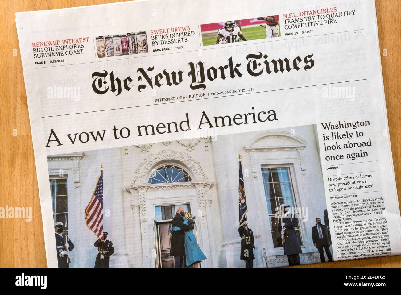
By committing to one headline typeface, Cheltenham, and commissioning its own custom version of it, The New York Times turned a type choice into something readers recognize before they read a word.
Brand
The New York Times
Year(s)
Cheltenham in long use; unified custom headline system from 2003; web headlines by 2012
Channel(s)
Print edition, NYTimes.com, apps
Goal
Give every headline a consistent, recognizable voice across print and screen
Topic
Typography and Visual Hierarchy
1896
Year design work on Cheltenham began (Wikipedia, citing type histories)
2003
Year the Times unified its print headlines in Cheltenham with weights by Matthew Carter (The New York Times, 2003)
2012
Year by which NYTimes.com was setting headlines in NYT Cheltenham web fonts (Fonts In Use)
The situation
Cheltenham is an old American typeface. Architect Bertram Goodhue and Ingalls Kimball of the Cheltenham Press began designing it in 1896, and it was completed around 1902 with work by the type foundry American Type Founders. It is a sturdy serif typeface, sold today in several standard versions by different font vendors.
The New York Times has used Cheltenham in its headlines for a long time. Exactly when it started is not well documented. The type history site Fonts In Use flags 1902 as a possible first use, with a question mark. For much of its history, though, Cheltenham was one of several headline faces in the paper, mixed with others.
The challenge
Headlines do the most work on a news page. They rank stories, signal importance and set the tone. If every section uses a different mix of typefaces, the paper looks less like one publication and more like a collection of pages.
By the early 2000s, the Times’ print headlines were still a mix that included Cheltenham, Bookman, a version of Century Bold and Latin Extra Condensed. The paper wanted one consistent system.
What they did
In 2003, the Times introduced a unified Cheltenham headline palette for the print edition. Tom Bodkin, then the paper’s design director and an assistant managing editor, brought in type designer Matthew Carter to draw several weights and a heavily condensed width of Cheltenham. These replaced most of the other headline faces (as reported by The New York Times in October 2003).
- One family, many weights. Instead of switching typefaces to show importance, editors could use different weights and widths of the same face.
- A custom version. The result, known as NYT Cheltenham, was made for the Times. Fonts In Use credits most of its weights to Matthew Carter in the early 2000s, with earlier work credited to Jonathan Hoefler.
- Part of a larger custom system. NYT Cheltenham sits alongside other custom faces made for the paper, including NYT Imperial, NYT Franklin and NYT Karnak (Fonts In Use).
- Carried onto screens. The fonts were updated in 2009, and by 2012 NYTimes.com was setting headlines in NYT Cheltenham as web fonts (Fonts In Use).
What happened
Cheltenham became the visible voice of the Times across print, web and apps. Fonts In Use documents it on major moments, including the May 24, 2020 “Incalculable Loss” front page.
Because the Times uses its own version, the look is hard to copy exactly. Matthew Carter’s custom designs for publications, including the Times, were privately commissioned for those companies’ own use.
Why it worked
Consistency builds recognition. When a typeface shows up on every headline, every day, for years, readers learn it the way they learn a logo. The font becomes a signal of the source.
One family also creates clear hierarchy. Using bold, light, condensed and wide versions of the same face lets editors rank stories without the page looking chaotic. The reader sees what matters most, and the page still looks like one paper.
A custom version protects the asset. A standard font is available to anyone. A commissioned version, tuned for the paper’s needs on paper and on screens, belongs to the brand.
Where it gets complicated
Some popular claims about this story are overstated. It is often said the Times has used Cheltenham since the early 1900s. That may be true, but we could not confirm a start date. What is documented is that Cheltenham became the unified headline face in 2003.
Typography is also only one part of recognition. The Times’ blackletter nameplate, unchanged since 1967, plus its layout, photography and writing style all help people know it is the Times. And standard versions of Cheltenham are sold by several font vendors, so another publication could choose a similar look. The custom version and decades of use are what make it the Times’ own.
The marketing principle
A typeface becomes a brand asset through long, consistent use and a clear system for how it shows hierarchy. The Times did not just pick a nice font. It committed to one family, made its own version and used it everywhere. Recognition is earned by repetition.
Sources
- A Face Lift for the Times, Typographically, That Is, The New York Times (2003)
- NYT Cheltenham, Fonts In Use (2026)
- Cheltenham, Fonts In Use (2026)
- Cheltenham (typeface), Wikipedia (2026)
- Matthew Carter, Wikipedia (2026)
Group activity for this case
One Family, Every Headline
One type family for your brand with a weight and width system that ranks three messages without a second font. A 20-minute group activity. Dr. Morris gives the password in class.
Back to Typography and Visual Hierarchy · All case studies
Brand names, images and trademarks belong to their owners and appear here for educational purposes only.