Case study · Marketing 475 · Visual Marketing in the Wild
The swoosh started as a cheap student design its client did not love. It became a mark that needs no name beside it through decades of consistent use.
Brand
Nike
Year(s)
1971 to today
Channel(s)
Product, packaging, advertising, digital
Goal
Give a young shoe company a mark it could put on every product
Topic
Visual Marketing in the Wild
$35
Carolyn Davidson’s bill for the design (1971, Business Insider)
500
Nike shares given to Davidson in 1983, with a diamond swoosh ring (Business Insider)
1995
year Nike dropped the lettering and used the swoosh alone (Complex)
The situation
In 1971, the company that became Nike was still called Blue Ribbon Sports. Co-founder Phil Knight needed a mark for a new line of shoes, and production deadlines were close. He asked Carolyn Davidson, a graphic design student at Portland State University.
Davidson spent weeks sketching options on tissue paper. She brought several designs to the meeting. The one the team picked was a simple curved stroke she called “the stripe.”
The challenge
Nobody in the room loved it. Nike’s own account quotes Knight saying, “Well, I don’t love it. But it will grow on me.” The mark had no history and no meaning yet. It was a shape on a shoe from a company most people had never heard of.
Davidson billed $35 for the work. She had been paid $2 an hour, and the bill covered about 17.5 hours.
What they did
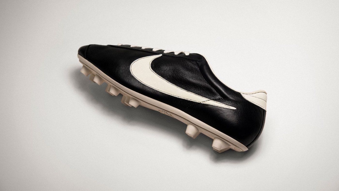
Nike put the mark to work and kept it. The swoosh appeared on early shoes such as the Cortez in 1972. For years it ran with the NIKE name set inside or beside it. The lettering changed to Futura in 1976.
In 1995, Nike dropped the lettering and let the swoosh stand alone. By then the shape had appeared on more than two decades of shoes, apparel and advertising.
- 1971: Davidson designs the mark for $35.
- 1972: the swoosh appears on early Nike shoes like the Cortez.
- 1976: the logo lettering changes to Futura.
- 1995: Nike drops the lettering and uses the swoosh alone.
What happened
Today Nike uses the swoosh with no name beside it, and people still know whose product it is. Nike also recognized Davidson. In 1983, Knight and his co-founders gave her a gold swoosh ring set with a diamond and 500 shares of Nike stock.
- $35: Davidson’s bill for the original design (1971).
- 500 shares of Nike stock and a diamond ring given to Davidson (1983).
- 1995: the year Nike began using the swoosh without the company name (Complex).
Why it worked
The drawing is simple. It is one filled shape with no fine detail and no text. That means it holds up when it is tiny on a phone screen or huge on a building, and it survives being embroidered, embossed, printed in one color or reversed out of a dark background. A detailed mark would lose its shape in many of those uses.
But simplicity only made the swoosh usable. Consistency made it valuable. Nike put the same shape on its products for 24 years before it trusted the mark to work without the name. Every shoe, ad and athlete wearing it added meaning that the original drawing never had.
Where it gets complicated
The $35 story is popular because it suggests great logos are cheap. That is the wrong lesson. The design fee was small, but the meaning came from decades of product, athlete partnerships and advertising spending. A small brand cannot copy the swoosh’s simplicity and expect the same result.
The story also shows that early reactions are a poor test of a logo. Knight did not love it. Most new marks feel empty at first because they have not been used yet. Teams that change their logo every time it feels flat never give it the chance to build meaning.
Finally, simple marks are easy to copy. A shape this basic depends on trademark protection and consistent use to stay tied to one brand.
The marketing principle
In visual marketing, a mark is a container. A simple, flexible shape gives a brand something it can repeat everywhere, and repetition over time fills it with meaning. The swoosh did not start as a symbol of performance. Nike made it one by using it consistently for decades.
Sources
- Never Done: Leaving a Mark (the story of the Swoosh), Nike (n.d.)
- Nike Bought Its Iconic ‘Swoosh’ Logo Design For A Measly $35 In 1971, Business Insider (n.d.)
- The History of the Swoosh on Nike’s Sneakers, Complex (2021)
Group activity for this case
The Tiny Logo Torture Test
Your group will have a stress-tested logo with notes on where it holds up and a simpler version if it breaks. A 20-minute group activity. Dr. Morris gives the password in class.
Back to Visual Marketing in the Wild · All case studies
Brand names, images and trademarks belong to their owners and appear here for educational purposes only.