The big idea: Visual identity is strategy, not decoration. Any brand can have a logo, but a consistent brand has a world, and you can take that world apart with five questions.
See it in action
Five-Second Test Lab
An ad for PEAK, an invented cold brew, sits in a busy feed. Change one attention driver at a time and see where eyes land first.
Numbered markers show a simplified, illustrative model of where eyes go first. They are not real eye-tracking data.
Key concepts
- The five-point visual audit: Look at the logo, the color palette, the typography, the imagery style and how consistent it all is. It’s a method, not a matter of taste.
- Logo: Check shape, weight, simplicity and memorability. Can you draw it from memory? Does it still work tiny or in one color?
- Color and the 60-30-10 rule: About 60% primary color, 30% secondary and 10% accent, with the same exact colors everywhere.
- Typography: Serif signals tradition and authority; sans-serif signals modern and clean. Pair one headline font with one body font.
- Imagery style: Shot type, light, color grading and whether images are styled or candid. Inconsistent editing makes a brand look scattered.
- Consistency: Across platforms, over time and at every touchpoint. This turns a logo into a brand world.
Real examples
- Glossier: Soft natural light, one specific pink and real skin, the same on every channel.
- Dollar Shave Club vs. Gillette: The same product in two very different visual worlds.
- Tiffany & Co.: A blue so recognizable it’s trademarked.
- Patagonia: Real people outdoors, almost never products on white. The photography is the promise.
- Spotify: Electric green on black, a custom typeface and candid imagery, with Wrapped as proof of consistency.
Real brands in action
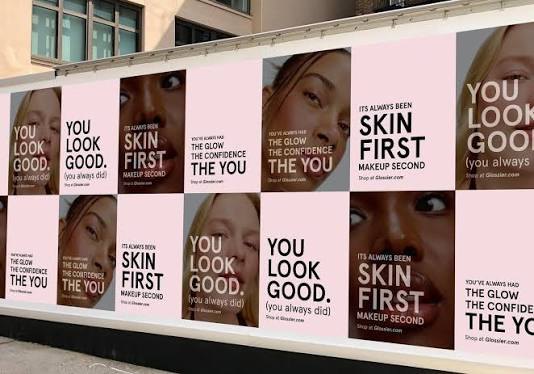
Glossier: A blog that became a billion-dollar brand
Emily Weiss started Into The Gloss as a beauty blog in 2010 and turned it into a product brand by 2014. Glossier reached a $1.8 billion valuation without leaning on advertising or celebrity deals. It built a visual world instead: soft natural light, one specific millennial pink, real skin on real people, and the same look across packaging, photos, the website and Instagram.
The lesson: Visual consistency can do the work that ad budgets usually do.
Image courtesy of Glossier
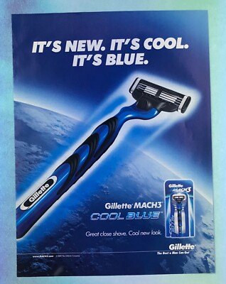
Dollar Shave Club vs. Gillette: Same product, different visual world
Gillette used blue, silver and chrome to signal serious razor technology. Dollar Shave Club launched in 2012 with bold color, simple layouts and slightly irreverent type that said it was in on the joke. Unilever bought Dollar Shave Club in 2016 for $1 billion, and the brand got there without a TV ad budget.
The lesson: Visual positioning decides who a product is for, even when the product is the same.
Image courtesy of Dollar Shave Club vs. Gillette

Spotify: Wrapped works because it looks like Spotify
Spotify uses the same green, the same Circular typeface and the same bold graphic style in the app, on the website, on social and in outdoor ads. Wrapped takes each user’s listening data and dresses it in that look. People recognize it in the first second of a scroll and share it because it looks like Spotify.
The lesson: A consistent brand turns a yearly campaign into something people spot and share on sight.
Image courtesy of Spotify

Patagonia: The photography is the brand promise
Patagonia rarely shows its products in isolation. Its images show real people climbing, paddling, protesting and repairing gear in real places. There are no white-background product shots and no studio lighting, and that is a deliberate choice.
The lesson: Imagery that shows the product in real use proves what the brand claims.
Image courtesy of Patagonia
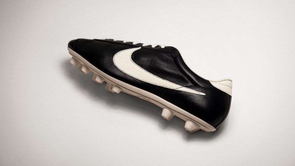
Nike: A $35 logo that works at any size
The Nike swoosh cost $35 in 1971. It reads as motion without a word, and it works at 16 pixels or 16 feet, in black, white, embroidered or embossed. Its value comes from years of consistent, intentional use, not from the drawing itself.
The lesson: A simple mark gains meaning through consistent use.
Image courtesy of Nike
Brand images are shown for educational purposes only. Each image and trademark belongs to the brand credited, and each credit links to that brand.
Frameworks from class
Logo, identity, brand world
Any brand can have a logo. Not every brand has a world. Use this ladder to see where a brand sits and how far it still has to go.
- Just a logo: a mark, a file, something a designer made once
- Visual identity: logo, color, type and imagery applied with intention
- Brand world: every touchpoint feels like the same universe, and people know you before they see your name
Reading a logo
A logo is the most compressed version of a brand. Start by naming its type: wordmark, lettermark, pictorial mark, combination mark or emblem. Then test it. The Nike swoosh works at 16 pixels and at 16 feet, and you know it without the name.
- Shape: geometric reads as stable, organic as warm, abstract as modern
- Weight: heavy lines feel confident, thin lines feel refined
- Memory: can you draw it from memory?
- Versatility: does it work in black and white, reversed, or embroidered on a hat?
- Name test: remove the company name. Would you still know whose it is?
Why brands change their look
A visual identity is not fixed forever. Brands refresh their look for four reasons. Old Spice went from your grandfather’s cologne, with navy and nautical imagery, to bold red and absurd humor for guys who do not take themselves too seriously. The product stayed. The visual world changed.
- Cultural relevance: keeping up with new aesthetics and moments
- Audience change: the core customer ages, or the brand chases a new generation
- Platform change: new digital spaces need new formats
- Competition: rivals update their look, so you have to stand apart again
Taste vs. professional observation
Saying their logo is simple shows taste. A professional explains what it does and why it works. For example: the logo uses a single continuous line that suggests movement and stays legible at any size, even reversed on dark backgrounds. Aim for the second kind of sentence in every audit.
A brand is a living entity, and it is enriched by every encounter with the customer.
Alina Wheeler
Class exercise: Read an ad in visual language only
Describe a brand ad without guessing who it is for.
- Pick one ad from a brand with a strong look, such as Glossier.
- Describe the light. How soft or hard is it, and where is it coming from?
- Name the colors and what they communicate.
- Decide whether the product is the focus or whether something else is.
- Describe how the spacing and composition feel.
- Do not mention demographics or assumptions about the buyer. Stick to what you can see.
Try it
Audit three brands with the five-point framework: one you love, one you dislike and one you feel neutral about. Check the website, social accounts and any packaging. Be specific: “the logo is simple” says little; “a single continuous line that reads as movement and stays legible on dark backgrounds” is a professional observation.
Tips and best practices
- Run a five-second test before you publish. Show a draft to someone for five seconds, hide it, and ask what they remember. If they cannot name the brand and the message, simplify.
- Give every piece one clear first stop. Decide what the eye should hit first, usually the product, a face or the headline, and make it the biggest or highest-contrast element.
- Cut words, then cut again. Ads seen in a scroll or from a car get a glance, not a read. Keep headlines short and move details to the landing page.
- Use faces on purpose. People notice faces first. Have the person look at the product or headline when you want attention to move there.
- Audit brands with the five points. Check logo, color palette, typography, imagery style and consistency across the website, social and packaging. Write specific observations, not opinions.
Quick check
Think through your answer, then select a question to reveal one.
What are the five points of a visual audit?
Logo, color palette, typography, imagery style and consistency.
What does the 60-30-10 rule describe?
A balance of about 60% primary color, 30% secondary and 10% accent.
View the Visual Marketing in the Wild slides on Gamma