Case study · Marketing 475 · Photography for Marketing
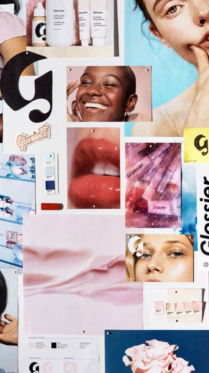
Glossier decided its pictures should feel like skin, not makeup, and carried that feeling from product shots to packaging to customers’ own photos.
Brand
Glossier
Year(s)
2014 to present
Channel(s)
Instagram, website, packaging, campaigns, customer photos
Goal
Make natural, skin-first beauty look desirable in every image
Topic
Photography for marketing
The situation
Glossier launched in 2014 out of Emily Weiss’s beauty blog, Into The Gloss. Weiss has described the brand’s core approach as “skin first, makeup second,” a philosophy she says seemed niche at launch and has since become mainstream.
At the time, much beauty advertising sold transformation: heavy makeup, dramatic retouching and a look most people could not recreate. Glossier wanted to sell the opposite feeling.
The challenge
A brand that promises natural, effortless beauty has a photography problem. If the images look heavily styled, the promise feels false. If they look careless, the brand feels cheap. Glossier needed images that felt real and still looked beautiful and premium.
It also needed images that worked on Instagram, where the brand was highly active, and that customers could easily recreate with their own phones.
What they did
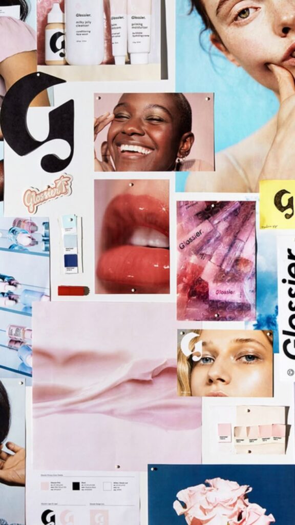
Glossier built a small, repeatable visual vocabulary. Its signature is a soft pink, common enough among fans that #glossierpink became a hashtag. Products arrived in a pink pouch that Packaging Europe in 2020 described as reusable and “great social media content.” Faces in its imagery show skin with a glow, not a mask of foundation. Backgrounds stay simple so the skin and product carry the image.
The look was protected by people and by process.
- A 2016 order included a poster of a model’s face captioned “no filter, just Glossier” (The Fashion Studies Journal).
- Weiss said in 2017 that she thought of the products as “pieces of content.” Customers photographed their purchases, and Glossier reposted those photos on its own Instagram (TechCrunch).
- In 2018, Glossier hired Marie Suter, who had spent 13 years at Condé Nast, including as director of photography at InStyle, to oversee campaigns, packaging and creative (The Business of Fashion).
What happened
The images became easy to recognize and easy to copy. Because the look relied on light, skin and a single color rather than elaborate sets, a customer’s photo of a pink pouch on a bathroom shelf could sit next to an official campaign image and feel like part of the same world. That consistency helped the brand travel on social media.
The style is strong enough that departures get noticed. In June 2024, Highsnobiety reported that a Glossier summer capsule swapped the signature pink for orange, lavender, pale yellow and emerald, with a chunkier logo. Press and social media creators read it as a possible rebrand, though Glossier had not confirmed one.
Why it worked
Glossier decided what its photos should feel like before deciding what they should show. The feeling was simple: fresh skin, soft light, nothing hidden. Every choice, from color to background to casting, could be checked against that feeling.
The style also matched the product promise. A skin-first brand that shows glowing, lightly made-up skin is making the same claim in its pictures that it makes in its copy. When the photos and the promise line up, the photos do persuading that words cannot.
Where it gets complicated
“Natural” photography is still produced photography. In a 2016 essay in The Fashion Studies Journal, writer Aimee Williams noted the gap between Glossier’s “real girl” message and its “extremely high resolution, well lit, and color corrected images.” Her own results did not look like the ads. She argued that the language of imperfection “might just be another standard to meet.” Effortless is a look, and looks take work.
A signature element can also become a liability. The pink pouch that made unboxings photogenic drew complaints about waste. In 2019, Glossier responded by offering a limited-packaging option without the pouch and stickers (Dazed). The photogenic choice and the responsible choice were not the same.
The marketing principle
Strong brand photography starts with a feeling, not a shot list. Glossier chose soft light, simple backgrounds, one signature color and visible skin, and used them so consistently that customers could join in with their own phones. Decide what your photos should feel like, then shoot every image to that feeling, and be honest about how much production the “natural” look requires.
Sources
- How to build a brand in 2017: Tips from Glossier CEO Emily Weiss, TechCrunch (2017)
- Beauty in Real Life: Glossier’s Post-Feminist Beauty Agenda, The Fashion Studies Journal (2016)
- How to create Instagram-ready packaging, Packaging Europe (2020)
- Glossier mines Condé Nast to fill creative director role, The Business of Fashion (2018)
- Glossier finally responds to calls for more sustainable packaging, Dazed (2019)
- Glossier rebrand 2024 (summer capsule coverage), Highsnobiety (2024)
Group activity for this case
Shoot to One Feeling
Your group will have one feeling your brand’s photos must deliver and a checklist every shot has to pass. A 20-minute group activity. Dr. Morris gives the password in class.
Back to Photography for Marketing · All case studies
Brand names, images and trademarks belong to their owners and appear here for educational purposes only.