The big idea: Your phone is a professional camera if you know how to see. Good marketing photos come from light, composition and a consistent style, not expensive gear.
Key concepts
- Light first: Soft natural light flatters almost everything. Golden hour, just after sunrise and before sunset, adds warmth.
- Composition: Use the rule of thirds, leading lines and a clean background so the subject stands out.
- Angles tell the story: Shoot from eye level, overhead and close up to give your brand a range of shots.
- Phone basics: Clean the lens, turn on gridlines, tap to set focus and exposure, and avoid digital zoom.
- Consistent editing: Use the same edit style or preset so every photo feels like the same brand.
See it in action
Light & Composition Lab
Choose a lighting style and a composition. Watch how the same coffee cup changes, and read what each choice says about a brand.
The vocabulary of brand photography
Every photo choice sends a message. Use these terms to name what you see in brand photos and to plan your own shots.
Lighting
| Term | What to look for | What it does for a brand |
|---|---|---|
| Soft light | Gentle shadows, smooth glow, no harsh edges | Calm, trustworthy, approachable |
| Hard light | Sharp shadows, bright highlights, strong contrast | Bold, energetic, edgy |
| Backlight | Light from behind: glowing edges or a silhouette | Aspirational, dreamy, special |
| Side light | Light from one side: half bright, half shadow | Dramatic, shows texture, reads luxe |
| Natural light | Window light or outdoor sun; looks unstaged | Real, honest, everyday |
| Dark and moody | Mostly shadow, with the product picked out by light | Premium, mysterious, serious |
Composition
| Term | What to look for | What it does for a brand |
|---|---|---|
| Rule of thirds | Product sits off-center, about a third of the way in | Natural and balanced; the eye moves through it |
| Leading lines | Roads, shelves, edges or shadows that point to the product | Pulls your eye straight to what matters |
| Negative space | Lots of empty background around the product | Clean, confident, high-end |
| Framing | Seen through something: a doorway, hands, leaves | Intimate, like a peek inside |
| Low angle | Camera below the product, looking up | Powerful, heroic |
| Close-up | So close you see texture: drips, stitching, grain | Sensory; you can almost touch it |
Brand photo scavenger hunt: In 20 minutes, find at least 8 of these 12 techniques in real brand photos on Instagram, brand websites, ads or packaging. Label each find with its term and the brand, then pick your best one and answer two questions: Where does your eye go first, and why? What would change with different lighting or framing?
Real brands in action
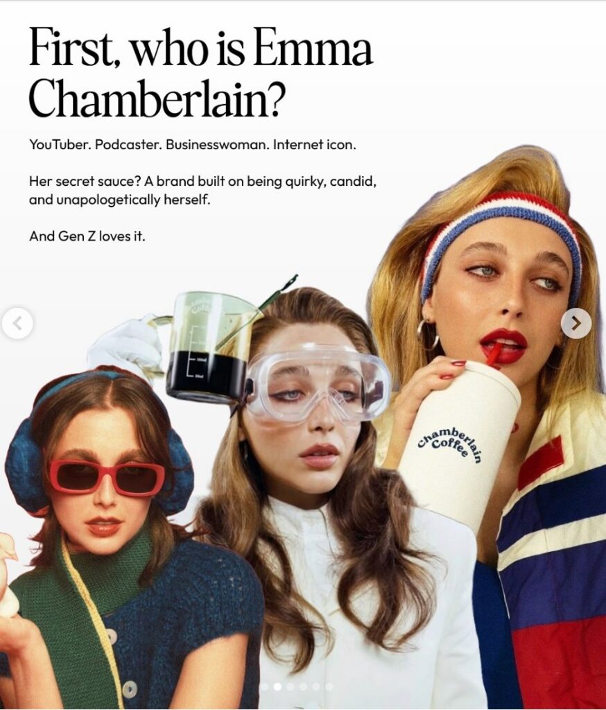
Emma Chamberlain: Imperfect on purpose
Emma Chamberlain built her brand on unfiltered realness: candid, unposed photos, warm natural light, lo-fi video and everyday moments. That look carried straight into Chamberlain Coffee, which uses hand-drawn elements and packaging that feels personal instead of corporate.
The lesson: Your photo style is a brand choice, and polished is not always the right one.
Image courtesy of Emma Chamberlain

Harry Styles: Signature details in every frame
Harry Styles’ photography leans into 70s glam rock: bold color, sequins, feathers and custom suits. Pearls, boas and oversized collars show up again and again until they become signatures. The imagery backs up his music’s themes of self-expression and joy.
The lesson: Repeat a few signature visual details and people will know it is you without a caption.
Image courtesy of Harry Styles
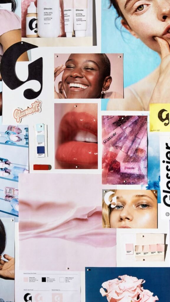
Glossier: Dewy skin, soft light, one world
Glossier’s images use soft blush pinks, whites and clean backgrounds. Texture does a lot of the work: glossy finishes, dewy skin and see-through packaging all point to natural beauty. The result reads as effortless luxury.
The lesson: Decide what your photos should feel like, then shoot every image to that feeling.
Image courtesy of Glossier
Brand images are shown for educational purposes only. Each image and trademark belongs to the brand credited, and each credit links to that brand.
Frameworks from class
Three kinds of shots
Strong brand photography uses all three shot types, because each one answers a different customer question. Plan your shoot so you come back with some of each.
- Hero or product shot: what it is
- Lifestyle shot: what it feels like to own it
- Detail shot: the craft, texture and quality
Notice what is missing
A photo style is defined as much by what it leaves out. Patagonia rarely shows products alone. There are no white backgrounds, no studio lights and no models, just real people doing real things outdoors. Spotify uses bold crops, cut-off faces and extreme close-ups so its images feel like music, not stock photos. Decide what your brand will never shoot.
Photo, illustration or abstract
Your image type changes how the brand is read. Pick the one that matches your personality words.
- Authentic photography: trust and relatability. Real products, people and places.
- Illustration: personality and play, and a simple way to explain complex ideas
- Abstract or artistic visuals: sophistication and depth, often used by premium brands
Use AI images as your shoot brief
AI images are not final assets, but they make excellent art direction. Generate the shot you want, then hand it to your photographer or team as the reference. Describe the light, mood, props and setting so the real shoot matches the brand. Keep the misses too. They show what to avoid.
Class exercise: Write a one-page shoot brief
Plan a brand shoot before you pick up the camera.
- List your brand’s personality words and color palette at the top.
- Choose one AI-generated or found reference image that shows the mood you want.
- Plan a shot list with at least one hero, one lifestyle and one detail shot.
- For each shot, note the light, the setting, the props and the angle.
- Write three things your brand will never shoot.
- Note any permissions you need, like model or location releases.
Try it
Shoot ten photos of one product for your brand: three in different light, three from different angles, two close-ups and two in a lifestyle setting. Edit them all with the same style, then pick the three that best fit your brand’s personality words.
Tips and best practices
- Find the light before you frame the shot. Soft window light or the warm light near sunrise and sunset flatters most products and people. Turn off overhead lights that mix colors and add harsh shadows.
- Give the subject room and one job. Use the rule of thirds, a clean background and enough negative space for a headline. Remove anything in the frame that does not support the subject.
- Shoot a set, not a single photo. Capture each product at eye level, overhead, close up and in a lifestyle scene. A range of angles gives you assets for every platform and format.
- Use your phone like a camera. Wipe the lens, turn on the grid, tap to set focus and exposure, and move closer instead of using digital zoom. Shoot a little wider than you need so you can crop for different formats.
- Keep the look consistent across every shot. Pick one edit style or preset that matches the brand and apply it to everything. Write down your light, background and edit settings so anyone on the team can match them.
- Get permission in writing. Use a signed model release for anyone recognizable and a property release for private locations, and confirm who owns and can reuse the photos. Never pull images from search results for brand use without a license.
Quick check
Think through your answer, then select a question to reveal one.
Why use gridlines on your phone camera?
They help you place the subject using the rule of thirds and keep horizons straight.
What makes a set of photos feel like one brand?
A consistent edit style, light and composition across every image.