Case study · Marketing 475 · What a Visual Marketer Does
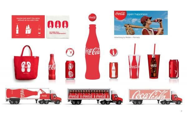
For more than a century, Coca-Cola has tied its red, its script and its bottle to scenes of people sharing a moment, so every visual choice points back to the same idea.
Brand
Coca-Cola
Year(s)
1886 to present
Channel(s)
Logo, packaging, TV, print, holiday and outdoor advertising
Goal
Make the brand stand for optimism and shared moments, not just a soft drink
Topic
What a visual marketer does
1886
First sold at Jacobs’ Pharmacy in Atlanta (The Coca-Cola Company)
1915
Contour bottle patented (The Coca-Cola Company)
100,000+
Letters received after the 1971 Hilltop ad (The Coca-Cola Company)
The situation
Coca-Cola was first sold on May 8, 1886, at Jacobs’ Pharmacy in Atlanta, for five cents a glass. Frank M. Robinson, the inventor’s partner and bookkeeper, suggested the name because “the two Cs would look well in advertising.” He also wrote the name in the flowing script that became the trademark.
From the start, the people behind the brand thought visually. The name was chosen partly for how it would look.
The challenge
A soft drink is easy to copy. By the 1910s, competitors were imitating Coca-Cola’s script logo, according to the company. The brand needed visual assets that could not be confused with anyone else’s, and a meaning bigger than the liquid in the bottle.
In class we compare Coca-Cola with Apple and REI. Each brand’s visuals line up with its values, positioning and audience. Coca-Cola’s job is to look like optimism and togetherness everywhere it appears.
What they did
Coca-Cola built a small set of assets and used them for generations.
- The script logo, written by Robinson in the 1880s and still in use.
- The contour bottle. In 1915, bottlers asked glass companies for a “bottle so distinct that you would recognize [it] by feel in the dark or lying broken on the ground.” The Root Glass Company of Terre Haute, Indiana, won. The shape was patented in 1915 and recognized as a trademark in 1961.
- Red as the dominant brand color, used on signs, cans, trucks and ads.
- Imagery of people sharing a Coke. The 1971 “Hilltop” ad, “I’d Like to Buy the World a Coke,” came from McCann Erickson creative director Bill Backer, who saw “Let’s have a Coke” as a way of saying people should keep each other company.
- Campaign lines that repeat the same feeling: “It’s the Real Thing” (1969), “Open Happiness” (2009), “Taste the Feeling” (2016) and “Real Magic” (2021).
What happened
The Hilltop ad drew more than 100,000 letters to the company and its bottlers after its U.S. release in July 1971. Its music became a Top 10 hit as “I’d Like to Teach the World to Sing (In Perfect Harmony).”
In 2011 in Australia, the Share a Coke campaign replaced the logo on bottles with the 150 most popular first names. It worked because the brand was so recognizable that the logo could step aside and the red, the script style and the bottle still said Coca-Cola. The campaign expanded to the U.K. in 2013.
Interbrand ranked Coca-Cola the sixth most valuable global brand in its 2023 study.
Why it worked
Every visual choice points back to one idea. The red is warm and energetic. The script feels human, like handwriting, not machine-made. The bottle is meant to be held. The ads show people together. A visual marketer’s job is to make sure those choices add up to one meaning instead of competing with each other.
The consistency also compounds. Because the core assets have lasted so long, Coca-Cola can experiment with a campaign, like printing names in place of the logo, without losing recognition.
Where it gets complicated
Brands sometimes get credit for more than they did. Coca-Cola is often said to have invented the red-suited Santa Claus through its 1930s holiday ads by illustrator Haddon Sundblom. In fact, red-and-white Santa images were already common, and other brands, such as White Rock Beverages, used Santa in ads in 1915 and 1923. A strong identity can absorb culture and look like its source.
There is also a gap between image and product. The visuals say optimism and togetherness. A typical 12-ounce can contains about 39 grams of sugar, and public health critics have long targeted soft drinks. In 2019, the Break Free From Plastic brand audit named Coca-Cola the world’s top plastic polluter. Visual marketers should notice that a consistent, happy identity does not settle questions about what the product does in the world. And even a strong system can misfire in execution: Coca-Cola’s AI-generated holiday ads in November 2024 drew public criticism, which the company defended.
The marketing principle
A visual marketer turns what a brand stands for into things people can see. Coca-Cola picked a meaning, optimism and shared moments, and made its color, script, bottle and imagery all point to it for more than a century. Every visual choice should point back to what the brand stands for, and the brand still has to live up to what its visuals promise.
Sources
- The Birth of a Refreshing Idea, The Coca-Cola Company (n.d.)
- The History of the Coca-Cola Contour Bottle, The Coca-Cola Company (n.d.)
- Creating “I’d Like to Buy the World a Coke”, The Coca-Cola Company (n.d.)
- Coca-Cola, Wikipedia (2026)
- List of Coca-Cola slogans, Wikipedia (2026)
Group activity for this case
Every Choice Points Home
Your group has one meaning for your brand and a check that every visual choice points back to it. A 20-minute group activity. Dr. Morris gives the password in class.
Back to What a Visual Marketer Does · All case studies
Brand names, images and trademarks belong to their owners and appear here for educational purposes only.