The big idea: Visual marketing isn’t about making things look good. It’s about making them work: stopping a scroll, showing a brand’s personality in seconds and turning a stranger into a customer.
See it in action
Brief to Deliverables Lab
Pick a business problem for Trailhead Outfitters, an invented outdoor brand. See the workflow, the deliverables and the skills the job takes. Tap any step for detail.
Measure feeds the next round of Research. The job is a loop, not a straight line.
Deliverables
Skills this job leans on
Key concepts
- Design with a job to do: Every visual should have a goal, an audience and a message.
- The skill mix: Design fundamentals, brand strategy, production tools, AI, data and the ability to present your choices.
- Tools serve strategy: Photoshop and Canva matter, but knowing why you’re making something matters more.
- Your portfolio is your proof: Hiring managers want to see finished work and the thinking behind it.
- Iteration over perfection: Professionals make, get feedback and revise. That cycle is the job.
Real brands in action

Airbnb: Visuals that move a brand
Airbnb shifted its visual marketing from property photos to experiences and belonging. It introduced the Bélo symbol to stand for “belonging anywhere,” brought in real travelers’ photos and built one visual language across every touchpoint. The visuals helped move Airbnb from “alternative accommodations” to “belonging anywhere.”
The lesson: A visual marketer turns a positioning idea into images people can see.
Image courtesy of Airbnb
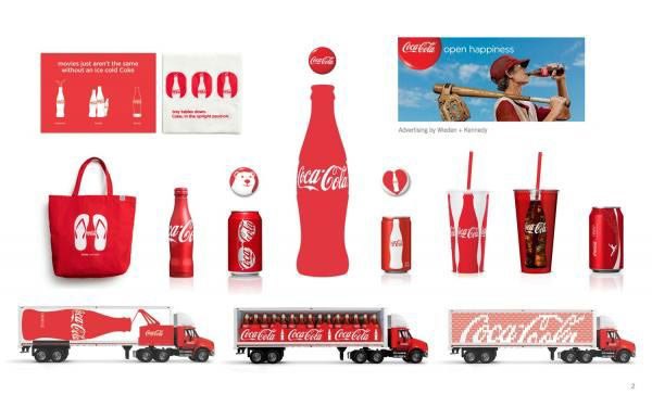
Coca-Cola: Red, optimism and shared moments
Coca-Cola’s visual identity runs on its iconic red, optimistic imagery and a focus on happiness and shared experiences. The class compares it with Apple and REI to see how each brand’s visuals line up with its values, positioning and audience.
The lesson: Every visual choice should point back to what the brand stands for.
Image courtesy of Coca-Cola
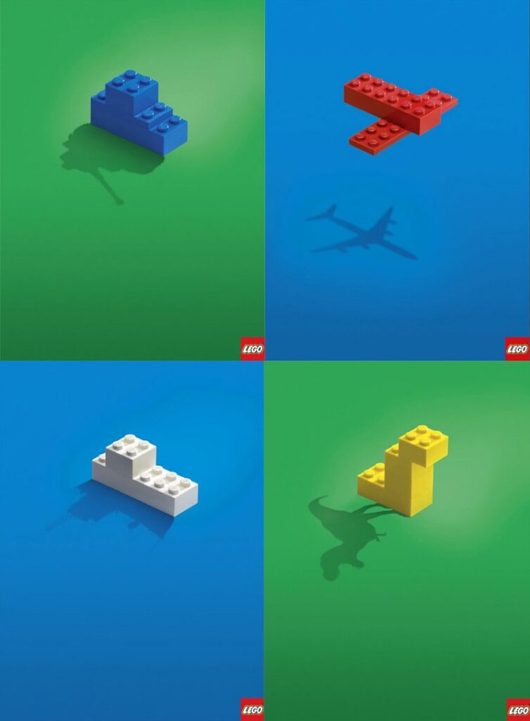
Lego: Decoding an ad
The class uses a Lego ad for a visual decoding exercise. Students name the emotion it is going for, what the eye lands on first, second and third, the color choices and how each element supports Lego’s playful, family-friendly positioning.
The lesson: Reading an ad element by element is the core skill of a visual marketer.
Image courtesy of Lego
Brand images are shown for educational purposes only. Each image and trademark belongs to the brand credited, and each credit links to that brand.
Frameworks from class
Four ways to tell a story with visuals
Good visual marketing does not just show the product. It makes the customer the main character. These four story formats show up in campaigns again and again.
- Hero’s journey: the customer faces a challenge and your product helps them win
- Before and after: show the change so people want the same result
- Behind the scenes: show the people and process to build trust
- User-generated content: real customers sharing real experiences as social proof
Four common visual marketing mistakes
The most common mistake is putting looks ahead of results. Great work sits where good design meets the business goal. Watch for these four traps.
- Visual overload: too many elements in one piece, so nothing is clear
- Inconsistency: a different look on every channel, which weakens recognition
- Generic imagery: cliched stock photos that could belong to anyone
- Visuals that miss the message: a beautiful piece that does not support the main point
How visuals drive behavior
People process images faster than text, and images connect to emotion and memory. That is why visual choices can push someone to act before they think it through. Knowing the principles lets you guide the viewer on purpose.
- Pattern recognition: people respond to what feels familiar
- Color: colors trigger emotional responses
- Hierarchy: the eye follows size, contrast and placement
- Gestalt: people see complete shapes even when parts are missing
Ethics check before you publish
Visuals carry power, so they carry responsibility. Run every campaign through a few questions before it goes live.
- Does it repeat a harmful stereotype?
- Is the image edited in a way that sets unrealistic expectations?
- Does it borrow cultural elements without understanding or respect?
- Is diversity shown in a real way?
- How might it read in a different cultural context?
Class exercise: Visual decoding
Break down one ad the way a visual marketer would.
- In a group of three or four, pick one ad.
- Name the emotional response the brand wants.
- Map the hierarchy: what you see first, second and third.
- Describe how color is working on the viewer.
- Explain how the visual choices support the brand’s position.
- Ask whether the ad would work as well without those specific visual elements.
Try it
Find three marketing job postings that mention visual content. List the skills and tools that show up in at least two of them, then circle the ones you already have and star the ones this course will help you build.
Tips and best practices
- Start every piece with a one-line brief. Write the goal, the audience and the single message before you open a design tool. If you cannot fill in that line, you are not ready to design.
- Show more than one concept. Sketch two or three directions before polishing one. Clients and managers decide faster when they can compare.
- Name the metric before you launch. Decide up front what success looks like, such as preorders, saves or sign-ups. Then you can show your visuals worked, not just that they looked good.
- Build templates, not one-offs. Turn repeat work like social posts and ads into editable templates with locked colors and fonts. It keeps the brand consistent and saves hours every week.
- Document your thinking for your portfolio. Save the brief, early sketches, the final piece and the results for each project. Hiring managers want to see how you think, not only the finished work.
Quick check
Think through your answer, then select a question to reveal one.
What’s the difference between making something look good and making it work?
Working visuals are built for a goal and an audience, and you can explain how they move someone to act.
Why does a portfolio matter more than a list of tools?
It shows what you can actually make and how you think.