Case study · Marketing 475 · Typography and Visual Hierarchy
Apple designed its own typeface so it could control how text looks and reads on every screen it makes, turning type into a brand asset it owns.
Brand
Apple
Year(s)
2014 (Apple Watch) and 2015 (iOS 9, OS X El Capitan) to today
Channel(s)
Product interfaces on Apple Watch, iPhone, iPad, Mac and Apple TV; corporate brand
Goal
Readable, consistent type across screens from a watch face to a TV
Topic
Typography & Visual Hierarchy
2014
Year Apple released San Francisco, first for Apple Watch (Fast Company, 2014)
20 pt
Size where the system switches from SF Text to SF Display (Wikipedia, citing Apple)
150+
Languages supported by SF Pro (Apple Developer)
9
Weights in SF Pro (Apple Developer)
The situation
Before San Francisco, Apple’s system text on the Mac and iPhone was set in Lucida Grande and Helvetica Neue, typefaces Apple did not design. Helvetica is one of the most famous typefaces in the world, but it was not created with tiny glanceable screens in mind.
In 2014 Apple was preparing the Apple Watch, a device with a tiny screen read in quick glances. Text had to work at sizes Helvetica was never designed for.
The challenge
A typeface designed for paper does not always read well on a small, bright screen viewed at a glance. Letters can crowd together, thin strokes can disappear, and similar shapes can blur. Apple also wanted one look across a growing family of devices, from a watch to a TV. With a typeface someone else owns, a company cannot reshape it freely for its own products.
What they did
On November 18, 2014, Apple released San Francisco to developers as part of its Apple Watch tools. Fast Company called it Apple’s first new in-house typeface in almost 20 years and noted it seemed inspired by Helvetica and DIN.
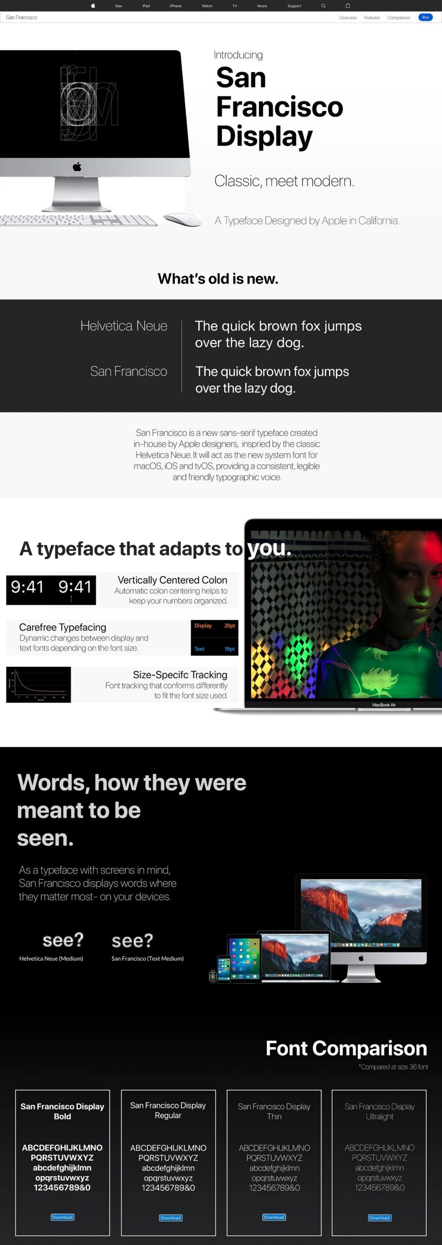
- Built for small sizes. The Next Web reported that small text was spaced more loosely, with larger openings in letters like “a” and “e,” and punctuation that grows relative to the text as type gets smaller. Large text was set tighter and slightly condensed to save space.
- Optical sizes. San Francisco has “Text” and “Display” designs. The system uses the Display version at 20 points and above and the Text version below that. Apple says size-specific outlines and dynamic tracking keep type legible at every point size.
- One family across devices. In 2015 San Francisco became the system typeface for iOS 9 and OS X El Capitan, replacing Helvetica Neue and Lucida Grande. Today Apple lists SF Pro for iPhone, iPad, Mac and Apple TV, SF Compact for Apple Watch, SF Mono for code, and a serif companion called New York.
- Brand use. San Francisco has been Apple’s corporate typeface since 2017, replacing Myriad Pro in its wordmarks (Wikipedia).
What happened
San Francisco now sets the text people read on Apple devices every day. Because Apple owns it, Apple can add weights, widths and languages when its products need them.
- SF Pro now has nine weights, four widths, a rounded version and support for more than 150 languages in Latin, Greek and Cyrillic scripts (Apple Developer).
- Apple keeps tight control. Its license limits use of the fonts to registered developers creating mock-ups of interfaces for Apple platforms, and bars embedding them in other products (Apple Developer).
Why it worked
Owning the typeface let Apple design type for its own hardware. The letterforms were shaped for its screens and sizes, not adapted after the fact.
Optical sizing solved a real hierarchy problem. A headline and a caption need different letter spacing and proportions to read well. San Francisco handles that automatically, so designers get clear hierarchy without hand-tuning every size.
Consistency became a brand signal. The same type family on a watch, a phone and a TV makes the products feel like one system. Most users never learn the font’s name, but they recognize the look.
Where it gets complicated
Custom type is expensive and slow. It takes years of design work and ongoing updates for new devices and languages. Most companies are better served by a well-chosen licensed typeface.
Ownership also cuts both ways. Apple’s restrictive license means outside designers cannot freely use San Francisco in their own brand work, which protects the asset but limits its reach outside Apple’s world.
And not everyone loved the change. The San Francisco Chronicle once called it “Helvetica on a low-carb diet.” A typeface that is easy to read can also look plain, and recognition comes more from years of use than from the letterforms alone.
The marketing principle
Typography is part of a brand, not decoration. When a company controls its own type, it controls how every word looks and reads across every channel. Apple built San Francisco to fit its screens and its system, and that shows why a typeface can be a brand asset worth owning, when the business has the scale to support it.
Sources
- Apple Releases Its Most Important Typeface In 20 Years, Fast Company (2014)
- Meet Apple’s new font, designed for its smartwatch, The Next Web (2014)
- Fonts, Apple Developer (n.d.)
- San Francisco (sans-serif typeface), Wikipedia (2026)
Group activity for this case
Build It or Borrow It
A decision on how your brand gets its typeface, plus the size rules that keep it readable on the smallest screen. A 20-minute group activity. Dr. Morris gives the password in class.
Back to Typography and Visual Hierarchy · All case studies
Brand names, images and trademarks belong to their owners and appear here for educational purposes only.