Case study · Marketing 475 · What a Visual Marketer Does
In 2014 Airbnb turned a positioning idea, belonging, into a symbol, a photo style and one visual system, which is exactly the job of a visual marketer.
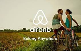
Brand
Airbnb
Year(s)
2014
Channel(s)
Logo and identity, website, iOS and Android apps, photography and film, host profiles
Goal
Reposition Airbnb from a place to book rooms to a brand about belonging
Topic
What a Visual Marketer Does
July 16, 2014
date Airbnb launched the Bélo and redesigned site and apps (The Next Web, 2014)
4
ideas built into the Bélo: people, place, love and Airbnb (Entrepreneur, 2014)
18
cities and villages where the agency researched hosts’ homes (agency case study)
The situation
By mid-2014 Airbnb was reportedly worth more than $10 billion, but it was also fighting regulators, especially in New York, where the state attorney general had subpoenaed host data (Entrepreneur, 2014). To many people it was simply a cheaper alternative to a hotel.
Its visuals reflected that. The old logo was a bubbly script wordmark, and the product was organized around listings: rooms, prices and locations.
The challenge
The founders believed the company stood for something bigger than lodging. Co-founder and CEO Brian Chesky put it this way: “a house is just a space, but a home is where you belong.” The problem was that an idea like belonging is invisible. Someone had to turn it into images, symbols and layouts that people could actually see and feel.
What they did
Airbnb worked with the London agency DesignStudio. According to the agency, its team spent time at Airbnb’s San Francisco headquarters and in hosts’ homes across 18 cities and villages around the world, and concluded that Airbnb was about people more than places. On July 16, 2014, Airbnb launched the result.
- A new symbol, the Bélo, which Airbnb called “the universal symbol of belonging.” It combines a head (people), a location pin (place), a heart (love) and the letter A (Airbnb) (Entrepreneur, 2014).
- A new positioning line: “Belong anywhere.”
- A flatter, cleaner design for the website and the iOS and Android apps, with consistent type across the system (The Next Web, 2014; Fonts In Use, 2014).
- Photography and film that showed real people and places, stressing warmth and welcome over location and price (agency case study).
- A tool that let hosts draw their own version of the Bélo for their profiles, so the symbol could carry each host’s personality (The Next Web, 2014).
What happened
The rebrand got attention immediately, both good and bad. The agency says it trended on Twitter and won several design awards. Inside the company, it says, the belonging mission went on to guide decisions in hiring, office design and partnerships.
Airbnb kept building on the system. It later commissioned its own typeface, Airbnb Cereal, with the foundry Dalton Maag, to work “from button to billboard” across web, iOS and Android.
Why it worked
Every visual choice pointed to one idea. The symbol literally contained people, place and love. The photography moved the focus from rooms to the people in them. The redesign made the product feel calmer and more consistent everywhere. Students can trace a straight line from the positioning statement to each visual decision.
The host tool was a smart move too. It invited the community to make the symbol their own, which is a visual way of saying “you belong here.”
Where it gets complicated
The launch was rough. Within days, people online were mocking the shape of the Bélo, and someone set up a Tumblr blog devoted to the jokes (Entrepreneur, 2014). Observers also pointed out that it looked nearly identical to the logo of the software company Automation Anywhere, and the two companies issued a joint statement saying they were working to resolve it (The Next Web, 2014).
Visuals also cannot do all the work. A brand promise of belonging is tested every time a guest or host has a bad experience, and the regulatory fights did not go away because of a new logo. Finally, be careful with cause and effect. The agency links the brand to Airbnb’s later growth and its December 2020 stock market debut, but many business factors drove those results. A rebrand supports a positioning. It does not prove one.
The marketing principle
A visual marketer turns a positioning idea into images people can see. Airbnb started with a clear idea, belonging, and then made the symbol, the photography and the product design all say the same thing. When the visuals and the idea line up, people understand the brand before they read a word.
Sources
- Airbnb updates design and introduces new Bélo logo, The Next Web (2014)
- Airbnb, Why the New Logo?, Entrepreneur (2014)
- Airbnb identity, website and app (2014 redesign), Fonts In Use (2014)
- Airbnb (case study), Further (formerly DesignStudio) (n.d.)
- Introducing Airbnb Cereal, Airbnb Design (n.d.)
Group activity for this case
Make Belonging Visible
Your group turns your brand’s big idea into a symbol concept, a photo style and one way customers can make it their own. A 20-minute group activity. Dr. Morris gives the password in class.
Back to What a Visual Marketer Does · All case studies
Brand names, images and trademarks belong to their owners and appear here for educational purposes only.