Case study · Marketing 475 · Typography and Visual Hierarchy
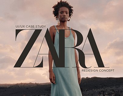
Zara’s tightly packed serif wordmark uses the visual language of fashion magazines and luxury houses, which helps a mid-priced retailer feel more premium than its price tags.
Brand
Zara (Inditex)
Year(s)
2019 logo redesign; upmarket push through 2023
Channel(s)
Logo, stores, labels, campaigns, website
Goal
Signal fashion authority and a more premium image
Topic
Typography and visual hierarchy
73%
Share of Inditex sales that come from Zara (Reuters, 2023)
13
Zara campaigns shot by Steven Meisel since 2017 (Reuters, 2023)
2019
Year Zara introduced its Baron & Baron serif wordmark (Dezeen)
The situation
Zara opened its first store in A Coruña, Spain, in 1975. It is the largest brand in the Inditex group. Reuters reported in 2023 that Zara accounts for 73 percent of Inditex’s sales. Zara is known as a fast-fashion retailer, selling trend-driven clothing at prices far below luxury labels.
Its logo has long been a set of serif capital letters. The previous version, introduced around 2010 to 2011, spelled ZARA in serif capitals with wide spacing between them.
The challenge
A mid-priced brand that wants to feel like fashion, not just clothing, has to borrow signals people associate with high-end style. Price, materials and store design all help. Typography is one of the fastest and most visible signals, because the logo appears on every bag, label, sign and screen.
What they did
In January 2019, Zara introduced a new logo by Baron & Baron, the agency of Fabien Baron, who was also Zara’s artistic director. The new wordmark keeps the serif capitals but packs the letters so tightly that they touch and overlap. The Z and R gained curved, exaggerated details.
The choice was deliberate fashion language. Dezeen noted that the style resembles Baron’s signature work, including his 1990s redesign of Harper’s Bazaar. FashionUnited reported that designers on social media saw the resemblance to the Harper’s Bazaar logo. Fast Company pointed out that Baron has also created typography for luxury brands such as Dior, Coach and Bottega Veneta.
- Serif letterforms: a classic cue for editorial and heritage fashion
- Tight, overlapping spacing: a magazine-cover look, not a retail sign
What happened
The redesign was controversial. Type designer Erik Spiekermann called it “the worst piece of type I’ve seen in years” on Twitter, and other typographers called it “claustrophobic” (Dezeen, Fast Company, 2019). FashionUnited noted that the move went against the trend: many luxury houses were switching to plain sans-serif logos at the time, while Zara moved toward a more ornate serif.
The logo was one part of a broader move upmarket. Reuters reported in 2023 that under Marta Ortega, who became Inditex’s non-executive chair in April 2022, Zara was positioned more toward high fashion. Fashion photographer Steven Meisel, who usually works for luxury clients, had shot 13 Zara campaigns since 2017. Inditex was investing in large flagship stores in prime locations and raised prices as costs rose.
Why it worked
Type carries associations. Serif wordmarks with tight, dramatic spacing are a long-standing convention of fashion magazines like Harper’s Bazaar and of heritage luxury houses. When Zara uses that language, it borrows some of that authority.
The logo also works with the rest of the system. Campaigns shot by luxury fashion photographers and large flagship stores tell the same story. One analyst told Reuters in 2023 that Zara “sells fashion, not just clothes.” Typography is one of the clearest places that idea shows up.
Where it gets complicated
Readability suffered. A logo whose letters run into each other is harder to read, especially at small sizes. Fast Company’s Elizabeth Segran asked whether it “would have killed Zara to add just a little bit more space between the letters.” A premium signal is not worth much if people struggle to read the name.
Type alone does not make a brand premium. Zara’s image also rests on photography, store design and pricing. If the product or service does not match the signal, the logo can feel like a costume.
There is also no public data isolating the logo’s effect on sales. We can say what the typography signals and what trade press observed. We cannot say how much revenue it produced.
The marketing principle
Typography is part of positioning. Zara’s serif wordmark borrows the visual language of fashion magazines and luxury houses, raising how premium the brand feels at mid-range prices. But type must still do its first job, which is to be read, and it works best when the rest of the brand tells the same story.
Sources
- Zara’s logo gets a controversial revamp by Baron & Baron, Dezeen (2019)
- Zara’s new logo may be the future of branding. Love it or hate it, Fast Company (2019)
- Zara changes its logo, FashionUnited (2019)
- In the background, Inditex heiress sets tone for Zara revamp, Reuters via Cyprus Mail (2023)
Group activity for this case
Borrowed Fashion Language
Two type moves your brand borrows from a world it wants to be part of, checked so the name still reads at small size. A 20-minute group activity. Dr. Morris gives the password in class.
Back to Typography and Visual Hierarchy · All case studies
Brand names, images and trademarks belong to their owners and appear here for educational purposes only.