Case study · Marketing 475 · Typography and Visual Hierarchy
Target’s promise has two halves that pull against each other, and its clean, friendly visual system, type included, is built to signal good design without signaling expensive.
Brand
Target
Year(s)
1962 to present (current logo in use since 2004)
Channel(s)
Logo and signage, website and app, packaging, ads
Goal
Look welcoming and design-forward while staying clearly affordable
Topic
Typography and visual hierarchy
1962
First Target store opened, Roseville, Minnesota (Wikipedia, Target Corporation)
500+
Objects Michael Graves designed for Target, 1999 to 2012 (Wikipedia, Michael Graves)
#cc0000
Theme color set in target.com’s site metadata (target.com, 2026)
The situation
The first Target store opened on May 1, 1962, in Roseville, Minnesota. Target’s own history timeline dates the bullseye logo to that same year. Today Target operates about 2,000 U.S. stores.
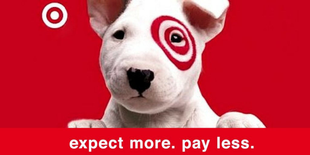
Its brand promise is short: “Expect More. Pay Less.” As of 2026, those words still sit in the page title of target.com. The site’s theme color is a single bright red, #cc0000.
The challenge
Those two halves pull in different directions. “Pay less” is a discount promise. Discount retailers often use loud, crowded, sale-heavy design. “Expect more” is a quality and design promise. Premium brands often use thin, formal, high-contrast type and lots of space.
Target needed a visual voice that said both things at once: this is a nice place to shop, and you can afford it. Typography is one of the main places that tension gets resolved, because every sign, price tag, ad and app screen depends on it.
What they did
Target backed the “expect more” half with design itself. In January 1999, housewares by architect Michael Graves went on sale in Target stores. By the time the partnership ended in 2012, Graves had designed more than 500 objects for Target. That same year, 1999, Target’s timeline lists the arrival of Bullseye, its white bull terrier mascot.
The visual system stays simple and consistent.
- One dominant color: red, paired with lots of white.
- One symbol: the bullseye, which Target has used since 1962 and which works without the name.
- Clean sans-serif type that reads as friendly and approachable rather than formal or luxury.
- Short, plain headlines and price messaging that aim to feel calm rather than loud.
What happened
The combination gave Target a position between discount stores and department stores: design you would not expect at that price. The Graves partnership brought an architect’s designs to ordinary shoppers and helped make him known for household goods as well as buildings.
The bullseye became recognizable enough that some stores near major airports have it painted on their roofs, and Target built a solar installation in its shape at a Phoenix distribution center in 2017.
Why it worked
Type sets tone before anyone reads a word. A friendly, clean sans-serif feels open and modern. It does not look cheap the way crowded discount layouts can, and it does not look exclusive the way a thin luxury serif can. That middle ground matches the middle ground of the promise.
The type also works because it is not doing the job alone. Red, the bullseye, white space and design partnerships all point to the same idea. Students should notice that a typeface supports a promise most when everything around it says the same thing.
Where it gets complicated
Target does not publish its type guidelines in a public source we could verify, so this case does not name the typeface or claim specific details about it. That is a useful lesson in itself. You can analyze how type feels by looking closely at a brand, but claims about which font a company uses, or why it chose it, need a source.
Friendly, clean sans-serif type is also common. Many retailers and tech brands use something similar. Type alone cannot make a brand distinct. Target’s distinctiveness comes from the full system, especially the red and the bullseye. And no typeface can rescue a broken promise. If prices stop feeling like “pay less” or the products stop feeling like “expect more,” welcoming type will not hold the brand together.
The marketing principle
Pick type that sounds like your brand promise. Target’s promise is good design at a good price, so its typography has to feel welcoming and modern without tipping into either bargain-bin or luxury. Type does its best work when color, symbol and layout carry the same message.
Sources
- Target.com, Target (2026)
- History Timeline, Target Corporation (n.d.)
- Target Corporation, Wikipedia (2026)
- Michael Graves, Wikipedia (2026)
Group activity for this case
Split the Promise
A two-sided promise for your brand and the type, color and layout choices that say both halves at once. A 20-minute group activity. Dr. Morris gives the password in class.
Back to Typography and Visual Hierarchy · All case studies
Brand names, images and trademarks belong to their owners and appear here for educational purposes only.