Case study · Marketing 475 · Typography and Visual Hierarchy
In its 2015 identity era, Spotify used Circular, a warm geometric sans-serif, which shows how a typeface can carry a brand’s personality on the small screens where people actually meet it.
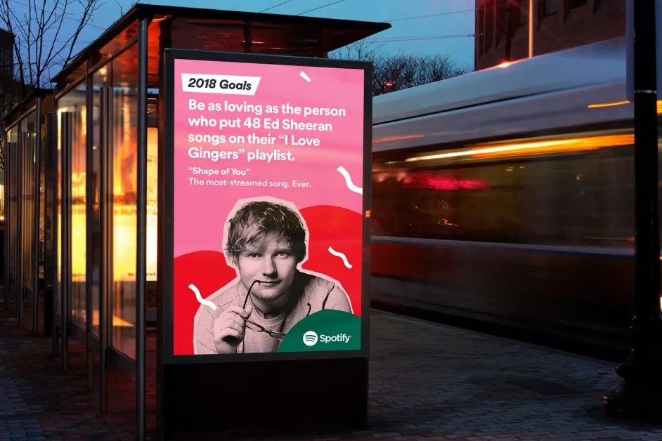
Brand
Spotify
Year(s)
2015 identity era
Channel(s)
Mobile and desktop app, website, marketing
Goal
Give a tech product a friendly, recognizable voice in type
Topic
Typography and Visual Hierarchy
2013
year Lineto released Circular (Typographica / Typewolf)
70px / 21px
minimum on-screen size for Spotify’s full logo and icon (Spotify developer guidelines)
The situation
Spotify is used mostly on screens, and many of those screens are phones. Song titles, artist names, playlist labels and buttons all compete for space. For a music app, type is not decoration. It is most of the interface.
In March 2015, Spotify introduced a refreshed identity developed with the design firm Collins. According to Collins, the work repositioned Spotify around personalized music experiences rather than cheap access to a big catalog, and pushed the brand to feel as lively as the music culture it serves.
The challenge
Spotify needed type that could do two jobs at once. It had to feel friendly and culturally current, not like a bank or a software company. It also had to stay clear when set small, in many weights, across thousands of screens of text.
What they did
Spotify used Circular, a typeface from the Swiss foundry Lineto designed by Laurenz Brunner. Typewolf, which tracks fonts on notable websites, recorded spotify.com using Circular as its only typeface in April 2015.
- Circular is a commercial typeface released by Lineto in 2013 after years of development; early versions were in use from 2007 to 2009 (Typographica, 2014).
- It reworks the classic geometric sans-serif, drawing on models like Futura, but a reviewer called it “geometric but not cold,” with an even texture on the page (Typographica, 2014).
- It comes in a wide range of weights, from Thin to ExtraBlack, each with an italic (Lineto).
- Spotify paired the type with bold color and duotone photo treatments, which Collins designed so third-party artist photos would still look like Spotify.
What happened
Type was one part of a tightly managed system that also included the green and the duotone imagery. Spotify’s developer guidelines describe Spotify Green as the color “used whenever Spotify’s voice needs to be recognizable,” and set strict minimum sizes for the logo on screens: 70 pixels for the full logo and 21 pixels for the icon alone.
Those rules show how seriously the brand treats small sizes. A brand that lives on phones has to plan for what its marks and words look like at a fraction of an inch.
Why it worked
Geometric sans-serifs are built from simple circles and straight lines, so they read as clean and modern. Circular softens that geometry, which gives it a friendlier feel. That matched a brand that wanted to sound like a music fan, not a tech company.
A broad family of weights also helps visual hierarchy. One typeface can set a bold playlist title, a regular artist name and a light caption, so the screen has clear levels of importance without mixing fonts.
Where it gets complicated
Circular was licensed, not owned. Lineto sells it to anyone. Airbnb used Circular across its website and apps in its 2014 redesign (Fonts In Use), so two major consumer brands shared the same type at the same time. A licensed typeface can fit your personality, but it cannot be yours alone. Airbnb later commissioned its own typeface, Airbnb Cereal, from the foundry Dalton Maag, saying it needed type that worked “from button to billboard.”
Licensing also limits who can use the brand font. Spotify’s developer guidelines tell partners to use their platform’s default sans-serif, or Helvetica Neue, Helvetica or Arial, rather than Spotify’s brand type. So the brand looks slightly different wherever Spotify does not control the screen.
Brands also change their type over time. This case describes Spotify’s 2015 identity. Check Spotify’s current brand materials before assuming it still uses Circular today.
The marketing principle
Choose type that fits both the brand’s personality and the screens people actually use. Test it at the smallest size it will ever appear, give it enough weights to build hierarchy, and decide early whether you need to license a typeface or own one.
Sources
- Spotify, Collins (2015)
- LL Circular (typeface review), Typographica (2014)
- Circular, Typewolf (2015)
- Design guidelines, Spotify for Developers (2026)
- Airbnb identity, website and app (2014 redesign), Fonts In Use (2014)
- Introducing Airbnb Cereal, Airbnb Design (n.d.)
Group activity for this case
Test It Tiny
A typeface for your brand that fits its personality, with a three-level weight hierarchy built for a phone screen. A 20-minute group activity. Dr. Morris gives the password in class.
Back to Typography and Visual Hierarchy · All case studies
Brand names, images and trademarks belong to their owners and appear here for educational purposes only.