Case study · Marketing 475 · Typography and Visual Hierarchy
Vogue’s high-contrast Didone lettering has stayed essentially fixed on its covers since the 1950s, and that consistency turned a typeface style into a signal of fashion authority.
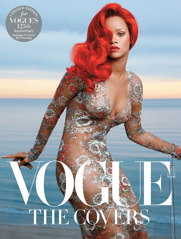
Brand
Vogue
Year(s)
1955 to today
Channel(s)
Magazine covers, masthead, digital
Goal
Signal elegance and authority at a glance on a crowded newsstand
Topic
Typography and Visual Hierarchy
1892
year of Vogue’s first issue
1955
year after which Vogue’s all-capital Didone cover lettering stayed essentially fixed (Eye, 2007)
The situation
Vogue first published in December 1892. For its first decades, the cover lettering changed often. Designer and writer Abbott Miller noted in Eye magazine in 2007 that early covers used illustrated lettering, and that as late as 1955 Vogue still mixed serif, sans serif, script and photographic letters.
A magazine cover has seconds to work. On a newsstand or a phone screen, the name has to be recognized before anything else is read.
The challenge
Changing lettering keeps a cover fresh, but it also makes the brand harder to recognize. Vogue needed a type identity that could sit on top of any photograph, any season and any trend, and still say “Vogue” instantly.
The lettering also has to hold its place in the visual hierarchy. Cover lines, photographs and model names all compete for attention. The name has to win that competition every month without shouting.
What they did
After 1955, Vogue settled on all-capital Didone lettering, and Miller wrote that this approach has stayed essentially fixed since.
Didone is a family of serif typefaces from the late 1700s and early 1800s, named for two printers, Firmin Didot and Giambattista Bodoni. Didones have extreme contrast between thick and thin strokes, thin flat serifs and vertical stress. The card’s “Bodoni-style” is close: Bodoni and Didot are the two best-known Didones.
- Very thick vertical strokes.
- Hairline-thin horizontals and serifs.
- Vertical, upright stress that looks precise and formal.
- All capitals on the cover.
What happened
The Didone look became shorthand for fashion itself. Harper’s Bazaar, under art director Alexey Brodovitch from 1934 to 1958, also made Didot a signature, and Fabien Baron’s 1992 Bazaar redesign revived it with a new digital Didot by Jonathan Hoefler. Miller argues that through this repeated use, Didones became associated with luxury and refinement.
- 1892: Vogue’s first issue.
- After 1955: all-capital Didone cover lettering, essentially unchanged since (Eye, 2007).
- 1934 to 1958: Brodovitch makes Didot a signature at Harper’s Bazaar (Eye, 2007).
Why it worked
Type has a personality. Miller suggests the thin lines of Didones evoke tailoring, seams and draped fabric, and their light, see-through quality works well layered over cover photos. Through repeated use, they came to signal luxury and refinement.
Consistency did the rest. A cover photo changes every month. The lettering does not. That fixed element sits at the top of the visual hierarchy and tells the reader what they are looking at before they see the model or read a headline. Swap it for a generic typeface and the same cover would read as a lesser publication.
Where it gets complicated
Vogue does not own the style. Harper’s Bazaar and other fashion titles use Didones too. That means the typeface style alone is not what makes Vogue recognizable. It is the specific letterforms, the name and more than 70 years of consistent use together.
Didones also have practical limits. They look best on smooth, glossy paper, where the hairlines stay crisp. At small sizes or on low-quality screens, the thin strokes can break up, which is why digital revivals such as Hoefler’s Didot make the strokes heavier at small sizes. A Didone that looks elegant at masthead size can be hard to read as body text.
Finally, a style that signals “fashion” can turn into a cliche. The more brands borrow a high-contrast serif to look upscale, the less that signal stands out.
The marketing principle
A typeface is not decoration. Its shapes carry meaning, and consistent use over time turns that meaning into identity. For Vogue, the lettering sits at the top of the hierarchy on every cover, and the brand’s authority rests partly on never changing it.
Sources
- Through thick and thin: fashion and type, Eye Magazine (Abbott Miller) (2007)
- Didone (typography), Wikipedia (2026)
- Vogue (magazine), Wikipedia (2026)
Group activity for this case
The Masthead That Never Moves
One fixed type element for your brand that stays put on every design, plus a rule for where its style stops working. A 20-minute group activity. Dr. Morris gives the password in class.
Back to Typography and Visual Hierarchy · All case studies
Brand names, images and trademarks belong to their owners and appear here for educational purposes only.