Case study · Marketing 475 · Photography for Marketing
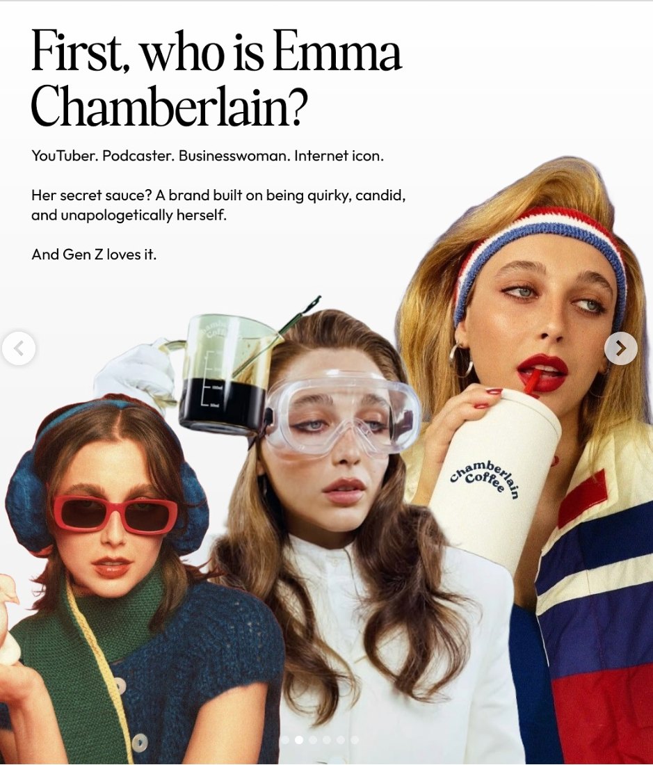
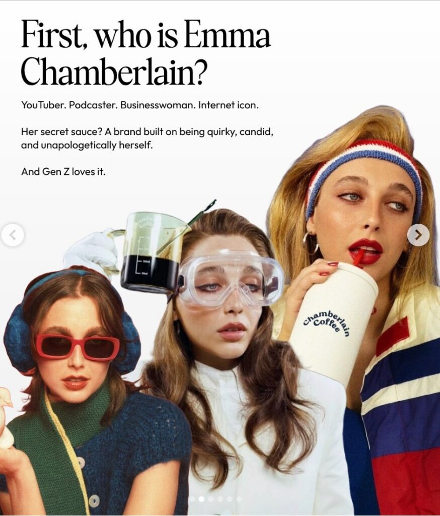
Emma Chamberlain built a personal brand on a raw, unpolished visual style, and that style was a deliberate, labor-intensive choice, not an absence of effort.
Brand
Emma Chamberlain (personal brand) and Chamberlain Coffee
Year(s)
2016 to today
Channel(s)
YouTube, social media, direct-to-consumer and retail coffee
Goal
Stand out from polished influencer content by looking and sounding like a real person
Topic
Photography for Marketing
8M
YouTube subscribers about two years after she started (Time, 2019)
785M+
total video views at the time (Time, 2019)
30 hours
time she said she could spend editing one video (reported by Time, 2019)
The situation
Emma Chamberlain started posting vlogs on YouTube in 2016, while she was still in high school. At the time, a lot of popular lifestyle content was bright, carefully posed and heavily filtered. The influencer look was polished and aspirational.
Within about two years, she had roughly 8 million subscribers. In 2019, Time named her one of the 25 most influential people on the internet.
The challenge
A teenager filming herself could not out-produce established creators on polish. She needed a visual style that made a simple setup look like a point of view.
What they did
Chamberlain went the other way. Time described her videos as built on stream-of-consciousness narration, fast jump cuts and grainy distortions, with a look close to normcore. She left in small mistakes, like burps, that other creators would cut. Time called the result “a rejection of the slickness that typifies influencer culture.”
She carried the same personal voice into business. In December 2019 she launched Chamberlain Coffee, starting with steeped coffee bags sold online. The brand’s About page still opens in her own first-person voice: “Hi, I’m Emma Chamberlain, and I am a certified coffee lover.”
- Unpolished visuals: grain, distortion, jump cuts.
- Mistakes left in, not edited out.
- A casual, everyday look rather than styled glamour.
- A founder’s first-person voice carried into the product brand.
What happened
Her style spread. Time reported that other creators, including model Karlie Kloss, followed her lead. Chamberlain Coffee grew too. Los Angeles magazine reported in 2026 that the brand’s coffee and matcha were sold in more than 6,000 retail locations, including Target and Erewhon.
- About 8 million YouTube subscribers roughly two years after starting (Time, 2019).
- Over 785 million video views at the time (Time, 2019).
- Named one of Time’s 25 Most Influential People on the Internet (2019).
- Chamberlain Coffee launched online in December 2019 (Refinery29, 2019).
- More than 6,000 retail locations for Chamberlain Coffee (Los Angeles magazine, 2026).
Why it worked
Visual style sends a signal before anyone reads a caption. Polished, posed images say “this is a brand.” Grainy, casual footage says “this is a person.” For an audience tired of perfect feeds, the unpolished look made her feel like a friend instead of an advertiser.
It also gave her something hard to copy. Polish can be bought. A consistent, personal way of seeing is harder to imitate. When she launched a coffee brand, that trust gave the product a voice people already knew.
For students, the photography lesson is about fit. Her audience was young and online, and they spent their days surrounded by staged images. A casual, unposed look stood out in that feed because it was different from everything around it.
Where it gets complicated
The look is not effortless. Time reported that she told The New York Times she could spend up to 30 hours editing a single video. The “imperfect” style was carefully built. Students should not confuse lo-fi with low effort.
Raw style is also hard to scale. A coffee brand sold in thousands of stores needs consistent packaging, product photos and displays, which pulls toward polish. The brand has to decide which parts stay personal and which parts need to look professional.
A correction to the card version of this story: we could not find a reliable source describing Chamberlain Coffee’s packaging as hand-drawn, or describing her photo style in terms of warm natural light. Those details were left out. What is documented is the lo-fi editing style and the founder’s personal voice.
The marketing principle
Photo and video style is a brand decision, not just a technical one. Polished imagery signals authority and aspiration. Raw imagery signals closeness and everyday life. The right choice depends on the relationship the brand wants with its audience, and either one takes real craft to do well.
Sources
- The 25 Most Influential People on the Internet, Time (2019)
- Emma Chamberlain’s coffee brand launch (news report), Refinery29 (2019)
- About Us, Chamberlain Coffee (n.d.)
- Emma Chamberlain’s Chamberlain Coffee opens on Abbot Kinney (news report), Los Angeles magazine (2026)
Group activity for this case
Polished or Raw?
Your group will have a decision on polished vs. raw photo style for your brand, with the rules that make your choice look intentional. A 20-minute group activity. Dr. Morris gives the password in class.
Back to Photography for Marketing · All case studies
Brand names, images and trademarks belong to their owners and appear here for educational purposes only.