Case study · Marketing 475 · Layout and Composition
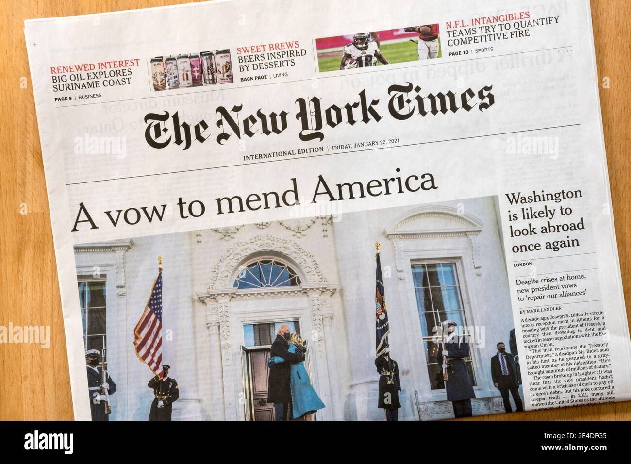
The New York Times can put dozens of stories on one page and still feel orderly because every element sits on a column grid that readers sense even when they cannot see it.
Brand
The New York Times
Year(s)
2006 to today
Channel(s)
nytimes.com homepage and section pages
Goal
Present a large, changing set of stories in a clear order of importance
Topic
Layout and Composition
1996
year nytimes.com launched (Dezeen, 2018)
40 + 60
readers interviewed at home and readers who tested prototypes for the 2018 redesign (Dezeen, 2018)
The situation
A news homepage has a hard job. It has to show the biggest story of the day, dozens of other stories, opinion, features, photos and ads, and it changes every hour. Most of that content is placed by editors under deadline, not by a designer laying out each page by hand.
The New York Times has run nytimes.com since 1996. The site’s layout is a common teaching example. The Nielsen Norman Group, a user-experience research firm, used the Times homepage in 2022 as its example of a hierarchical grid.
The challenge
Without structure, a page with this much content turns into noise. Readers cannot tell what matters most, where one story ends and the next begins, or where to look next. Think of a crowded community flyer where every item is a different size and floats wherever it fits.
The Times also needs a layout that editors can fill quickly and that still works on a phone, a laptop and a large monitor.
What they did
The Times builds its pages on a column grid. Columns, the gutters between them and the outer margins form an invisible framework. Every headline, image and block of text snaps to that framework.
On a desktop screen, NN/g describes the result this way: the most important story takes the large left column, and secondary stories fill a narrower right column and smaller modules. Size and position tell the reader what matters before they read a word.
In 2018 the Times redesigned the desktop site to match its mobile apps. The team interviewed 40 readers in their homes and tested prototypes with 60 more. Its stated goal was a flexible “product system” that could keep improving over time, not a one-time redesign.
- Columns hold the content.
- Gutters keep neighboring stories visually separate.
- Margins frame the page.
- Story size and column width signal importance.
What happened
The grid lets the Times change the news constantly without redesigning the page each time. A big story can take more columns. A smaller one drops into a module. The page still holds together because every piece shares the same edges and spacing.
- nytimes.com launched in 1996 (Dezeen, 2018).
- Before 2018, the site’s overall design had stayed largely the same for about a decade (Dezeen, 2018).
- The 2018 redesign research included 40 in-home reader interviews and prototype tests with 60 readers (Dezeen, 2018).
Why it worked
Grids work because people notice alignment even when they do not notice the grid. When edges line up, the eye reads the page as one organized system. When they do not, the page feels messy, even if the reader cannot say why.
A grid also speeds up the work. NN/g notes that grids help designers build aligned layouts quickly, help users scan predictable layouts, and adapt to different screen sizes. For a newsroom, that means editors can place stories fast without breaking the design.
Where it gets complicated
A note on the card version of this story: it says nytimes.com runs on a 12-column grid. We could not confirm the exact column count from a public Times source. What NN/g does say is that 12 columns is a common, flexible choice for desktop layouts, and that grids usually drop to fewer columns on smaller screens.
Grids are also hard to keep consistent. In April 2006, Khoi Vinh, who was then working on design at NYTimes.com, wrote on his blog that “the underlying column structure on the home page is slightly different from the one we use” on section fronts and article pages. He called it an inconsistent grid. Real products grow piece by piece, and grids drift.
And a strict grid can make every page look the same. Big feature stories and data graphics sometimes need to break the grid on purpose. The skill is knowing the rule well enough to break it with intent.
The marketing principle
Layout is a promise of order. A grid lets a brand show a lot of content while still telling the reader what matters most and where to look next. Readers rarely see the grid, but they feel it when it is missing.
Sources
- Using Grids in Interface Designs, Nielsen Norman Group (2022)
- New York Times redesigns website to catch up with mobile offering, Dezeen (2018)
- Blog post on the NYTimes.com home page grid (April 18, 2006), Subtraction (Khoi Vinh) (2006)
Group activity for this case
Grid It Like the Times
A column grid for your brand, set up in Canva, with one page laid out so size and position show what matters most. A 20-minute group activity. Dr. Morris gives the password in class.
Back to Layout and Composition · All case studies
Brand names, images and trademarks belong to their owners and appear here for educational purposes only.