The big idea: Layout is the invisible structure behind every design you trust. Decide what people should see first, second and third before you place anything.
See it in action
Poster Layout Lab
This night market poster breaks the basic layout rules. Turn on one principle at a time, switch reading patterns, and watch the same pieces rearrange.
Key concepts
- Grid systems: Professional layouts snap to an invisible grid. Keep margins and gutters consistent and line elements up with column edges.
- Break the grid on purpose: An oversized image creates tension, but only when everything else is locked in.
- Rule of thirds: Place the key element on an intersection, not dead center, to give the eye somewhere to go.
- Whitespace: Empty space tells the viewer the important thing doesn’t have to compete. Knowing what to leave out is the hardest skill.
- Visual flow: Text-heavy pages follow an F-pattern; ads and landing pages follow a Z-pattern that ends at the call to action.
- Specificity: A strong brand concept names a specific product, customer and reason to choose you.
Real examples
- nytimes.com: A grid sits under everything on the page.
- apple.com: Surrounded by whitespace, the product is the first thing you notice.
Real brands in action
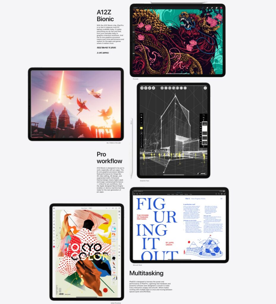
Apple: Whitespace puts the product first
Open apple.com and the first thing you notice is the product, because almost everything around it is white space. That space tells you the product does not need to compete with anything else on the page. Knowing what to leave out is the hardest design skill.
The lesson: Whitespace is a decision that tells people where to look.
Image courtesy of Apple
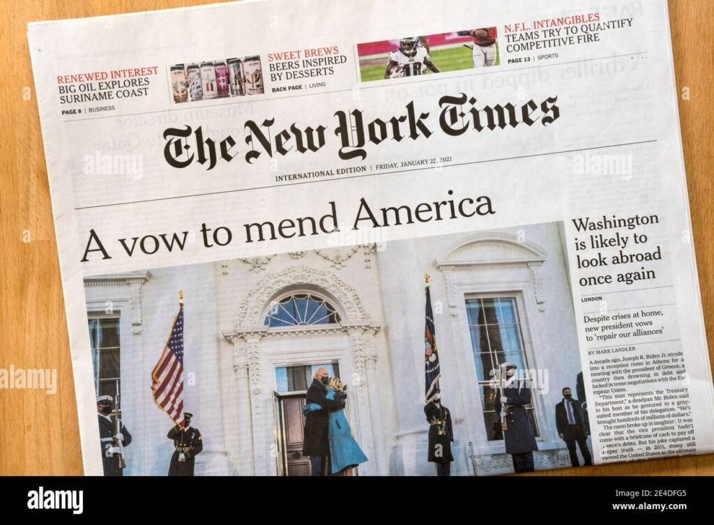
The New York Times: The grid under everything
Every professional layout snaps to an invisible grid. nytimes.com runs on a 12-column grid, which is why a page full of stories still feels organized. A cluttered flyer has no grid, and it feels chaotic.
The lesson: A grid creates order that readers feel even when they cannot see it.
Image courtesy of The New York Times
Brand images are shown for educational purposes only. Each image and trademark belongs to the brand credited, and each credit links to that brand.
Frameworks from class
How to design on a grid
Every professional layout snaps to a grid you never see. A cluttered flyer has none, which is why it feels chaotic. Set the grid up before you place a single element.
- Set your columns. Start with 12 and turn on the grid overlay in Canva, Figma or InDesign.
- Define margins and gutters. Margins are the space from the edge to the content. Gutters are the space between columns. A common start is 20 to 40 px margins and 16 px gutters.
- Snap everything. Text, images and buttons should start and end on a column line.
- Break the grid on purpose. One oversized image that bleeds past the grid creates tension, but only when everything else is locked in.
Balance: symmetry vs. asymmetry
Balance changes the feeling of a layout before anyone reads it. Choose it based on your message, not by habit.
- Symmetry feels stable and orderly. It fits trust, luxury and calm.
- Asymmetry feels energetic and full of movement. It fits launches, sales and youthful brands.
Everything cannot shout
If every element is loud, nothing gets noticed. Decide what matters most and make it impossible to miss. Everything else should support it. Use size, weight, placement and color contrast to set the order.
- Center-out is a third reading path. It works for hero images where the eye lands in the middle and moves outward.
Design is intelligence made visible.
Alina Wheeler
Class exercise: Event flyer with three levels
Design a one-page flyer that uses hierarchy and whitespace to do the work.
- Pick a real event, like a campus concert or guest speaker, or invent one.
- Use at least three levels of text: headline, subhead and body.
- Add one focal image or visual element.
- Use whitespace on purpose to separate sections.
- Create balance through alignment and spacing. Keep it to one page.
- Share it and point out one choice that guides the eye and one place where whitespace made it easier to read.
Try it
Make five elements: a headline, a subhead, body text, an image and a button. Arrange them three different ways without adding anything. Before each, decide what people should see first, second and third. Which version feels like luxury, and which feels like urgency?
Tips and best practices
- Decide the order before you place anything. Write down what viewers should see first, second and third. Then size and place elements to match that order.
- Pick one focal point and make it win. Make one element clearly bigger or bolder than the rest. If two things are the same size, neither leads.
- Snap everything to a grid. Use consistent margins and columns, and line elements up on shared edges. Break the grid only on purpose, once the rest is locked in.
- Group related information. Keep the date, time and place together, and put more space between groups than inside them. Viewers read close items as one idea.
- Protect your white space. Resist filling every gap with stickers or extra copy. Empty space is what lets your headline and call to action stand out.
- Design for how people actually scan. Use a Z path for ads and landing pages so the eye ends on the button. Use an F path for text-heavy pages and lead each line with key words.
Quick check
Think through your answer, then select a question to reveal one.
What is the Z-pattern?
The path the eye often follows on ads and landing pages: across the top, diagonally down, then across the bottom to the call to action.
Why use whitespace?
It gives the most important element room, so it doesn’t compete with clutter.
View the Layout and Composition slides on Gamma