Case study · Marketing 475 · Layout and Composition
Apple’s web layouts leave most of the screen empty on purpose, and that empty space is a decision that tells the viewer exactly where to look.
Brand
Apple
Year(s)
Ongoing; homepage reviewed October 2026
Channel(s)
apple.com, product pages, interface design guidance
Goal
Make the product the only thing competing for attention
Topic
Layout and Composition
9
Product tiles on the apple.com homepage when reviewed in October 2026 (apple.com)
4 to 13
Words of copy per homepage tile, beyond the product name, in the same review (apple.com, 2026)
The situation
Most retail homepages are crowded. They stack banners, promo codes, carousels, category menus and pop-ups, all asking for attention at once. The idea is that more offers on the screen means more chances to sell.
Apple’s homepage takes the opposite approach. When we reviewed apple.com in October 2026, the main page was a vertical stack of nine large tiles. Each tile had one product image, the product name, one line of copy and one or two links, such as “Learn more” and “Buy.” The lines of copy ran from about 4 to 13 words.
The challenge
Apple sells expensive products that it wants people to see as premium. Premium is hard to say in words without sounding like an ad. It has to be shown.
The layout problem is the same one every designer faces: the viewer’s attention is limited. Every element on a page competes with every other element. The question is what to leave out so the most important thing wins.
What they did
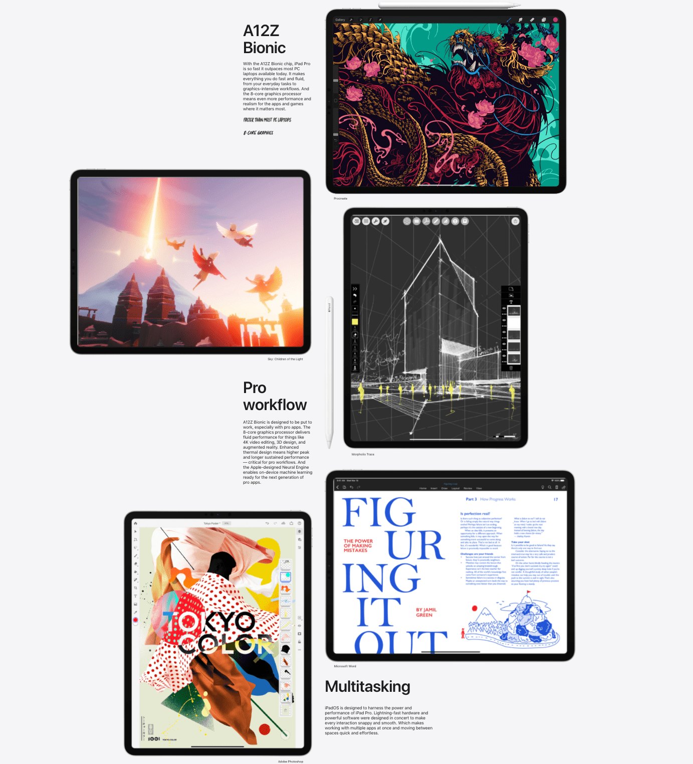
Apple uses empty space as the main design tool. Note that white space does not have to be white. It means the parts of a layout left empty, whatever the background color. On apple.com the background behind a product is often plain, and the product sits in the middle with room on every side.
Apple’s own design guidance for app makers, the Human Interface Guidelines, spells out the thinking behind this approach.
- Rank what matters. The guidelines tell designers to “order content by relative importance” and to place the most important items near the top.
- Use space to group. They suggest using “negative space, container shapes, or separator lines to show which elements are related and which are unrelated.”
- Do not overload. They warn that “an interface with too much content and too many choices makes it harder to find information quickly.”
- Be consistent. They say “use consistent spacing,” because uneven spacing makes a layout harder to scan.
What happened
The result is a page where each tile does one job. The product image is the largest element, the name is the second, and one line of copy explains why it matters. Detailed specs, comparisons and prices are not removed. They are moved one click deeper, to product pages where a shopper who wants them can find them.
Notice what the page does not have: no grid of competing offers, no coupon banner, no long paragraphs. The design choice is as much about what was removed as what was kept.
Why it worked
Empty space removes competition. When nothing else is near the product, the eye has nowhere else to go. Space works like a spotlight.
Space also groups. Nielsen Norman Group, a user experience research firm, notes that “items near each other appear related,” a design principle called the Law of Proximity. Generous gaps between Apple’s tiles tell the viewer that each product is its own story.
Finally, space sends a message about the brand. A page that does not need to fill every pixel looks confident. It suggests the product is strong enough to stand alone, which supports Apple’s premium pricing.
Where it gets complicated
Whitespace works for Apple partly because Apple is already famous. Most visitors arrive knowing what an iPhone is. A new or unknown brand that uses one product photo and five words may leave visitors confused about what it sells. Minimal layouts depend on the viewer already having context.
Minimal can also mean more scrolling and fewer visible choices. A shopper who wants to compare options quickly may find a sparse page slower to use. And copying Apple’s look is easy, but empty space only works when the one thing left on the page is worth looking at. A weak product photo surrounded by white space just looks empty.
The marketing principle
In layout, every element you add takes attention from something else. Whitespace is not unused space. It is a choice that ranks what matters and points the viewer to it. Before adding anything to a page, ask what you can remove so the most important thing wins.
Sources
- Apple homepage, Apple (2026)
- Layout, Human Interface Guidelines, Apple Developer (2026)
- Form Design Quick Fix: Group Form Elements Effectively Using White Space, Nielsen Norman Group (2013)
Group activity for this case
What’s the Empty Space Doing?
A before and after for your brand: one crowded piece and one cut down to the single thing that should win. A 20-minute group activity. Dr. Morris gives the password in class.
Back to Layout and Composition · All case studies
Brand names, images and trademarks belong to their owners and appear here for educational purposes only.