Case study · Marketing 475 · Building Your Brand Identity System
A strong mood board does not collect pretty images. It translates true facts about a brand, like copper stills, family ownership and a founding year, into a color, texture and story system every touchpoint can share.
Brand
Glenfiddich (William Grant & Sons)
Year(s)
Brand dates to 1887; visual identity refreshed in 2026
Channel(s)
Packaging, bottle, labels, brand imagery
Goal
Express heritage, craft and premium quality as one consistent look
Topic
Brand identity system
1887
First spirit ran from the stills on Christmas Day (Spirit of Speyside)
5
Generations of the Grant family owning and running the distillery (Spirit of Speyside)
1956
Year the triangular bottle, designed by Hans Schleger, was introduced (Wikipedia)
The situation
Glenfiddich is a single malt Scotch whisky from Dufftown, in the Speyside region of Scotland. According to the Spirit of Speyside festival’s profile of the distillery, William Grant built the distillery by hand in a single year with help from his seven sons and two daughters. The first spirit ran from his second-hand copper stills on Christmas Day 1887. That is why the brand says “since 1887.”
The distillery is still owned and run by Grant’s family, now across five generations. Wikipedia describes Glenfiddich as the world’s best-selling single malt. The brand also has strong visual assets: a triangular bottle introduced in 1956 and designed by Hans Schleger, and a stag emblem that comes from the Gaelic meaning of the name, “valley of the deer.”
The challenge
Premium whisky is a crowded shelf. Many brands use dark wood, gold type and old-world imagery. A brand that only says “heritage” can look like every other bottle.
So the question for a mood board is not “what looks expensive?” It is “what looks like this brand and no other?” A useful mood board answers that by tying each visual choice to something true about the company.
What they did
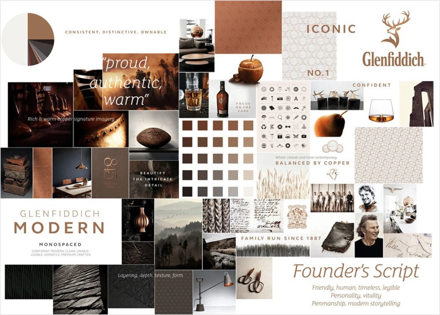
The mood board used in class pulls Glenfiddich into one look: rich copper, warm browns and soft neutrals, with natural textures like leather, wood and copper. This is an interpretive board built for teaching, not an official Glenfiddich document. What makes it strong is that each element points back to a real part of the brand story.
Glenfiddich’s own 2026 identity refresh shows the same logic at work. Made Thought led the redesign, according to The Dieline. The team kept the triangular bottle and the stag, and in some cases made the stag more prominent. The stag was redrawn with more depth and framed by the 1887 founding year. The Grant family crest, with the motto “Stand Fast,” is embossed on the packaging. The wordmark moved to a sans-serif style that pays tribute to the lettering Glenfiddich used on its bottles in the 1960s.
- Copper: echoes the copper pot stills at the heart of the distillery’s story
- Warm browns and wood: the color of the whisky and the casks it matures in
- Leather and soft neutrals: a quiet, premium feel rather than flashy luxury
- 1887, the stag and the family crest: story elements that carry the heritage claim
What happened
The refreshed identity began rolling out globally in April 2026, starting with a limited Father’s Day gift pack in the U.S., according to whiskey writer Fred Minnick. Rollout in India was announced for July 2026. The look also appeared on the Aston Martin Formula One car for 2026 as part of the brand’s partnership with Aston Martin.
It is too early for public sales results tied to the redesign. What we can see is consistency: the same few assets now repeat across packaging, gift packs and sponsorships.
Why it worked
The visual system is anchored in facts the brand can prove. Copper is not a random trend color. It refers to how the whisky is made. “Since 1887” is not a vague claim of age. It is the date of the first spirit. Family ownership is shown with a real crest and motto.
When color, texture and story are decided together, every touchpoint can use them without a designer starting from scratch. A gift box, a website banner and a race car can all feel like Glenfiddich because they draw from the same short list of assets.
Where it gets complicated
Warm copper and wood tones are common across whisky. A mood board built only on category cues can make a brand blend in. Glenfiddich’s protection is its ownable shapes: the triangular bottle and the stag. Color alone would not be enough.
Heritage can also feel old. The 2026 refresh tried to solve this by going back to 1960s lettering and simplifying the label, which The Dieline described as a “much cleaner presentation.” Notice that the brand chose a sans-serif wordmark. That is a reminder that a mood board’s warm, traditional textures need a modern counterweight somewhere in the system.
Finally, a mood board is a tool for alignment, not proof. Students should be careful not to present an interpretive board as the brand’s own guidelines.
The marketing principle
A brand identity system works when color, texture and story are chosen together and each one is tied to something true. Glenfiddich’s copper, wood, stag, bottle and 1887 date all point back to how and by whom the whisky is made. Build your mood board the same way: start with the story, then choose the look that proves it.
Sources
- Glenfiddich: A true family whisky, Spirit of Speyside (n.d.)
- Whisky Distiller Glenfiddich Unveils New Visual Identity and Packaging, The Dieline (2026)
- Glenfiddich Unveils New Branding, Packaging, Fred Minnick (2026)
- Glenfiddich Launches New Visual Identity, India Rollout Begins in July 2026, Restaurant India (2026)
- Glenfiddich, Wikipedia (2026)
Group activity for this case
Prove It With Copper
Your group has a mood board plan where every color, texture and image is tied to something true about your brand. A 25-minute group activity. Dr. Morris gives the password in class.
Back to Building Your Brand Identity System · All case studies
Brand names, images and trademarks belong to their owners and appear here for educational purposes only.