Case study · Marketing 465 · Analytics with GA4
When the Obama 2008 campaign measured the one action that mattered, email sign-ups, the data overruled the staff’s favorite idea and added millions of supporters.
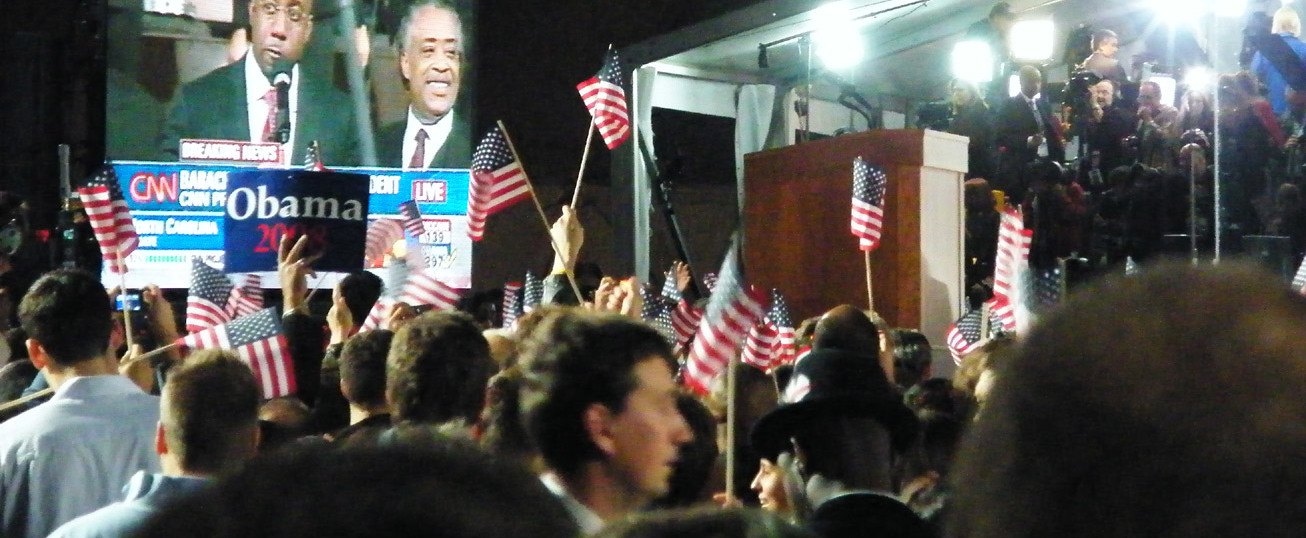
_(3005067535).jpg)
Brand
Obama for America (2008 presidential campaign)
Year(s)
2007 to 2008 (2012 follow-up)
Channel(s)
Campaign website splash page, email
Goal
Turn website visitors into email subscribers, volunteers and donors
Topic
Analytics with GA4
8.26% to 11.6%
Splash page sign-up rate, original vs. winning version (Siroker, Optimizely, 2010)
310,382
Visitors in the 24-version experiment (Siroker, Optimizely, 2010)
~$60M
Estimated additional donations, assuming the lift held all campaign (Siroker, Optimizely, 2010)
$2.6M+
Raised by the 2012 subject line “I will be outspent,” which beat 17 other variants (Epolitics, citing Businessweek data, 2012)
The situation
In December 2007, Barack Obama was trailing in the polls for the Democratic nomination. His campaign website was getting heavy traffic, but traffic alone does not win anything. The campaign needed visitors to do one specific thing: give an email address.
An email address mattered because it opened the door to everything else. The campaign could later ask that person to volunteer, to share, and to donate. Dan Siroker, who became the campaign’s Director of Analytics, later wrote that the big lesson was simple: every visitor to the website was an opportunity.
The challenge
The first page most visitors saw was a splash page with a large image or video at the top and a sign-up button below it. The staff had opinions about what should go there. Many of them strongly favored a video known as “Sam’s Video.”
Opinions were cheap. Choosing wrong was not. If the page converted a few percentage points worse than it could, the campaign would quietly lose a large number of supporters over the full race and never know it.
What they did
Siroker’s team ran a multivariate experiment on the splash page using Google Website Optimizer, a free testing tool from Google. They defined one success metric before they started: sign-up rate.
They tested two parts of the page at once, so every combination could be compared.
- 4 versions of the call-to-action button, one of them labeled “Learn More”
- 6 media options at the top: 3 still images and 3 videos
- 24 combinations in total, shown to 310,382 visitors, about 13,000 per version
- Each version was judged on the same outcome: the share of visitors who signed up
What happened
The staff favorite lost. Siroker reported that every one of the videos performed worse than every one of the images. The winning combination paired a “Learn More” button with a photo of the Obama family. He wrote that without the experiment, the campaign would very likely have used the video.
The campaign then rolled the winner out and ran dozens of further experiments across the site.
- Sign-up rate rose from 8.26% on the original page to 11.6% for the winning version, a reported 40.6% improvement (Siroker, Optimizely, 2010)
- Siroker estimated about 2.88 million additional email addresses over the campaign, about 288,000 additional volunteers, and about $60 million in additional donations, assuming the lift held for the rest of the race (Optimizely, 2010)
- In the 2012 re-election campaign, the team tested email subject lines the same way, often with as many as 18 variations. The line “I will be outspent” raised more than $2.6 million, according to testing data shared with Bloomberg Businessweek (reported by Epolitics, November 2012)
- Bloomberg Businessweek reported that most of the $690 million the campaign raised online in 2012 came from fundraising emails (November 2012)
Why it worked
The team picked the action that mattered to the mission, a sign-up, and measured everything against it. That is the same idea GA4 builds on when you mark an event like sign_up or purchase as a key event. Page views and video plays would have told a different, less useful story. A moving video can earn attention and still lose people at the moment that counts.
They also let the data change their minds. The staff had a clear favorite. The test showed it was wrong, and they acted on the result. Amelia Showalter, director of digital analytics for the 2012 campaign, later said the team was so bad at predicting what would win that it only reinforced the need to keep testing.
Where it gets complicated
The famous $60 million is an estimate, not a measured result. Siroker built it by assuming the 40.6% lift held for the whole campaign and by applying average volunteer and donation rates to the extra sign-ups. It is a reasonable model, but it is still a model. Accounts also differ in the details. NPR’s Planet Money, retelling the story in 2015, described the button test alone with smaller rates, roughly 7.5% rising to 8.9%.
A sign-up rate is also only one number. A page can win on sign-ups and still attract people who never volunteer or give. The campaign could follow those subscribers through email, which most brands find harder to do. And the 2012 emails showed the cost of optimizing hard: subject lines like “Hey” worked, but comedians and writers mocked them. Testing tells you what gets a response. It does not tell you what your brand should be willing to say.
Finally, this was an experiment, not a report. Analytics shows what happened. A controlled test shows what caused it. Good teams use both.
The marketing principle
Analytics is only as useful as the action you decide to measure. Define the key event first, compare versions or segments against it, and be ready for the answer to contradict the room. The Obama team’s advantage was not a better video. It was the habit of checking.
Sources
- Obama’s $60 million dollar experiment, Optimizely (Dan Siroker) (2010)
- Episode 669: A or B, NPR Planet Money (2015)
- The Science Behind Those Obama Campaign E-Mails, Bloomberg Businessweek (2012)
- Behind Obama’s Email Fundraising Success: Strategic Profanity and a Lot of Testing, Epolitics (Colin Delany) (2012)
Group activity for this case
Overrule the Favorite
Your group has picked the one key event that matters for your brand’s website and designed a test that could prove your favorite idea wrong. A 25-minute group activity. Dr. Morris gives the password in class.
Back to Analytics with GA4 · All case studies
Brand names, images and trademarks belong to their owners and appear here for educational purposes only.