Case study · Marketing 475 · Presenting Creative Work
In 2010 Gap put a new logo on its website with no brief, no rationale and no context, and the public judged it on taste alone. The explanation came days later, and by then the work was already dead.

Brand
Gap
Year(s)
2010
Channel(s)
Gap.com, Facebook, The Huffington Post
Goal
Introduce a more modern logo to match a changing brand
Topic
Presenting Creative Work
~1 week
how long the new logo stayed on Gap.com before Gap brought back the blue box (Christian Science Monitor, 2010)
2,000+
comments on Gap’s Facebook page, many asking for the old logo (The Drum, 2010)
~20 years
age of the blue box logo Gap tried to replace (Marketing Week, 2010)
The situation
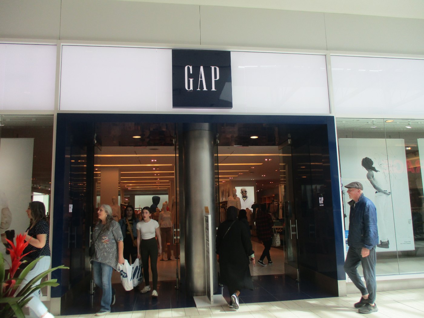
For about 20 years, Gap’s logo was simple: the word GAP in white capital letters inside a navy blue box. It appeared on shopping bags, store signs and clothing. Customers knew it well.
In early October 2010, Gap replaced it on its U.S. website. The new logo set GAP in black Helvetica-style letters, with a small blue gradient square sitting behind the P. Chain Store Age reported that the design came from Laird & Partners, a New York agency.
The challenge
Gap had a reason for the change. Its leaders felt the brand and its clothes were evolving, and that the logo should evolve with them. The problem was how the work was shown.
The Christian Science Monitor said the new logo appeared “without fanfare.” There was no announcement explaining the goal, no story about the decisions, and no mockups showing the logo on bags, storefronts or clothing. Marketing Week noted it appeared only on the U.S. site. One Facebook commenter, quoted by the Monitor, put it plainly: “A company as large as The Gap doesn’t launch a brand new logo by just slapping it up in one place on their website.”
What they did
With no context, people reacted to the logo as a picture. The reaction was fast and negative. NPR reported that Ad Age said the logo looked like something a child made with clip art. A Twitter account was set up just to fight it.
Gap’s explanation came after the backlash. Marka Hansen, president of Gap North America, wrote a column for The Huffington Post. She said the company’s brand and clothes were changing and that “rethinking our logo is part of aligning with that.” She wrote, “We chose this design as it’s more contemporary and current,” and said it “honors our heritage through the blue box while still taking it forward.”
Gap also asked fans on Facebook to share their own logo designs. That move drew a second round of criticism.
- Reveal: the logo went live on Gap.com with no rollout story.
- Defense: a rationale published only after the criticism started.
- Crowdsourcing: an open call for fan designs on Facebook.
What happened
About a week after the new logo appeared, Gap brought back the blue box. Hansen said, “All roads were leading us back to the blue box.” She also said, “We recognize that we missed the opportunity to engage with the online community,” and “we did not go about this in the right way.” On the crowdsourcing idea, she said, “This wasn’t the right project at the right time for crowd sourcing.”
- More than 2,000 comments on Gap’s Facebook page, many asking for the old logo (The Drum and Management Today, October 2010).
- A Twitter account created to oppose the logo reached about 5,000 followers (Management Today, October 2010).
- The new logo lasted about one week on Gap.com before Gap withdrew it (Christian Science Monitor, October 2010).
Why it failed
Gap skipped every step a good creative presentation needs. It did not restate the brief first, so people judged the logo by personal taste instead of by the goal. It did not explain its key decisions, such as why the box shrank or why the type changed. It did not show the logo in context, so nobody could picture it on a shopping bag or a storefront.
The order mattered too. Hansen’s rationale was a real argument about a brand catching up with its clothes. Shared first, it might have framed the work. Shared after the reaction, it read as a defense. The crowdsourcing request made it worse. Management Today reported that professional designers objected to Gap asking the public to work for free, and it looked like Gap did not trust its own work.
Where it gets complicated
A better presentation might not have saved this logo. Many critics disliked the design itself, not just the rollout. Presenting your thinking helps good work get understood. It cannot turn weak work into strong work.
Some observers also argued Gap reversed too quickly. Management Today pointed out that the complaints came from a few thousand people online, a small group compared with Gap’s customer base. It contrasted Gap with the London 2012 Olympics organizers, who kept their much-criticized logo. Listening to feedback is part of presenting. So is deciding which feedback should change the work.
Finally, some commenters suspected the whole thing was a publicity stunt. The Christian Science Monitor reported the speculation but found nothing to support it, and Gap’s own statements describe a mistake, not a plan.
The marketing principle
People buy work they understand. Gap showed the visual without the thinking, so its audience filled the gap with taste and assumptions. Start with the brief, explain your key decisions, and show the work where it will live. A rationale shared before the reveal frames the work. The same rationale shared after a backlash sounds like an excuse.
Sources
- New Gap logo withdrawn: The ‘blue box’ lives on, The Christian Science Monitor (2010)
- The Gap gets backlash for logo makeover, NPR (2010)
- Gap President Defends New Logo, MR Magazine (2010)
- Gap scraps new logo, Marketing Week (2010)
- Gap scraps new logo after online furore, The Drum (2010)
- Mind the Gap: retailer withdraws its new logo, Management Today (2010)
Group activity for this case
Story Before the Reveal
Your group will have the brief, rationale and in-context mockup plan to present your brand’s logo before anyone sees it. A 20-minute group activity. Dr. Morris gives the password in class.
Back to Presenting Creative Work · All case studies
Brand names, images and trademarks belong to their owners and appear here for educational purposes only.