
The big idea: When you design for people at the edges, like a viewer with low vision or someone watching on mute, you make marketing that works better for everyone.
In 60 seconds
- Design for people at the edges first, like a viewer with low vision or someone watching on mute, and the work gets clearer for everyone.
- Text needs a contrast ratio of at least 4.5:1, or 3:1 for large text. Never use color alone to carry meaning.
- Caption every video, write alt text that says why an image is there, and show the real range of people you serve.
Do this: test your brand palette for contrast, then make every Final Campaign asset readable, captioned and described with alt text.
How accessible design works
How accessible design works
Design for the edges. It works better for everyone.
Accessible design means people can see, read, hear and understand your marketing whatever their abilities or situation. Design for the people at the edges first, and the work gets clearer for everyone.
The curb cut effect
A fix for one group became better design for everyone.
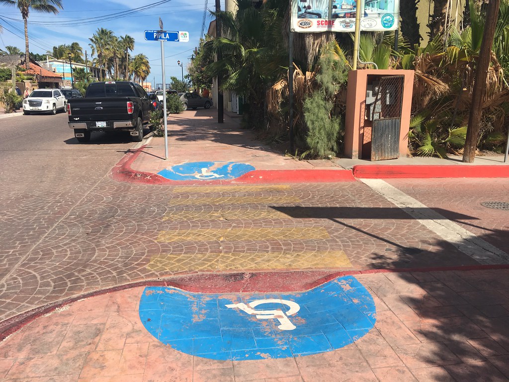
Curb cuts, the ramps where a sidewalk meets the street, were made for wheelchair users. Now parents with strollers, travelers with rolling bags, delivery workers with carts and kids on bikes all use them. The same thing happens with captions, strong contrast and plain words.
Limits are permanent, temporary or situational
Three kinds of limits. One design helps them all.
- 1PermanentSomeone who is deaf, blind, has low vision or is color blind. Example: a viewer who is deaf watches your brand video.
- 2TemporaryAn ear infection, an eye injury, a broken arm, lost glasses. Example: someone with a broken wrist scrolls with one thumb.
- 3SituationalSun glare on a phone, a loud bar, a quiet library, a cracked screen. Example: a student watches your reel on mute in class.
- 4One design for allCaptions, contrast and clear layout help every person in the first three cards. The payoff: more people get your message.
The six visual checks · 1. Color contrast
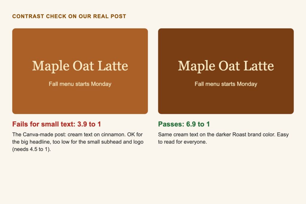
Check the contrast before you post.
4.5:1
WCAG AA asks for 4.5:1 for normal text and 3:1 for large text (24px and up, or about 19px bold) and for icons and graphics people need to understand.
Watch out: light gray, pastel and bright orange text on white usually fail.
Contrast, in plain math: what the ratio means and where the numbers come from
WCAG (the Web Content Accessibility Guidelines from the W3C) measures contrast as a ratio of the relative brightness of two colors. It runs from 1:1 (the same color) to 21:1 (black on white). Hue does not count, only lightness. That is why red on green can look bold to some people and still score close to 1:1.
| What it is | AA minimum | Examples |
|---|---|---|
| Normal text | 4.5:1 | Body copy, captions, prices, buttons, fine print |
| Large text | 3:1 | Headlines 24px and up, or about 19px and up in bold |
| Graphics and controls | 3:1 | Icons, chart lines, form field borders |
| Decoration and logos | No minimum | Background patterns, the logo itself |
AAA is the stricter level: 7:1 for normal text and 4.5:1 for large text. Aim for AA on everything and AAA on long reading.
Logos are exempt from the contrast rule, but a logo nobody can see still fails as marketing. Make a dark and a light version.
The six visual checks · 2, 3 and 6
Meaning, type and motion should never shut people out.
Never color alone
If red means “sold out” and green means “in stock,” add a word or an icon too. Color blind viewers and grayscale screens lose the meaning otherwise.
Watch out: charts and links that rely only on color.
Readable type
Body text of at least 16px on the web, lines of about 45 to 75 characters, and generous line spacing. On social graphics, test on your phone at arm’s length.
Watch out: thin script fonts and text over busy photos.
Motion with care
Flashing can trigger seizures in people with photosensitive epilepsy. Big zooms and spins can make some people dizzy or sick.
Watch out: strobe transitions and more than three flashes in one second.
The six visual checks · 4. Alt text that says why
Describe what the image means, not every pixel.
Describe what the image means in this spot, not every pixel. Screen readers read it aloud, and search engines use it too.
Skip
“Image of,” file names and keyword stuffing.
Write
Ask: if I could not show this image, what would I say in its place? Write that.
How to write alt text: describe the purpose, with examples
Ask: if I could not show this image, what would I say in its place? Write that. One or two sentences is usually enough.
- Product shot: “Mint green insulated water bottle with a bamboo lid, sitting on a trail rock.”
- Lifestyle shot: “Three friends laughing around a campfire, passing a bag of trail mix.”
- Graphic with text: include the words. “Fall sale: 20% off all candles through Sunday.”
- Decorative image: leave alt text empty (or tick Mark as decorative in Canva) so screen readers skip it.
Skip “image of” or “picture of.” Screen readers already announce that it is an image. Instagram, Facebook, LinkedIn and X all let you add alt text when you post.
The six visual checks · 5. Captions on all video
Design for sound off first.
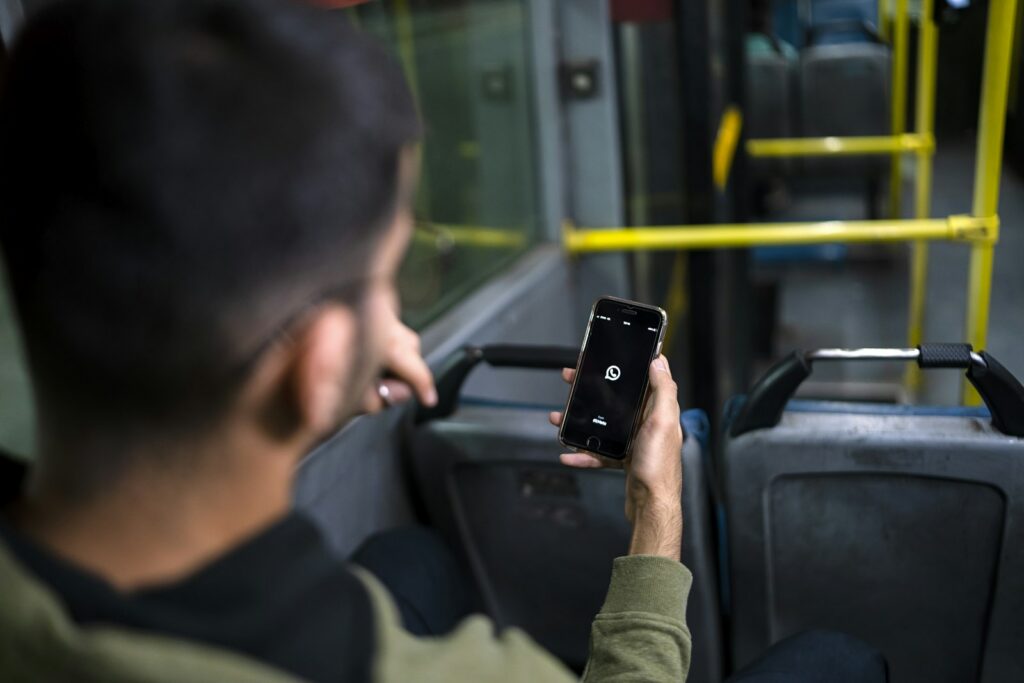
Many people scroll with the sound off: in class, at work, on a bus, next to someone sleeping. Captions carry the story for them and for viewers who are deaf or hard of hearing.
Watch out: auto-captions you never proofread.
Captions that work: sound-off design and caption basics
- Design for sound off first. The hook and the story should make sense on mute. Sound is a bonus.
- Caption every spoken word. Add meaningful sounds in brackets, like [door slams] or [upbeat music].
- Proofread auto-captions. Canva, CapCut, Instagram and TikTok can generate captions, and they get names, slang and brand words wrong.
- Make them readable. High contrast (a dark box behind white text works), two lines at most, and kept clear of the platform’s buttons and caption area.
- Time them to speech. Captions that race ahead or lag behind confuse viewers.
Captions show what is said. Subtitles translate it. Burned-in (open) captions are part of the video. Closed captions can be turned on or off.
Inclusive goes beyond access
Show people as they are.
- Show a real range. Ages, body types, skin tones, families and abilities that match the people you serve.
- Everyday roles, not props. Show a person with a disability as a customer, a friend or a boss, not as an inspiration story.
- Check your defaults. Stock libraries and AI image tools often repeat the same narrow look. Ask “who is missing?”
Write so everyone gets it
Plain words reach more people.
Lead with the point
Put the offer or action first.
Use short sentences and common words
“Use” beats “utilize.” “Buy” beats “acquire.”
Say what happens next
“Shop the sale” beats “Click here.”
Inclusive imagery and plain language, in practice: a quick review for any campaign
For example, a made-up outdoor gear brand reviews its campaign before launch:
- Who is in the photos? All six shots show the same kind of person. They add an older hiker, a family and a hiker using a wheelchair on an accessible trail.
- Who made the call? They ask people from those groups to look at the shots before launch, not after.
- What does the copy say? “Optimize your trail experience with our innovative hydration solution” becomes “Stay cool on the trail. Holds ice for 24 hours.”
- What are the words in the image? They move the details into the post caption, where screen readers can reach them, and keep the graphic to one short line.
Try it: Brand Color Contrast Checker
Tool · MARK 475
Brand Color Contrast Checker
Pick a text color and a background color, or start from a preset. See the pair on a real ad, the WCAG contrast ratio, and a fix if it fails.
- 1Pick colors
- 2Check
- 3Fix
New this week
Fresh drop this Friday
Body text at 16 pixels. Most captions, product details and calls to action on your designs are this size or smaller.
Fine print at 13 pixels. Offer ends Sunday.
All checks
Check your whole palette
Enter your brand’s 3 to 5 colors. Every cell is one color used as text (row) on another as background (column). Select a cell to open that pair in the checker above.
- Text: 4.5:1 or more, safe for any text
- Large: 3:1 to 4.49:1, headlines, icons and graphics only
- Decor: under 3:1, decoration only
Put it to work: an accessible Final Campaign
Accessibility is part of the Execution grade on your Final Campaign: designs are polished, platform sizes are correct and the video has captions. It starts on your identity board, where every color you choose has to work for real people on real screens.
Build it into every asset
Test your palette
Put your 3 to 5 brand colors into the palette check above. Find which pairs pass 4.5:1 for text. If none do, add a near-black or off-white neutral.
Your deliverable: on the final identity board, each hex code labeled with its job and its approved text pairs, such as “Ink #333333 on Cream #FFF7EE, 13.1:1, body text.”
Set type rules that read on a phone
Pick heading and body sizes that stay readable on a phone screen. Keep body copy off busy photos, or add a solid block behind it.
Your deliverable: a type line on the identity board, such as “Body text never smaller than ___, always on a solid color.”
Check every platform design
Each teammate runs Canva’s accessibility check (File, then Accessibility, then Check design accessibility) and fixes what it flags. Test in grayscale: does anything rely on color alone?
Your deliverable: platform designs with no contrast or small-text flags, plus alt text written for each image you would post.
Caption the video, start to finish
The grading asks for captions throughout. Build the story to work on mute, caption every spoken word, proofread every line and keep captions clear of platform buttons. No strobe or flashing transitions.
Your deliverable: a 55 to 65 second video that makes complete sense with the sound off.
Review who you show and how you sound
Look at your 5 photos, platform designs and video together. Does the cast reflect the audience in your brand brief? Is the copy short and plain?
Your slide: one line in your strategy rationale on how your visuals and words include your whole audience.
ExamplesBefore and after on three campaign assets
For example, a made-up candle brand called Ember and Oak:
Identity board
Before: a soft gold headline on cream. It looked warm and scored under 2:1.
After: gold becomes an accent for lines and icons only. Headlines move to a deep brown that passes 4.5:1.
Instagram post
Before: “20% off” in thin white script over a candlelit photo.
After: the offer sits on a solid brown band in the brand’s bold sans, with alt text that includes the offer.
1-minute video
Before: the story lived in the voiceover, with no captions.
After: proofread captions on every line, plus on-screen text for the hook, so it works on mute.
Before you submitThe accessibility checklist for your Final Campaign
- [ ] Every text and background pair on the identity board passes 4.5:1 (or 3:1 for large headlines only).
- [ ] Icons, chart lines and buttons in our designs reach at least 3:1.
- [ ] Nothing relies on color alone to carry meaning.
- [ ] Every platform design passed Canva’s accessibility check with no contrast or small-text flags.
- [ ] Text is readable on a phone, with body copy on a solid area, not a busy photo.
- [ ] Each image we would post has alt text that describes its purpose.
- [ ] The video has proofread captions throughout and makes sense on mute.
- [ ] No flashing more than three times in one second, and no strobe transitions.
- [ ] Our photos and video show the range of people in our target audience.
- [ ] Copy is short and plain, and every call to action says what happens next.
- [ ] Deck slides use the same passing color pairs and text big enough to read from the back of the room.
Go deeper
Back to all Marketing 475 topics
In-class group activity · 25 min
Design for the Edges Audit
Your group leaves with a contrast-tested palette with approved text pairs, alt text for two brand images, a sound-off caption plan for your video and three fixes for your campaign. Your instructor will give you the password in class.
Frequently asked questions
What is accessible design in marketing?
Accessible design means people can see, read, hear and understand your marketing whatever their abilities or situation. Designing for people at the edges, like a viewer with low vision or someone watching on mute, makes marketing work better for everyone. This is the curb cut effect: ramps built for wheelchair users now help strollers, rolling bags and bikes too.
What color contrast ratio do you need for accessible text?
WCAG AA asks for a contrast ratio of at least 4.5:1 for normal text and 3:1 for large text, meaning 24px and up or about 19px bold, and for icons and graphics people need to understand. The stricter AAA level asks for 7:1 for normal text. Light gray, pastel and bright orange text on white usually fail. Logos are exempt.
How do you write good alt text for marketing images?
Good alt text describes what the image means in that spot, not every pixel. Ask what you would say if you could not show the image, and write that in one or two sentences. Include any words in a graphic, leave decorative images empty, and skip image of or picture of, since screen readers already announce that it is an image.
What are common accessibility mistakes in social media video?
Common mistakes include skipping captions, posting auto-captions without proofreading them, and using flashing or strobe transitions. Many people scroll with the sound off, so design for mute first and caption every spoken word, adding meaningful sounds in brackets. Content should not flash more than three times in one second, because flashing can trigger seizures in people with photosensitive epilepsy.
How do you check a design for accessibility in Canva?
In Canva, open File, then Accessibility, then Check design accessibility. The check flags text that is too small, low color contrast and images without alt text. Run it on every design before you export. Canva also lets you mark an image as decorative so screen readers skip it.