The big idea: Every channel sends people somewhere, and a page with one goal, a headline that matches the click and nothing in the way is what turns that traffic into results.
In 60 seconds
- A landing page has one goal and one path. If you can’t finish “This page exists so the visitor will ___” with one verb, it does too much.
- On a phone, the first screen needs a headline that matches the click, a subhead, a real visual and one clear button.
- Keep people moving with message match, real trust signals and less friction, then test one change at a time.
Do this: build a click map that names the landing page for every channel in your Final Pitch, audit the client’s pages on a phone and plan one A/B test.
How landing pages work
How landing pages work
One page. One goal. Nothing in the way.
Every ad, email and post sends people somewhere. The page they land on decides whether that click turns into a booking, a sign-up or a sale, or just a bounce.
Website or landing page?
A website serves everyone. A landing page serves one click.
A website
- Many goals. It serves everyone: shoppers, job seekers, press, returning customers.
- Many paths. Menus, links and pages invite people to explore.
- Long life. It stays up and grows over years.
A landing page
- One goal. It exists for one action: book, sign up, buy, download.
- One path. Few or no exits. Every element points to the button.
- Built for a click. It matches a specific ad, email or post, and you can measure it on its own.
One page, one goal
“This page exists so the visitor will ___.”
If you cannot finish the sentence “This page exists so the visitor will ___” with one verb, the page is trying to do too much. Sending paid traffic to a home page usually means paying for a click and then handing the visitor a maze.
The first screen does the heavy lifting
Four things above the fold, in this order.
On a phone, the first screen (often called “above the fold”) is all a visitor sees before deciding to stay. It needs four things, in this order.
- 1HeadlineSays the offer in plain words, matching the click.Test: could a stranger repeat the offer after 3 seconds?
- 2SubheadWho it is for and what happens next.Test: does the right person think “this is for me”?
- 3Hero visualThe real product or experience, not a generic stock mood shot.Test: can they picture themselves using it?
- 4Call to actionOne button that says exactly what happens: “Claim my free class,” not “Submit.”Test: is it visible without scrolling?
Message match
Same offer. Same words. Same look.
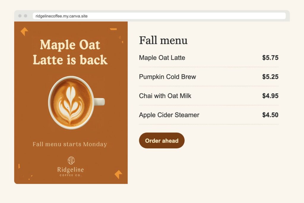
The page repeats the promise, words and look of the ad, email or post that sent the visitor. Same offer, same language, same visual feel.
Watch out: one generic page for every channel breaks the match for most of them.
Message match, channel by channel
Message match means the visitor feels no jump between the thing they clicked and the page they see. Check three layers: the offer, the words and the look.
| Traffic source | What the visitor expects | The page should |
|---|---|---|
| Paid search ad | An answer to the exact thing they typed. | Use the search terms in the headline and go straight to that product or service. |
| Paid social ad | The offer and the visual they just saw in the feed. | Repeat the offer word for word and reuse the ad’s image, colors or person. |
| The thing the subject line and button promised. | Open on that offer. Skip the brand introduction, since they already know you. | |
| Organic social post or bio link | The product, recipe, event or story in the post. | Land on that item, not the home page. A link-in-bio page should list current posts’ items first. |
For example, a local coffee shop runs an Instagram ad for “$2 off your first mobile order.” The landing page headline should say “$2 off your first mobile order,” show the same drink from the ad and have one button: “Start my order.”
What keeps people moving
Earn trust. Then get out of the way.
Trust signals
Reviews, short testimonials, ratings, guarantees, clear pricing, recognizable logos or credentials. They answer “Is this legit, and is it for me?”
Watch out: only use real reviews and real claims. Fake ones are deceptive and the FTC treats them that way.
Less friction
Short forms, a fast load, big tap targets and no pop-up in the way. Every extra step is a reason to quit.
Watch out: asking for data you will not use right away costs you sign-ups.
Forms: ask for less
Every field is a small cost to the visitor. Ask only for what you need to deliver the thing they asked for, right now.
- Start with the minimum. A newsletter needs an email. A free class needs a name and email. A quote request may need a bit more.
- Ask the rest later. Learn more in the welcome email, at the first visit or in a follow-up survey.
- Make optional fields clearly optional, or remove them.
- Label every field with a visible label, not only placeholder text that disappears when people type. This also helps screen reader users.
- Say what happens next and how you will use their information, with a link to the privacy policy.
Design for the phone first
Build for the thumb, then let it grow.
Social clicks happen mostly on phones, and many people read email on their phones too. Build the phone version first, then let it grow for desktop, not the other way around.
- Text readable without zooming
- Buttons big enough for a thumb, and no sideways scrolling
- Forms that bring up the right keyboard (email, phone)
- The call to action reachable without hunting
Mobile-first and page speed basics
Slow pages lose visitors before they ever see the offer, and paid clicks you lose this way are money spent for nothing. You do not need to code to spot the usual problems.
- Huge images. The most common problem. Resize photos to the size they display at and compress them before uploading.
- Autoplay video and heavy sliders. They load lots of data before the visitor asks for it.
- Too many add-ons. Every chat widget, tracking script and plugin adds weight. Keep the ones you use.
- Layout that jumps. Buttons that move while the page loads cause wrong taps.
Google’s free PageSpeed Insights tool tests any public URL on mobile and desktop and reports the Core Web Vitals: Largest Contentful Paint (how fast the main content shows), Interaction to Next Paint (how fast the page responds to a tap) and Cumulative Layout Shift (how much the layout jumps). Google describes “good” as LCP of 2.5 seconds or less, INP of 200 milliseconds or less and CLS of 0.1 or less.
Mobile checklist: text readable without zooming, buttons big enough for a thumb, no sideways scrolling, forms that bring up the right keyboard (email, phone), and the call to action reachable without hunting.
Test one change at a time
Change one thing, so you know what worked.
An A/B test sends half the visitors to version A and half to version B. Change one thing, so you know what caused the difference.
Measuring a landing page: UTM tags, key events and the numbers to watch
- Tag every link with UTM parameters. utm_source (instagram, newsletter, google), utm_medium (paid_social, email, cpc) and utm_campaign (fall_free_class). GA4 then shows which channel sent each visitor. Google’s Campaign URL Builder makes the tagged link for you.
- Mark the goal as a key event in GA4. A form submit, a purchase or a click on “Book now.” Without it you only know people arrived, not whether they acted.
- Watch three numbers per channel: sessions (how many arrived), conversion rate (how many acted) and cost per conversion for paid traffic (spend divided by conversions).
- Read them together. High traffic with a low conversion rate points to the page or the message match. Low traffic with a high rate points to the channel or the ad.
Try it: Landing Page Checker
Tool · MARK 465
Landing Page Checker
A phone-sized landing page for a made-up yoga studio. Pick where the visitor clicked from, then switch elements on and off.
- 1Pick the click
- 2Build the page
- 3Fix and test
Headline
Form fields
The dashed line on the phone is the end of the first screen.
All checks
Put it to work: name the destination for every channel
Your Final Pitch has no separate “website” section, but every channel you recommend sends traffic somewhere. Name that destination on your Social Media Strategy, Email & Lifecycle and Paid Media Recommendation slides, and measure it in your Measurement Plan. A strategy that drives clicks to a weak page is a strategy that leaks.
Build it in five steps
Map every click
List each channel in your strategy, the message it carries and the exact page it sends people to. Paid, email and social each get a row.
Your deliverable: a click map table: channel, message, landing page URL, one goal.
Audit the client’s current pages
Open those pages on your phone. Score them with the Landing Page Checker list: message match, first screen, trust, form, speed (run PageSpeed Insights), one goal.
Your slide: a phone screenshot of the current page with the two or three fixes that matter most.
Write the matched first screen
For your most important channel, write the headline, subhead and button text so they repeat the ad, email or post word for word. Say what the hero visual is.
Your slide: the ad and its landing page side by side, inside your Paid Media Recommendation or Social Media Strategy.
Decide how you will measure it
Name the conversion (form submit, booking, purchase) as a GA4 key event, the UTM tags for each channel and the conversion rate you will track.
Your slide: one Measurement Plan KPI such as “landing page conversion rate by channel,” with a 90-day and a 1-year target.
Plan one A/B test
Pick the single change most likely to lift conversions and write it as a hypothesis.
Your slide: “We will test ___ against ___ and judge it by ___,” on your Paid Media Recommendation or Measurement Plan slide.
Example: a click mapWhat a finished map looks like for a made-up client
For example, a made-up local bakery that wants more custom cake orders:
| Channel | Message | Landing destination | Goal and measure |
|---|---|---|---|
| Paid search | “Custom birthday cakes in Knoxville” | /custom-cakes, headline matches the ad, gallery of real cakes | Quote request form submits (key event), cost per quote request |
| “Graduation cake orders open this week” | /graduation-cakes, with order deadline above the fold | Orders from utm_medium=email | |
| Instagram (organic) | Reel of a cake being decorated | Link-in-bio page with that cake listed first | Bio link clicks and quote requests from utm_source=instagram |
Notice that no row says “home page.” Each click lands on a page built for its message.
Before you submitA quick checklist for your team
- [ ] Every channel in our strategy names its landing destination.
- [ ] Our main landing page’s headline matches the ad, email or post that sends people there.
- [ ] The first screen shows a headline, subhead, real visual and one clear button.
- [ ] We checked the client’s pages on a phone and in PageSpeed Insights.
- [ ] Our forms ask only for what the client needs right now.
- [ ] Our Measurement Plan tracks landing page conversion rate by channel, with UTM tags and a GA4 key event.
- [ ] We planned one A/B test with a clear hypothesis and metric.
- [ ] Any reviews or claims we show are real.
Go deeper
Back to all Marketing 465 topics
In-class group activity · 25 min
Follow the Click
Your group will have a click map for your brand (channel, message, landing page, goal), a phone audit of its most important page, a rewritten first screen and one A/B test to run. Your instructor will give you the password in class.
Frequently asked questions
What is the difference between a website and a landing page?
A website has many goals and many paths, while a landing page has one goal and one path. A website serves everyone, from shoppers to job seekers to press, and grows over years. A landing page exists for one action, such as book, sign up, buy or download, matches a specific ad, email or post, and can be measured on its own.
What should be on the first screen of a landing page?
The first screen of a landing page needs four things in this order: a headline, a subhead, a hero visual and a call to action. The headline states the offer in plain words that match the click. The subhead says who it is for and what happens next. The visual shows the real product, and one clear button is visible without scrolling.
What is message match on a landing page?
Message match means the landing page repeats the promise, words and look of the ad, email or post that sent the visitor. For example, a coffee shop ad for "$2 off your first mobile order" should lead to a page with that exact headline, the same drink and one button. A common mistake is using one generic page for every channel.
Why should you not send paid ad traffic to a home page?
Sending paid traffic to a home page usually means paying for a click and then handing the visitor a maze. A home page has many goals and paths, so visitors get distracted. A good test: if you cannot finish the sentence "This page exists so the visitor will ___" with one verb, the page is trying to do too much.
How do you run a fair A/B test on a landing page?
A fair A/B test changes one thing, such as the headline or button text, and splits traffic evenly between version A and version B at the same time. Write a hypothesis first, pick the metric before you start, usually conversion rate, and wait for enough data. Run the test for full weeks before calling a winner.