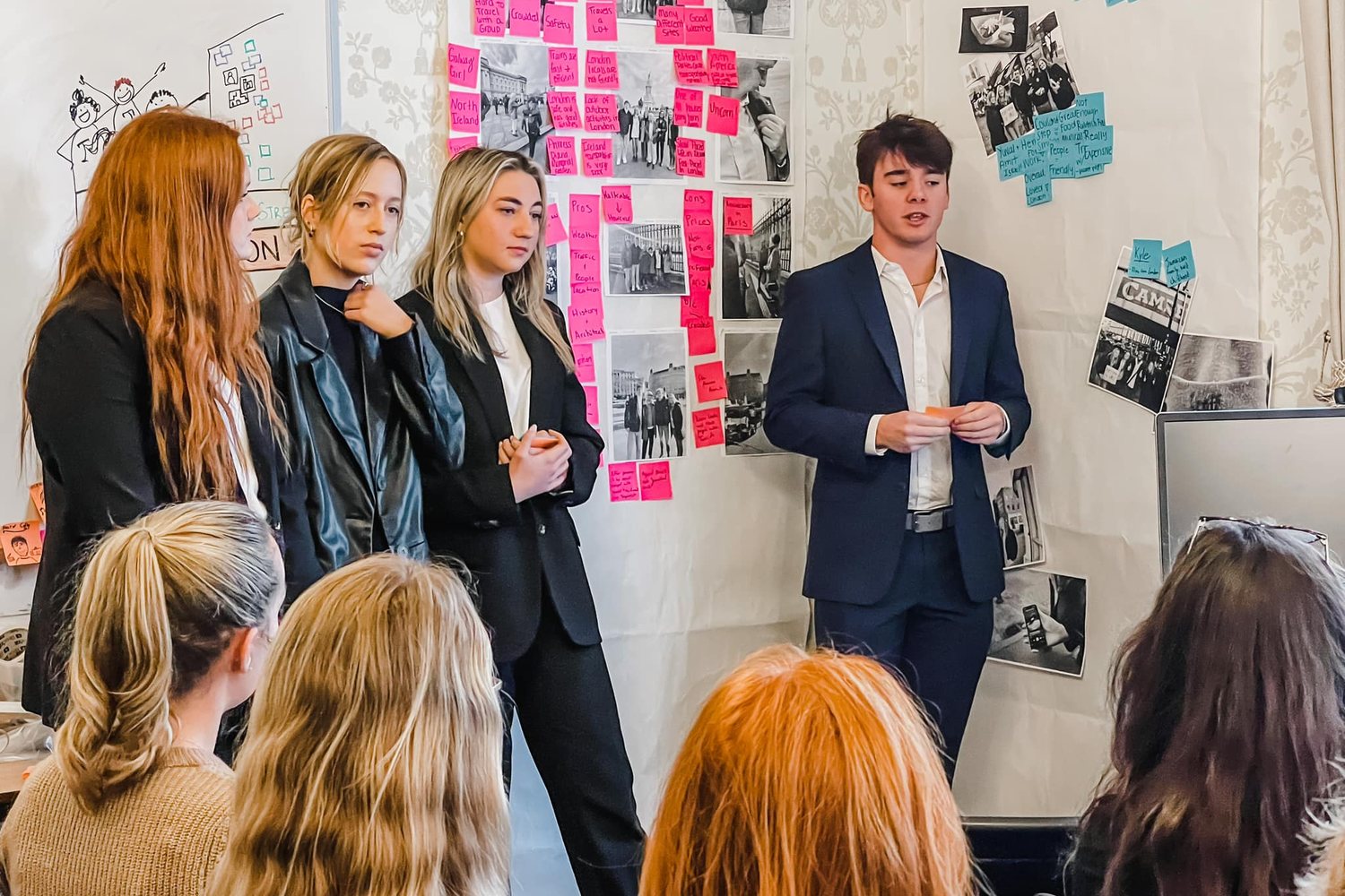
The big idea: Your abstract and poster tell one story in very little space: the human problem, who you listened to, what you learned and why it matters.
In 60 seconds
- Your abstract and poster tell one story: the human problem, who you listened to, what you learned and why it matters.
- Keep the abstract to 150 to 200 words a stranger can understand in a minute.
- Build the report first, then turn it into a poster readable from three feet.
Do this: register for EUReCA with your abstract, upload your poster and give a clean dress rehearsal in class.
How the poster and abstract work
EUReCA is UT’s Exhibition of Undergraduate Research and Creative Achievement, held each spring. Your team registers with an abstract, rehearses the poster in class, then presents it to judges and visitors. The abstract gets you in. The poster carries the conversation.
Purpose or design challenge
2 to 3 sentences. The human problem, maybe as a How Might We, and why it matters.
Answers: what did you study?
Approach
2 to 3 sentences. Human-centered design with qualitative research: methods and who took part.
Answers: who did you listen to?
Key insights
3 to 4 sentences. Patterns, tensions and unmet needs, not a list of results.
Answers: what did you learn?
Significance
2 to 3 sentences. What the insights could inform.
Answers: why does it matter?
The one-minute test
The abstract guide sets the bar: someone outside your team or major should read it and understand the value of your work in under a minute. Think of it as a short story: challenge, approach, insight, value.
The poster in three columns
Column 1: Problem and people
1. Research problem and context. 2. Users and perspectives.
Watch out: start with people, not your client’s building or product.
Column 2: Research and credibility
3. Research approach. 4. Credibility of findings. 5. Key insights.
Watch out: insights, not observations. Three to five of them.
Column 3: Insights, design and action
6. Resonance and transferability. 7. Design response. 8. Prototyping, testing and iteration. 9. Desirability through ethics. 10. Key takeaway.
Watch out: every design choice should trace back to an insight.
Format rules that can sink you
The Spring 2026 guide: 36 x 42 inches, landscape. Digital file as a PDF no larger than 10 MB. Figures legible from three feet. A poster that misses the size is not displayed. Always check eureca.utk.edu for the current year.
Same story as your report
The poster checklist mirrors the technical report sections. Build the report first and the poster becomes an edit, not a rewrite.
Writing the abstract, move by moveWhat goes in each of the four moves
- Purpose or design challenge. Open with the problem or opportunity. Ground it in people and lived experience, not just a space, product or organization. Say briefly why it matters.
- Approach. Say you used a human-centered design approach supported by qualitative research. Name the methods (interviews, observation, contextual inquiry, concept testing) and the kinds of participants. Skip technical detail.
- Key insights. Summarize the patterns, themes, tensions or unmet needs. This is where your rigor shows, through synthesis rather than a list.
- Significance. End with why it matters: how the insights could inform strategy, experience design, decisions or future development.
You do not need to name the Big-Tent criteria in the abstract. Sincerity, rich rigor, resonance and meaningful coherence should show in how you write it.
Abstract rulesLength, tense, citations and registration
- 150 to 200 words. EUReCA describes the abstract as a brief, well-developed paragraph covering purpose, methods, results (or anticipated results) and conclusions.
- No citations in the abstract.
- Past tense for what you did and found.
- Do not list poster sections or deliverables.
- Plain language. Every sentence earns its place.
What judges look for, section by sectionThe ten poster sections in plain terms
| Section | Big-Tent anchor | Must show |
|---|---|---|
| 1. Research problem and context | Worthy topic | A real problem, who has it, why now, how listening surfaced it |
| 2. Users and perspectives | Multivocality | Primary and edge users and how they differ |
| 3. Research approach | Sincerity, rich rigor | Methods and why, who took part, how many rounds, honest limits |
| 4. Credibility of findings | Credibility | Triangulation and conflicting perspectives |
| 5. Key insights | Significant contribution | 3 to 5 insights from patterns, with evidence |
| 6. Resonance and transferability | Resonance | Why insights ring true, where they travel, where they stop |
| 7. Design response | Meaningful coherence | The solution and the insight behind each choice |
| 8. Prototyping, testing and iteration | Rich rigor | What you tested, with whom, what changed |
| 9. Desirability through ethics | Ethics, meaningful coherence | Desirable, feasible, viable, sustainable and responsible |
| 10. Key takeaway | Meaningful coherence | The one learning, why it matters, optional theory of change |
Title bar: a title that names the human problem, plus authors, course, instructor, semester, UTK and the Smith GLS logo. Footer: a QR code to your report, prototype or video, a statement on HCD and the Big-Tent criteria, and the Tracy (2010) citation.
Design for three feetLayout habits that make a poster readable
- Write each section heading as a finding, not a label. “New hires go quiet in week one” beats “Findings.”
- One strong visual per column: a photo of the prototype, a stakeholder map, a before-and-after.
- Short lists and pull quotes instead of paragraphs. The full detail lives in your report, one QR scan away.
- Keep simple, colorful, well-labeled illustrations, as the guide asks.
- Print a test page at full size or project it, then step back three feet and read it.
Talking at the posterThe 60-second walkthrough and judge questions
- Have a 60-second version: problem, who you listened to, the key insight, the design and why it matters.
- Point to the poster as you talk so the visitor’s eyes follow the story.
- Know your limitations and say them plainly if asked. Sincerity is a quality criterion, not a weakness.
- Every teammate can give the walkthrough. Judges may arrive when only one of you is there.
Try it: Abstract Builder and Poster Checklist
Tool · BUAD 497
Abstract Builder and Poster Checklist
Write your EUReCA abstract in four moves, then check what your poster still needs.
- 1Write
- 2Check
- 3Share
Your abstract
0 words (EUReCA asks for 150 to 200)
Your poster at a glance
All checks
Put it to work: your EUReCA application, poster and dress rehearsal
In the spring you register for EUReCA with your abstract, upload the abstract and registration confirmation to Canvas, upload your poster (PowerPoint is preferred), present a dress rehearsal in class and then present at EUReCA. Check Canvas for this year’s dates.
Build it in five steps
Draft the abstract from your report
Pull from your executive summary, methods and key insights. Then cut hard.
Your deliverable: a 150 to 200 word abstract that answers the four questions.
Register with your mentor
Register as a Capstone Group Project with Lane or Jules as faculty mentor.
Your deliverable: the registration confirmation and abstract, uploaded to Canvas.
Lay out the three columns
Start from the poster checklist. Write each heading as a finding.
Your deliverable: a draft with every section, the title bar and the footer.
Cut for three feet
Swap paragraphs for a figure, a quote or a short list. Test at full size.
Your deliverable: a poster that meets the size and file rules, uploaded to Canvas.
Rehearse the walkthrough
Every teammate gives the 60-second version and answers the hardest judge question.
Your deliverable: a clean dress rehearsal in class.
Example: a strong abstractMade-up project: a city permit office
How might we make applying for a small business permit feel less like a maze? First-time business owners told us they lost weeks bouncing between city offices, paying rent before they could open. Using a human-centered design approach supported by qualitative research, we interviewed first-time applicants and permit staff and observed the front counter. We then tested paper prototypes with applicants in two rounds.
Applicants were not confused by the forms themselves. They struggled because no one told them the order of the steps, so one missing approval sent them back to the start. Staff saw the same pattern from the other side of the counter, and both groups wanted one person to own the path. We designed and tested a permit roadmap card and a named point of contact for each new applicant. This project shows how listening to both sides of a counter can turn a policy process into a service people can follow.
Look at what it leaves out: no citations, no list of poster sections, no “we will.” Jules’s abstract guide in Canvas has a second example from a downtown Knoxville project.
Do this, not thatHabits that work and common mistakes
Do this
- Lead the abstract with people and a problem.
- Name who you listened to.
- Write insights that say why.
- Use headings that state findings.
- Show the prototype in a photo.
- Practice the 60-second version.
Not that
- Opening with your client’s name or building.
- Citations or “this poster includes…” in the abstract.
- “We will” for work you already did.
- Pasting report paragraphs onto the poster.
- Tiny text in figures.
- Reading the poster to the judge.
Before you submitAbstract and poster checklist
- [ ] Abstract is 150 to 200 words.
- [ ] Abstract answers: what did you study, who did you listen to, what did you learn, why does it matter.
- [ ] No citations, past tense, no list of sections.
- [ ] Registered with a faculty mentor; confirmation and abstract uploaded to Canvas.
- [ ] Poster meets this year’s size and file rules on eureca.utk.edu.
- [ ] Title names the human problem; authors, course, instructor, semester, UTK and Smith GLS logo included.
- [ ] All ten sections are present across three columns.
- [ ] Figures readable from three feet.
- [ ] Footer has a QR code and the HCD and Big-Tent statement with the Tracy (2010) citation.
- [ ] Poster file uploaded to Canvas (PowerPoint preferred).
- [ ] Every teammate can give the 60-second walkthrough.
Go deeper
Back to all BUAD 497 topics · Next: Using AI in Consulting Research, the Right Way
In-class team activity · 30 min
Sixty Seconds at the Poster
By the end: A 150 to 200 word EUReCA abstract for your client project that a stranger can explain back, plus three column headlines for your poster. Your instructor will give you the password in class.
Part of the Smith GLS human-centered leadership sequence: IB 407, BUAD 317 and BUAD 497, toward the Human Centered Consulting Certificate.
Frequently asked questions
What is EUReCA at the University of Tennessee?
EUReCA is UT's Exhibition of Undergraduate Research and Creative Achievement, held each spring. Smith GLS capstone teams register with an abstract, rehearse their poster in class, then present it to judges and visitors. The abstract gets the team in, and the poster carries the conversation. Teams should check eureca.utk.edu for the current year's rules and dates.
How do you write a research abstract for EUReCA?
Write a 150 to 200 word abstract in four moves: purpose or design challenge, approach, key insights and significance. Open with the human problem, name your methods and who took part, summarize patterns and unmet needs rather than listing results, and end with why it matters. Use past tense and plain language, and leave out citations and lists of poster sections.
What size should a EUReCA poster be?
Under the Spring 2026 guide, the poster is 36 x 42 inches in landscape, with a digital PDF no larger than 10 MB and figures legible from three feet. A poster that misses the size is not displayed. Rules can change from year to year, so always check eureca.utk.edu for the current requirements before you print.
What are common mistakes in a research poster and abstract?
Common mistakes include opening with the client's name or building instead of people, adding citations or "this poster includes…" to the abstract, writing "we will" for work already done, pasting report paragraphs onto the poster, tiny text in figures and reading the poster to the judge. A strong abstract leads with people and a problem and states insights that explain why.
What is the one-minute test for an abstract?
The one-minute test asks whether someone outside your team or major can read your abstract and understand the value of your work in under a minute. Think of it as a short story: challenge, approach, insight, value. If a reader cannot tell what you studied, who you listened to, what you learned and why it matters, cut and rewrite.